Emma Schutt

Emma Schutt is a Communication Design and Marketing student who works with emerging brands and student-led projects to create branding that feels both considered and a little bit unexpected. She’s interested in building visual identities, packaging, and storytelling systems that don’t just look good, but actually feel like something.

Emma believes good design sits somewhere between strategy and instinct, where typography does a lot of the talking and details quietly do the heavy lifting.

She has developed branding systems, packaging concepts, and social media campaigns through her studies, with a focus on creating cohesive and memorable brand worlds.

Outside of design, Emma is usually reworking ideas in her head long after they’re finished, noticing type everywhere, or getting overly invested in small visual details most people wouldn’t think twice about.

Emma is currently completing a double degree in Communication Design and Marketing, and is building a portfolio focused on branding, typography, packaging, and visual identity, with a strong interest in how design shapes perception and connection.

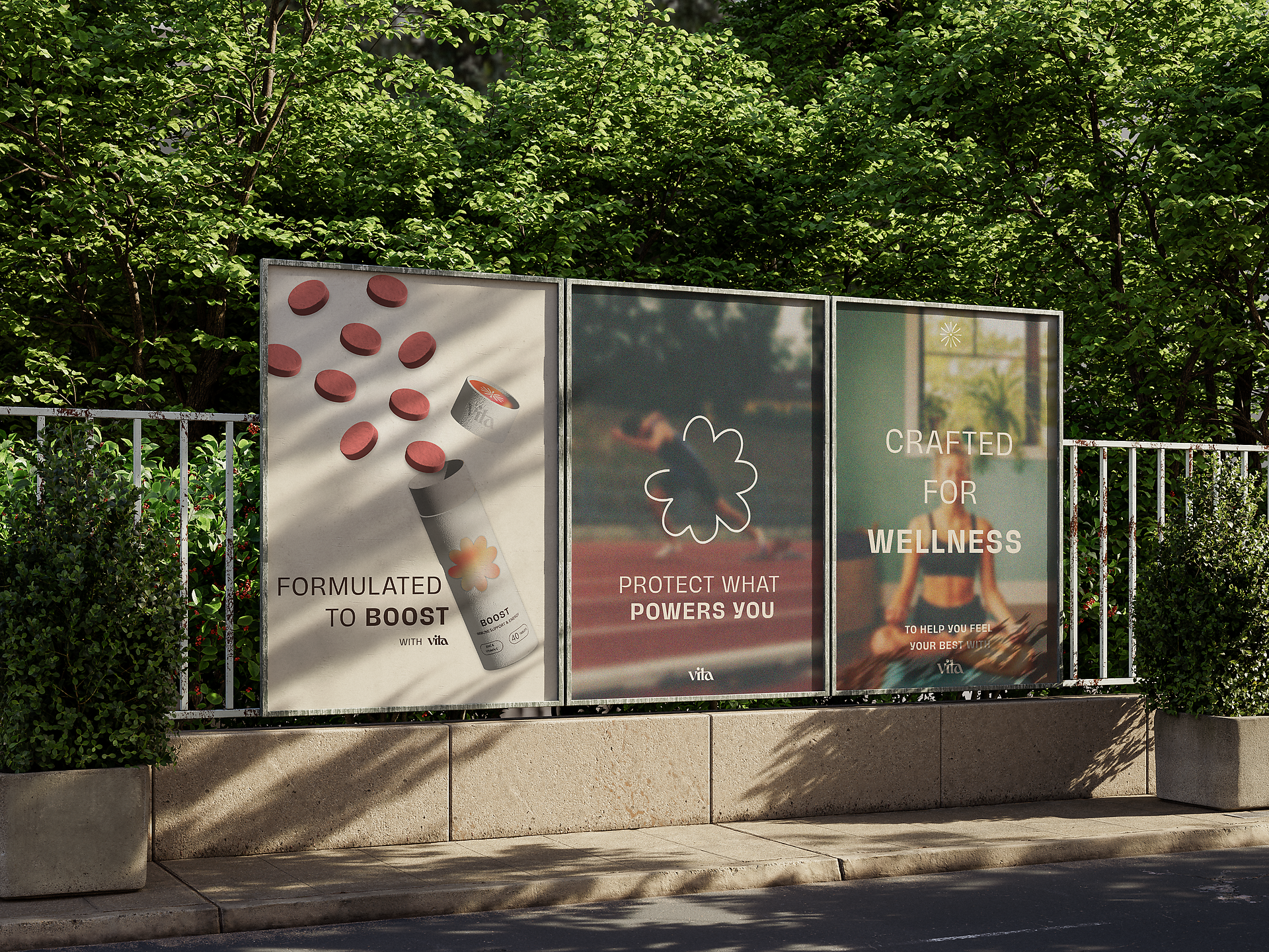
Vita Health

This project repositions Vita as an aspirational wellness brand by shifting it from a product-led identity to a lifestyle-focused experience. It uses a consistent visual language across packaging, posters, and social media to communicate energy, balance, and internal wellbeing while strengthening brand recognition and appeal.

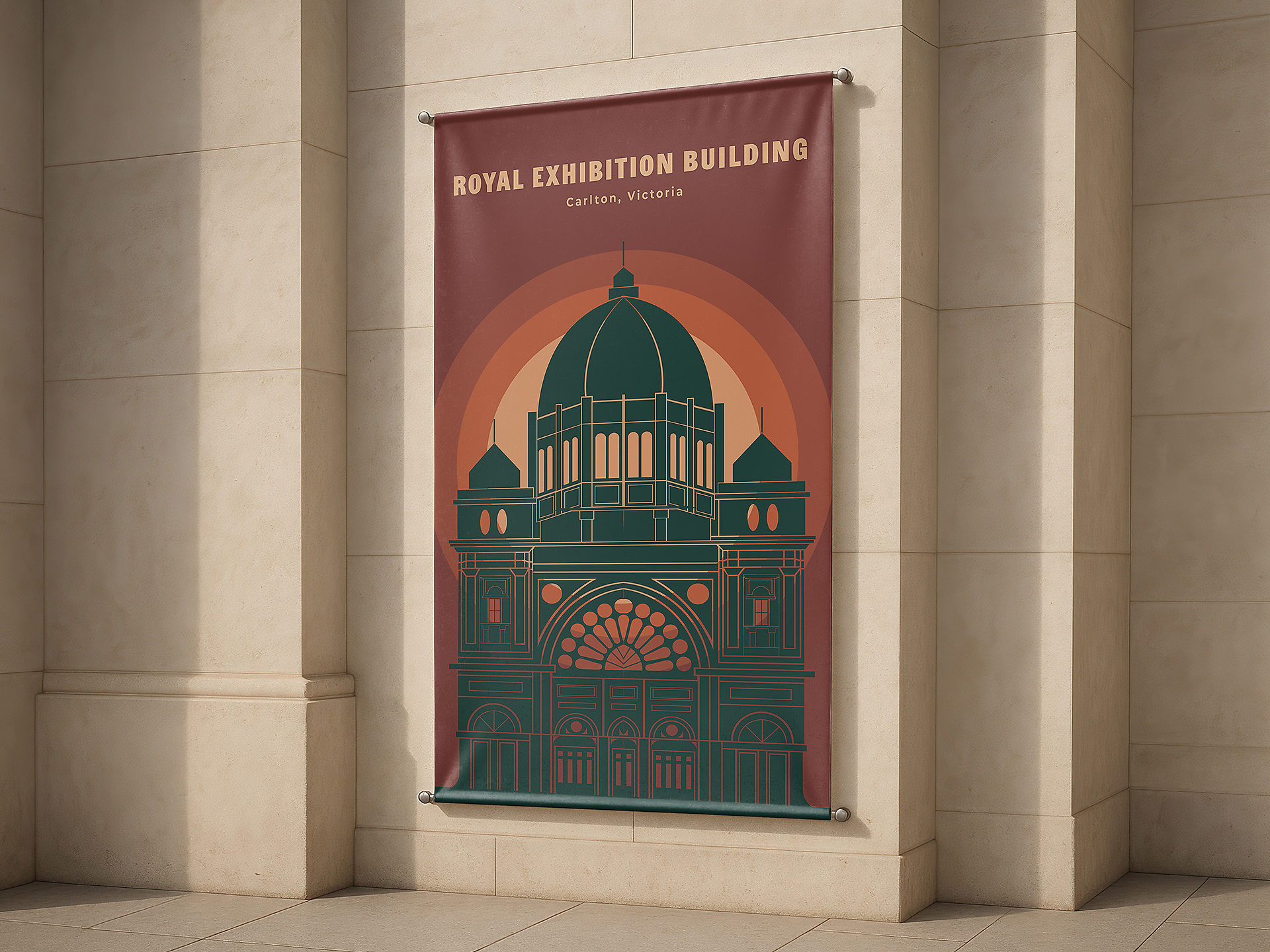
The Royal Exhibition Building

A visual identity project created for the City of Melbourne to promote Melbourne’s architectural landmarks to both locals and visitors through contemporary and engaging design outcomes. The project explored how heritage-inspired branding can communicate history while remaining visually relevant and accessible to modern audiences. The main objective was to translate key architectural features into a cohesive visual system that reflects the building’s cultural significance and historical presence in a contemporary context.

The design draws heavily on the structure, symmetry, and intricate detailing of the architecture to convey a sense of elegance, strength, and heritage. A warm, heritage-inspired colour palette was used to balance historical character with a modern execution, creating a bridge between past and present. Strong geometric forms and considered typography reinforce clarity and recognition, helping establish a bold and unified visual identity. Across promotional applications, these elements work together to create a consistent and engaging system that celebrates Melbourne’s architectural identity while enhancing its visibility and cultural value.

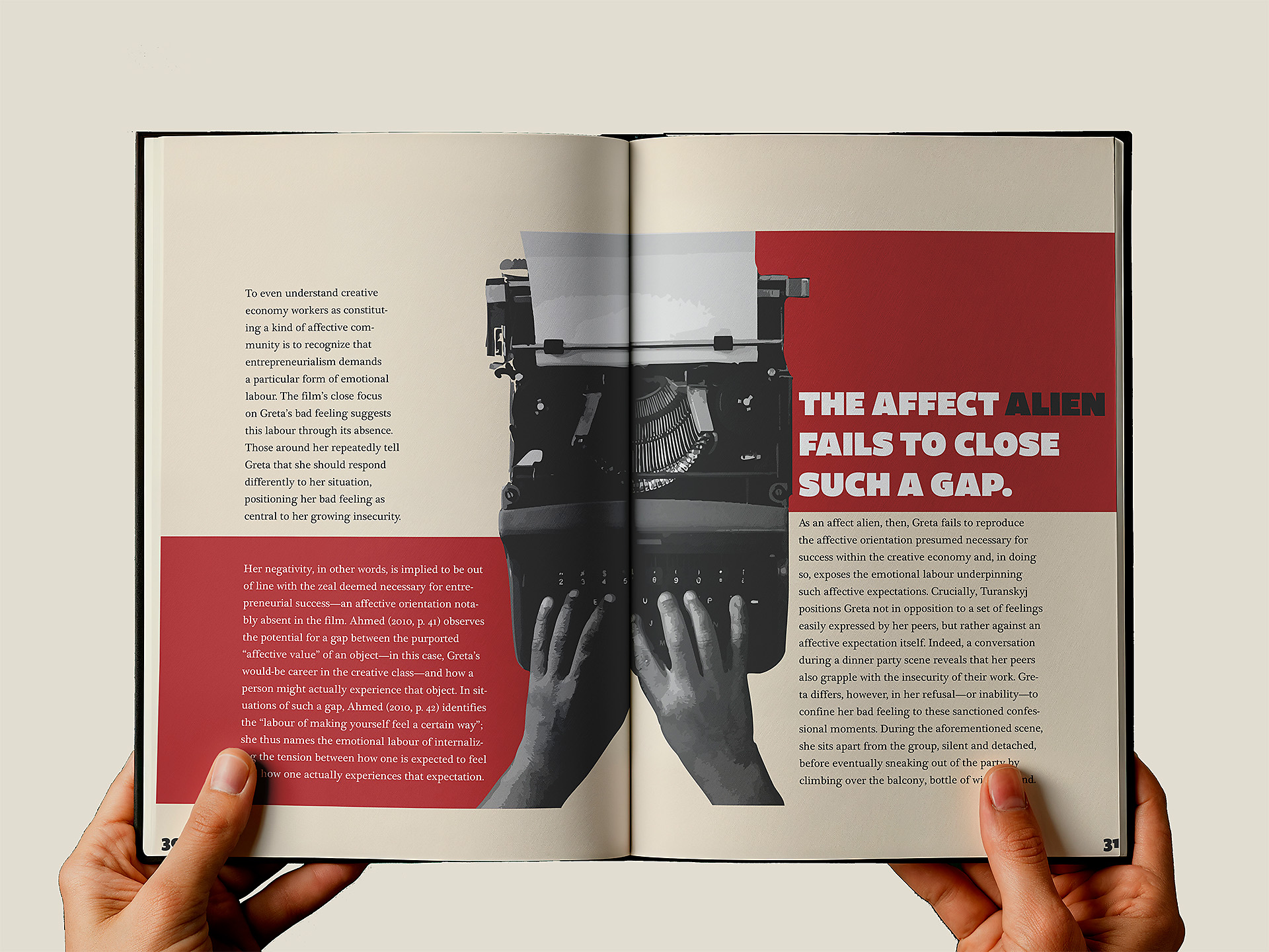
The Weight Within

A publication design project exploring emotional connection through bold, expressive, and visually impactful design choices. The project involved creating a strong visual identity for the original publication by Carolyn Veldstra, translating complex emotions into a cohesive and engaging editorial experience. The main objective was to develop a visual language that communicates intensity, vulnerability, and emotional depth through typography, layout, and image treatment, while still maintaining clarity, readability, and narrative flow throughout the publication.

A strong emphasis was placed on establishing brand personality through hand-drawn floral illustrations, earthy colour palettes, and layered botanical forms, which work together to evoke a sense of intimacy and emotional resonance. Strategic use of typography, colour, and hierarchy helps guide the reader through the content while reinforcing tone and meaning. These elements were extended across supporting touchpoints, including packaging, promotional material, editorial spreads, and merchandise, creating a cohesive and immersive visual system that strengthens the overall storytelling experience.

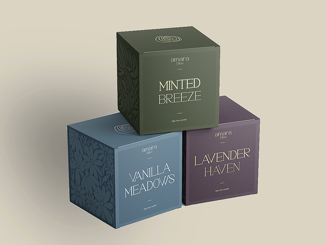
Amara Bliss

A boutique packaging and branding project developed for a three-product wellness range, focused on creating a calm, modern, and cohesive visual identity. The project explored how packaging design can effectively communicate mood, product differentiation, and brand consistency across an entire collection, while still allowing each item to hold its own identity within a unified system. The main objective was to design a structured packaging system that ensures each product feels distinct, yet remains clearly part of a recognisable and cohesive brand family.

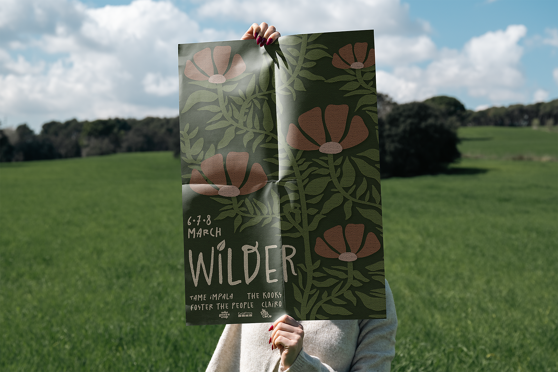
WIlder Festival

A branding project focused on developing a distinctive visual identity for a forest-inspired festival that captures a sense of nature, creativity, and community. The project explored how branding can communicate atmosphere, emotion, and experience through cohesive visual storytelling across print and promotional applications. The main objective was to create a memorable and recognisable identity system that reflects the festival’s organic, immersive environment while remaining clear, adaptable, and engaging across multiple touchpoints.

A strong emphasis was placed on brand personality through hand-drawn floral illustrations, earthy colour palettes, and layered botanical forms, which together reinforce the festival’s connection to nature and its expressive, creative energy. Strategic use of typography, colour, and hierarchy helped establish clarity and visual rhythm across applications. The system was extended across packaging, editorial material, promotional assets, and merchandise, ensuring a consistent and immersive brand experience that strengthens recognition and emotional connection with audiences.