Audrey Tange

Creative and strategically minded, I am a final-year double degree student at Swinburne University of Technology, studying a Bachelor of Design (Communication Design) and a Bachelor of Media & Communication (Media Industries).

My studies have centred around brand development and publication design, with a strong interest in creating thoughtful visual identities and editorial experiences that connect with audiences. Alongside this, my media degree has provided broad experience across journalism, marketing, advertising, social media, public relations, and media production, allowing me to approach creative projects with both strategic and creative thinking.

Throughout my degree, I have developed skills across branding, content creation, visual communication, and storytelling, with a passion for work that blends design, media, and culture. I enjoy translating ideas into meaningful visual outcomes, using research, strategy, and design principles to create work that is both engaging and effective. My experience across multiple creative disciplines has strengthened my ability to think critically, adapt to different audiences, and collaborate within diverse project teams.

A highlight of my studies was completing a semester abroad in Newcastle, England, where I gained international experience, expanded my creative perspective, and explored new approaches to communication and design within a global context. This opportunity encouraged me to embrace new challenges, work across cultures, and develop a broader understanding of the creative industries.

I am particularly interested in publication design, brand identity, and creative direction, and I am excited to continue building experience within the design and media industries. I am driven by a desire to create impactful work that communicates clearly, tells compelling stories, and leaves a lasting impression.
The Big Issue

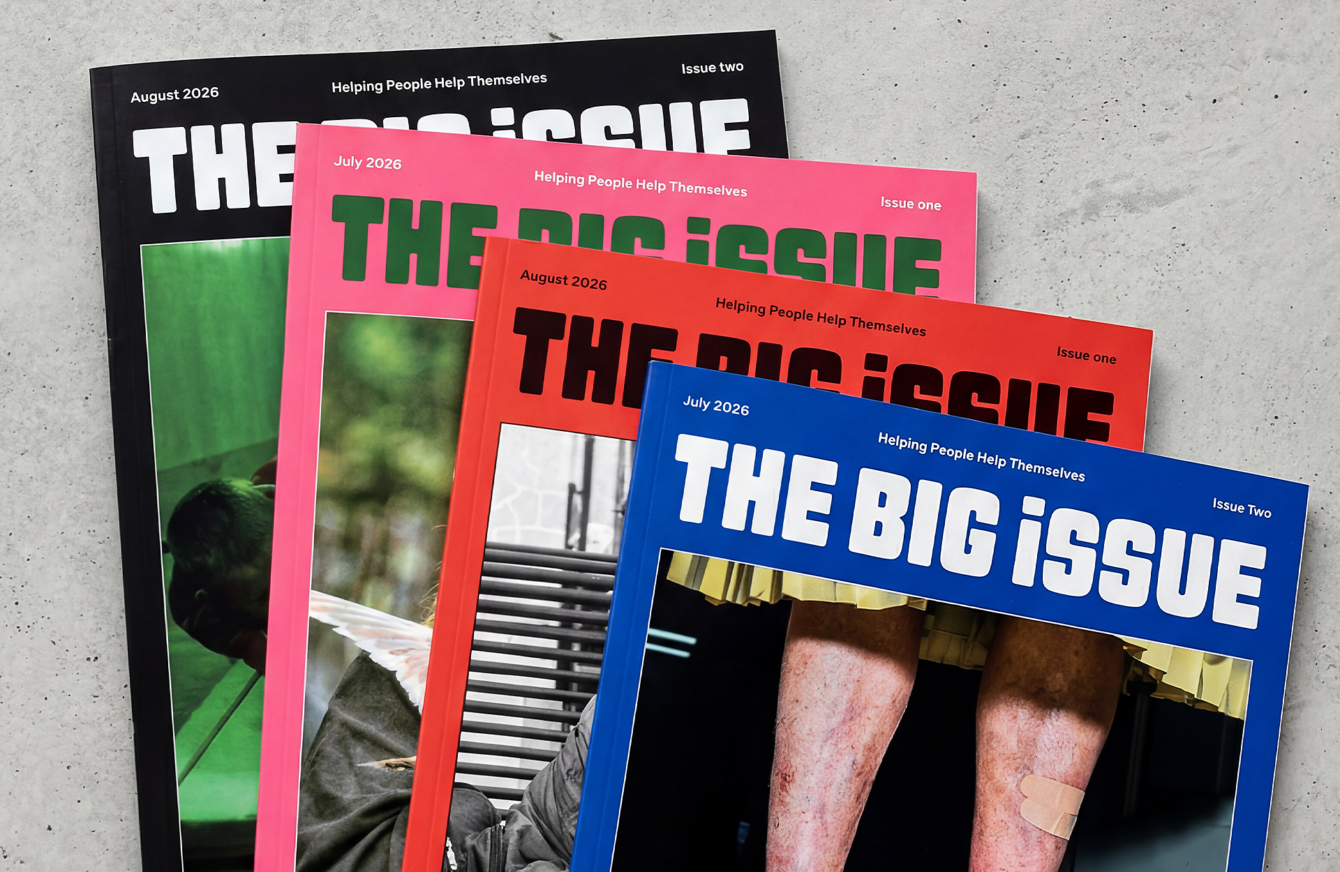
This capstone project reimagines The Big Issue Australia through a contemporary editorial redesign aimed at increasing visibility, engagement and audience connection. The project includes a 40-page publication, four cover variations and social media applications, combining bold typography, immersive layouts and human-centred storytelling.

Inspired by premium editorial design, the redesign positions The Big Issue as both a socially impactful publication and a visually compelling contemporary magazine, helping amplify the voices and stories at the heart of its mission.

Dauphine

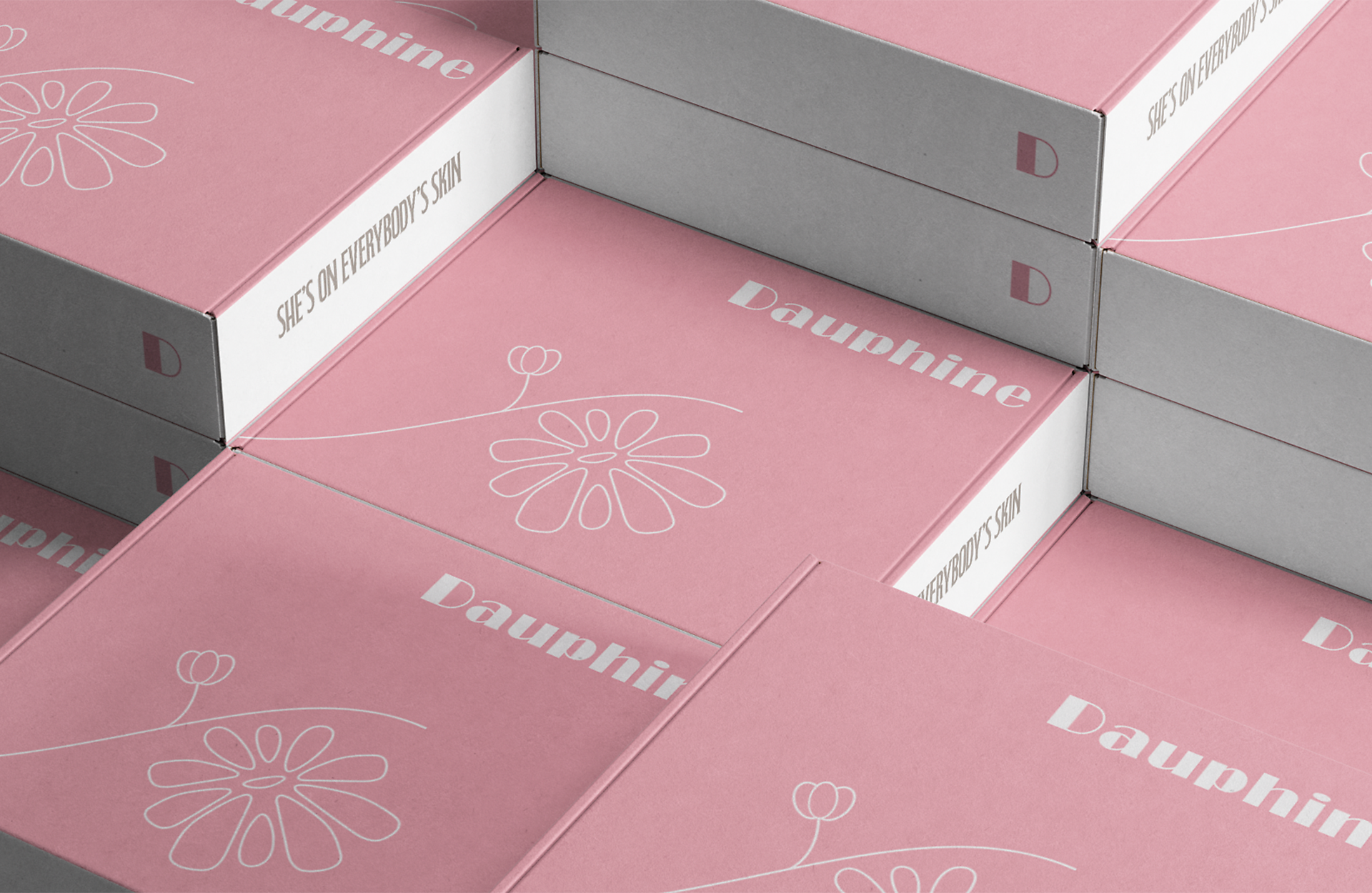
Dauphine is a luxury skincare and cosmetics brand inspired by the timeless elegance of the Art Deco movement. The visual identity combines soft blush tones, refined serif typography and delicate illustrative linework to create a brand that feels sophisticated, feminine and elevated. Drawing on the glamour and symmetry often associated with Art Deco aesthetics, the design balances minimalism with luxury, allowing the packaging to feel both contemporary and classic.

Created for a high-end beauty audience, the branding aims to evoke a sense of confidence, self-care and indulgence. Every design element was carefully considered to create a cohesive and memorable experience across packaging, positioning Dauphine as a modern beauty brand with a strong sense of elegance and identity.

Bad Feeling at Work

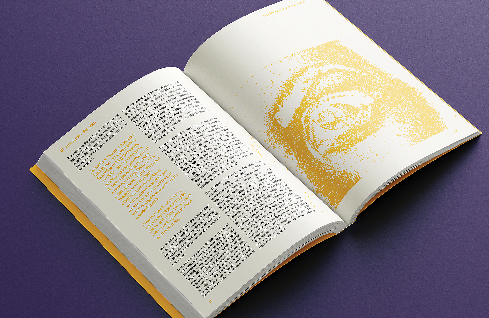
Bad Feeling at Work is a publication design exploring the emotional realities of modern workplace culture and burnout. The visual identity combines bold typography with minimal layouts and playful graphic elements to create a publication that feels both engaging and reflective. Using strong typographic hierarchy, generous white space and subtle colour accents, the design balances serious subject matter with an approachable and contemporary aesthetic.

The publication was designed to encourage readability while visually communicating feelings of tension, exhaustion and emotional disconnect often associated with toxic work environments. Inspired by modern editorial design, the project focuses on creating an impactful reading experience that feels expressive, clean and visually memorable across both cover and internal layouts.

Let's Talk About It

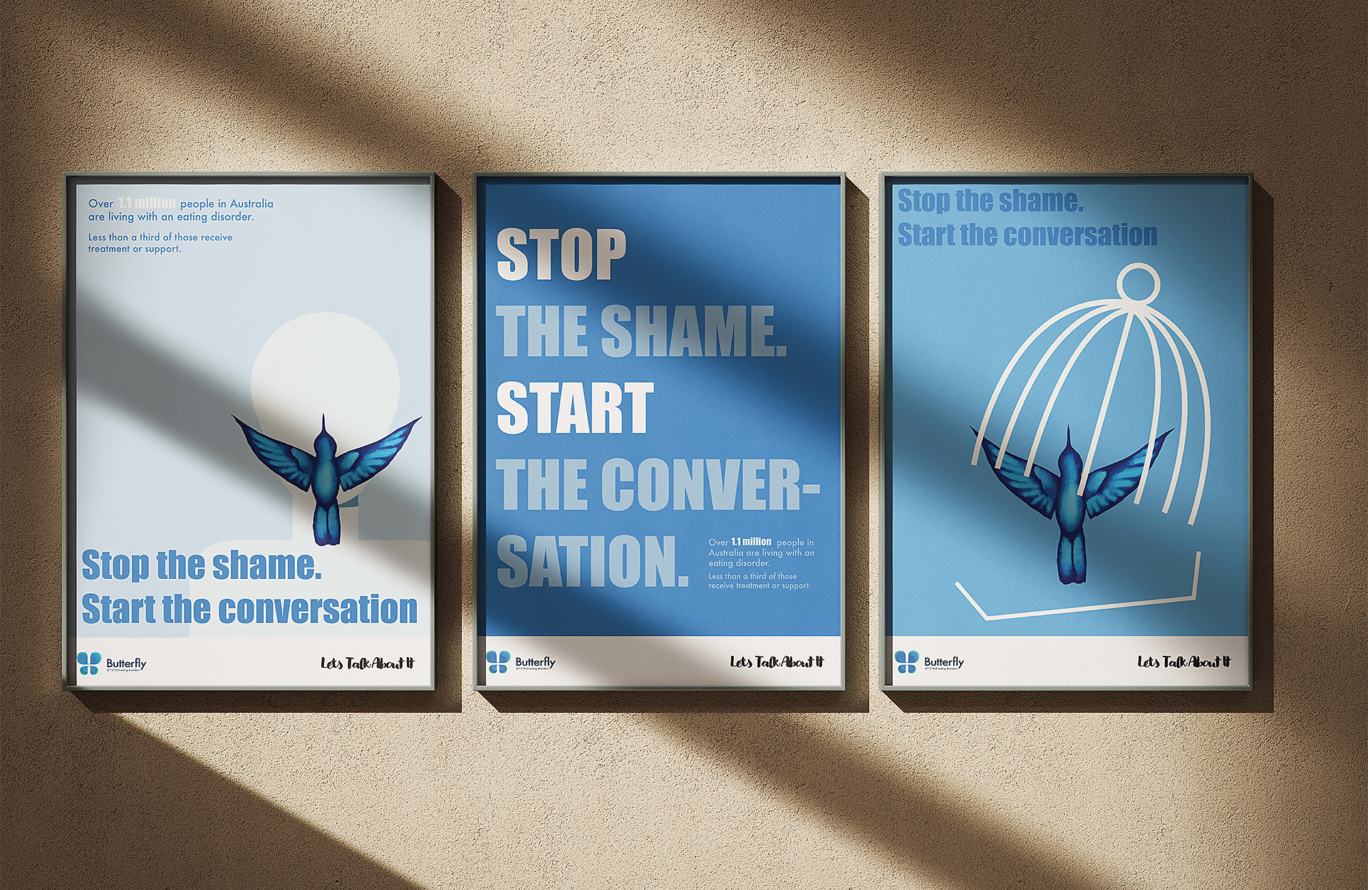
This is a thoughtfully crafted disordered eating awareness campaign designed to reach and resonate with young people aged 12 to 25. By combining a calming blue colour palette with the powerful symbolism of a hummingbird, the campaign communicates a message of hope, freedom, and renewal.

The hummingbird breaking free from a cage and flying toward the mouth of a silent figure is a powerful metaphor for reclaiming one’s voice and breaking the silence around disordered eating, reinforcing our catchphrase: Stop the shame. Start the conversation.

The multi-platform approach ensures that the campaign meets young people where they are. The trio of posters offers visual impact in schools, clinics, and community spaces, sparking curiosity and empathy.

A Psychic Connection

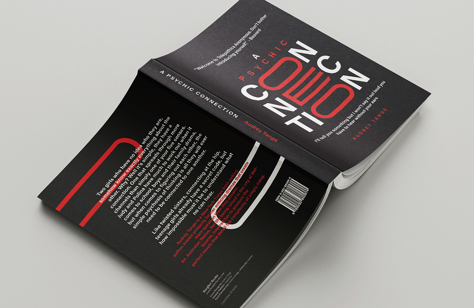
A Psychic Connection is a publication cover design inspired by the concept of telepathy and the invisible connections that can exist between people. The design uses bold typography, high-contrast colour, and flowing graphic forms to visually represent the transmission of thoughts, emotions, and unseen communication.

The intertwining red and white lines act as a metaphor for mental pathways and psychic links, creating a sense of movement, mystery, and connection. Through its striking visual identity, the cover captures the intrigue surrounding telepathy while establishing a contemporary and compelling presence on the shelf.