Imogen Giorgini

Hi, I’m Imogen, a Communication Design graduate with a strong interest in brand identity, packaging and print design. I have always been drawn to the small details that make something feel considered, the way colour can shift a mood, how texture can make a design feel more tactile, or how type and layout can completely change the way a story is experienced.

For me, design is about bringing ideas to life in a way that feels clear, thoughtful and memorable. I enjoy working across different formats, from packaging and publications to visual systems and client-based projects, and I love seeing how each piece can come together to create something cohesive. My work often explores bold colour, playful shape, strong composition and a sense of warmth.

I approach each project with curiosity and care. I like to understand the purpose behind a brief, listen closely, ask questions and think about how the final outcome can feel more meaningful. I am especially interested in design that balances personality with clarity, creating work that feels expressive while still being easy to understand.

The pieces in this portfolio reflect the kind of designer I am becoming: detail-driven, thoughtful and excited by the process of making ideas feel tangible. Through each project, I aim to create work that feels visually engaging, purposeful and connected to people.
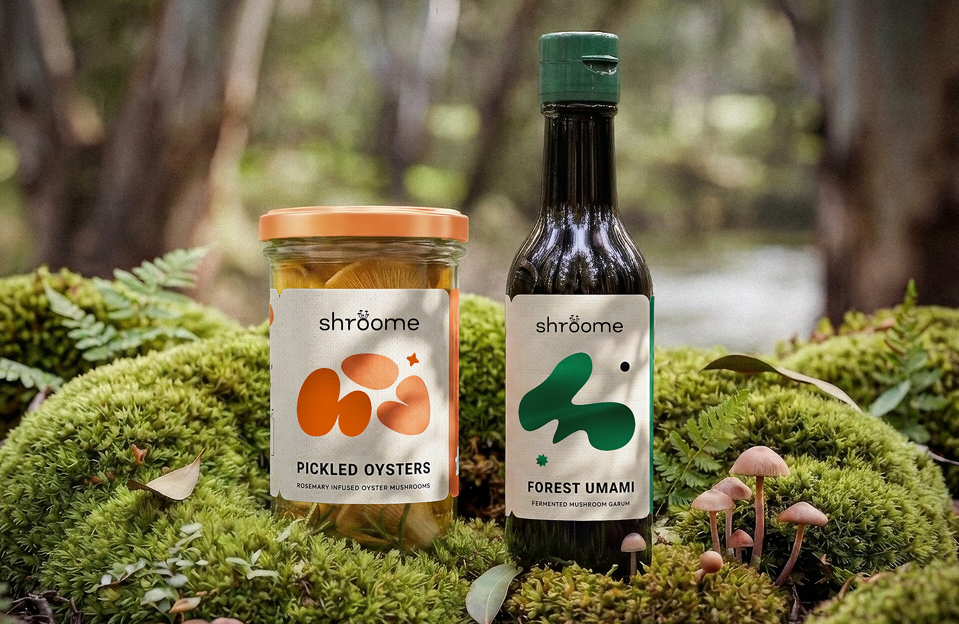
Shroome Product Packaging


Shroome Product Packaging explores how brand identity can be applied across a cohesive packaging system.
Featuring Pickled Oysters and Forest Umami, the design uses organic shapes, textured labels and vibrant colour to reflect the brand’s connection to mushrooms, nature and local produce.
Created using Adobe Illustrator, Substance 3D Stager and Photoshop.

Flora Forma Artists Festival Publication


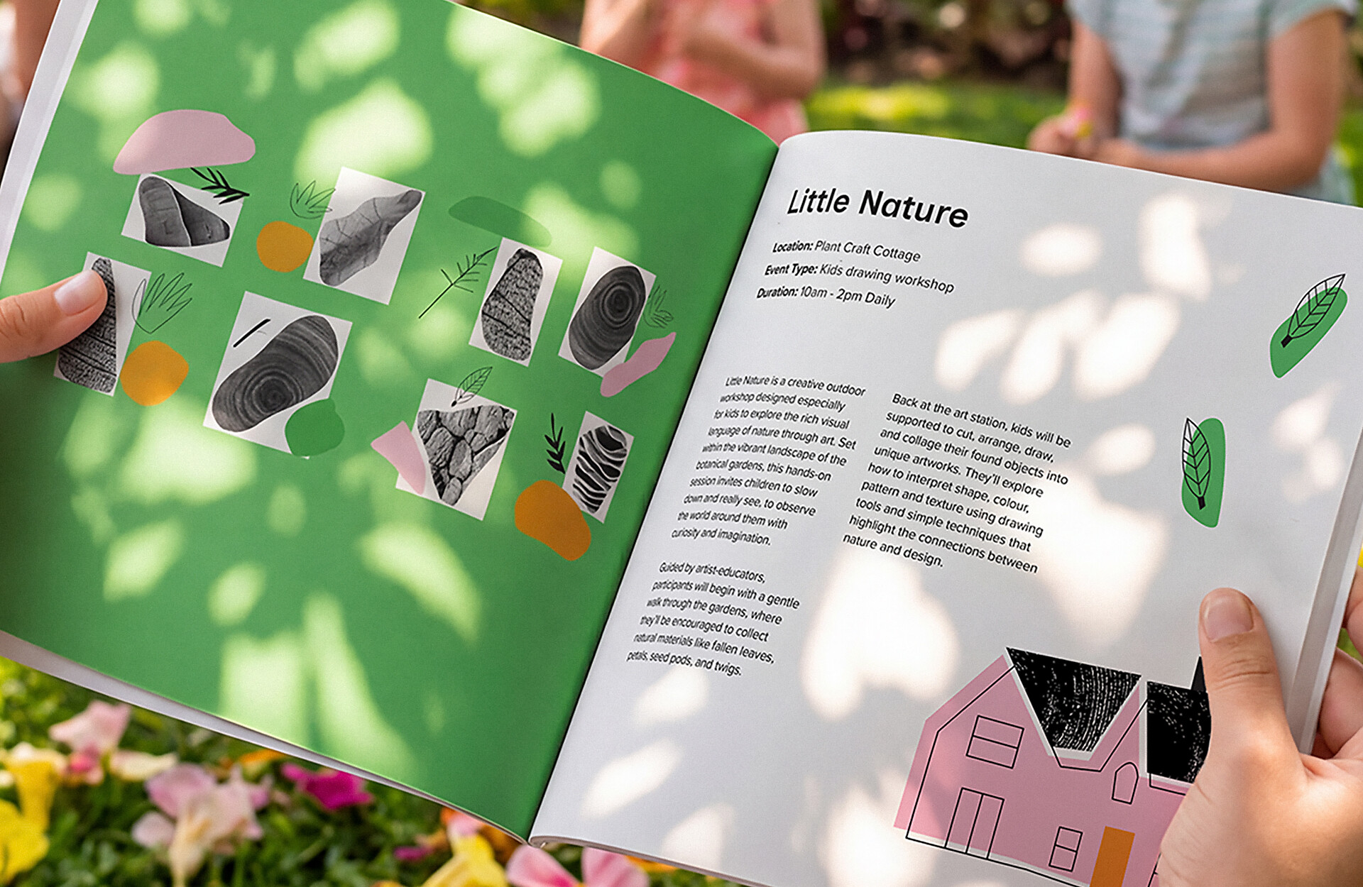
Flora Forma Artists Festival Publication explores how a children’s festival workshop can be communicated through a playful publication format.
This page design features Little Nature, encouraging curiosity and discovery within the Royal Botanic Gardens. Through collage, illustration, colour and texture, the design reflects the hands-on nature of collecting natural materials and transforming them into artworks.
Created using Adobe Illustrator, InDesign and Photoshop.

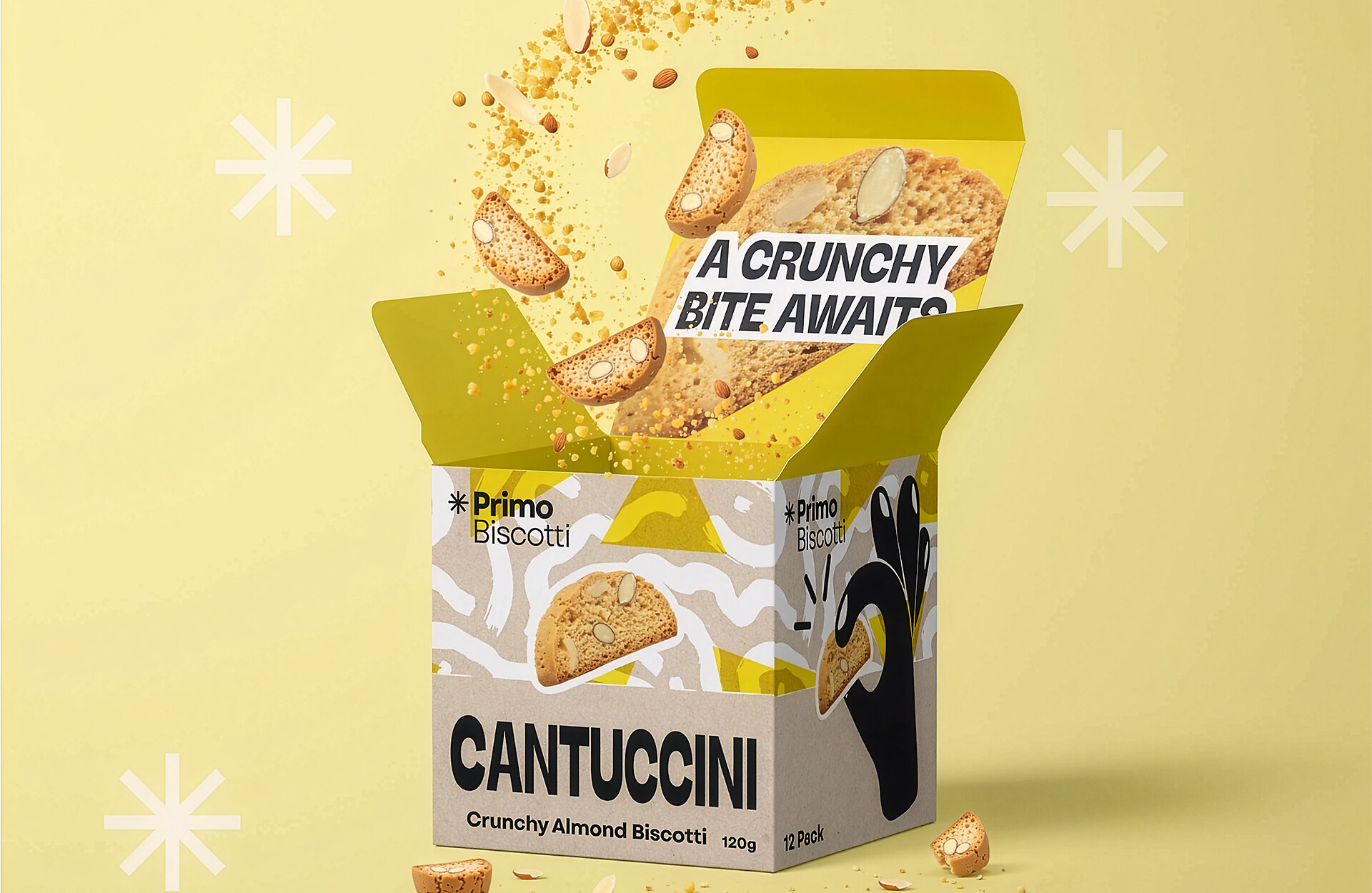
Primo Biscotti Packaging


Primo Biscotti Product Packaging brings a premium Italian biscuit range to life through bold shape, colour and texture.
Designed to reflect the crunch, flavour and playful energy of the product, the packaging balances a fun visual style with a refined, premium finish.
Created using Adobe Illustrator and Photoshop.

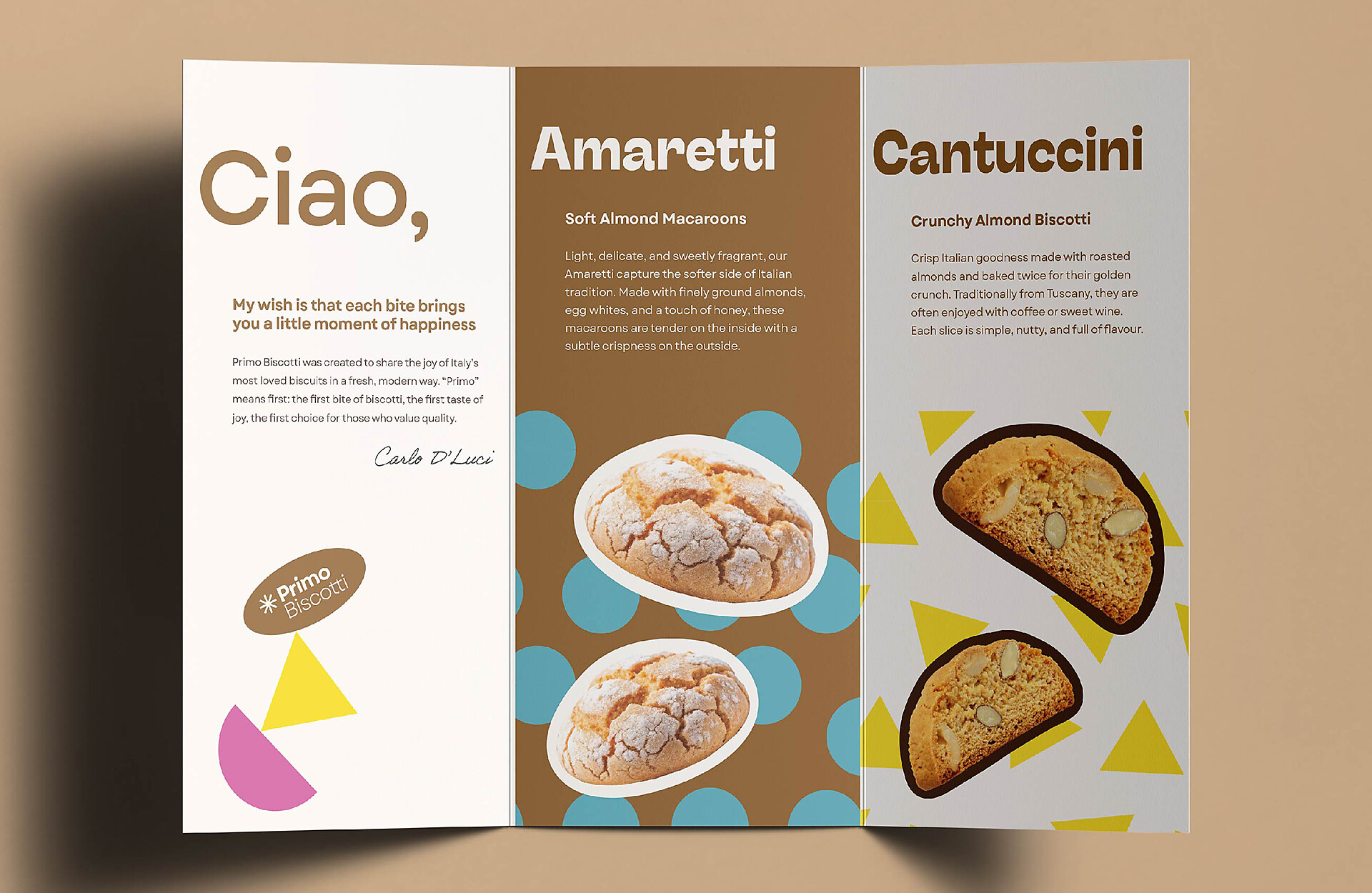
Primo Biscotti Tri-Fold Brochure


Primo Biscotti Tri-Fold Brochure is a complementary piece of design collateral created to support the product packaging range.
The brochure expands the brand experience through bold typographic hierarchy, playful composition and product imagery, bringing the biscuit flavours to life with a warm, expressive and premium finish.
Created using Adobe InDesign.

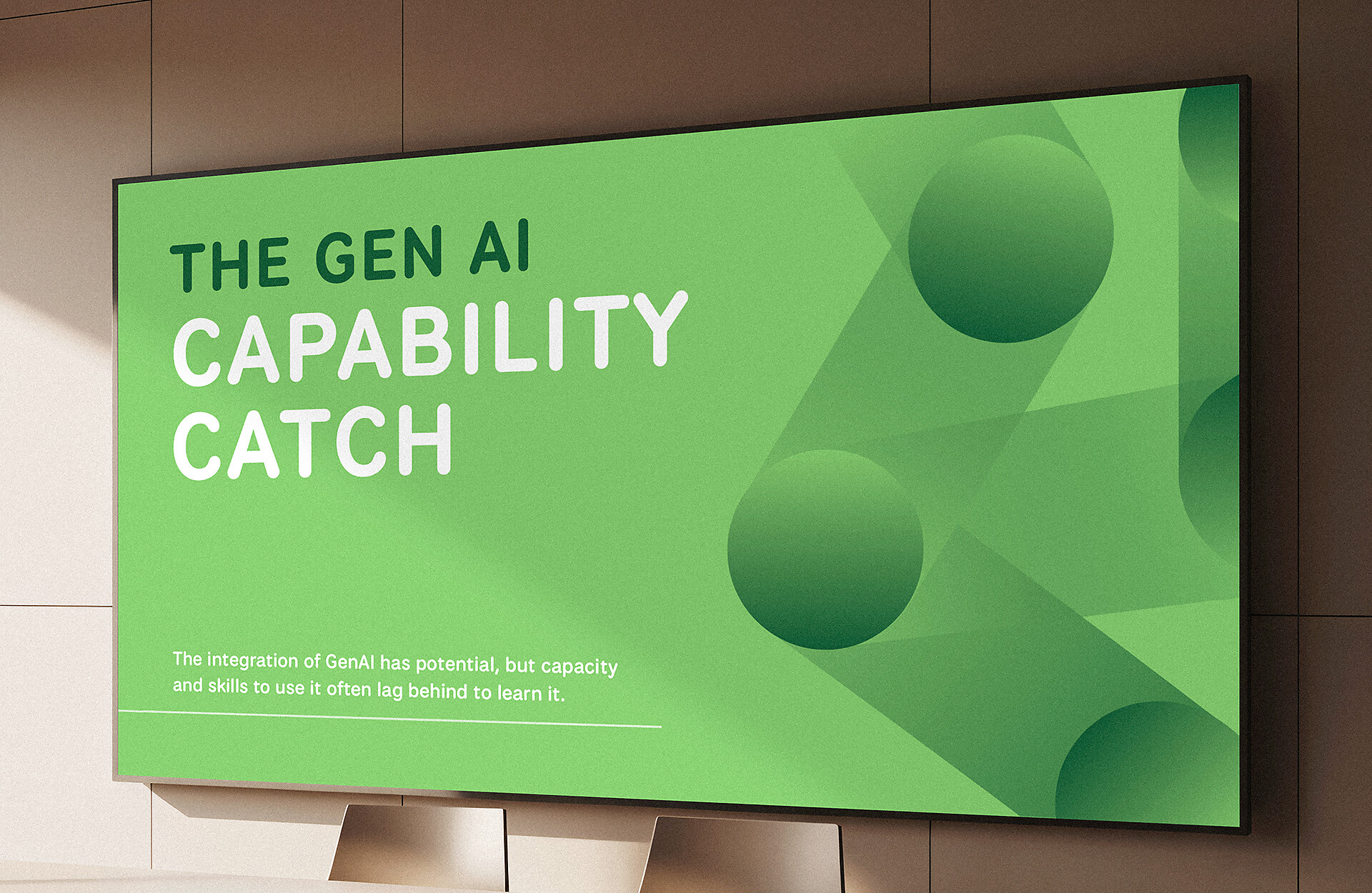
GenAI Tension 6 Tensions Presentation Design


GenAI 6 Tensions Presentation Design was developed collaboratively for client Education Horizons, in partnership with Portable and Griffith University Queensland.
This piece features one of six tension-based presentation designs created for school leaders, using bold geometric forms and colour to encourage discussion, reflection and responsible decision-making around the use of AI in schools.