Hi! I’m Meg Avontuur, a recent graduate of the Swinburne Communication Design (Honours) degree. During my studies I cultivated a diverse skill set by responding to a variety of creative briefs. I was fortunate enough to complete a year-long internship at Hardhat, where I gained valuable hands-on experience collaborating with skilled designers on engaging dynamic projects.

I’m especially passionate about advertising design and illustration, as seen in my portfolio of work. As I advance, I’m eager to further develop my expertise in web and packaging design.

I bring a strong attention to detail and a positive, can-do attitude to every project, ensuring that my work is not only precise but also filled with enthusiasm. I thrive in collaborative environments, as I believe that effective teamwork is crucial for producing exceptional outcomes. By working closely with others, I’m able to contribute to a dynamic exchange of ideas, fostering creativity and innovation while achieving shared goals. I value the collective strength of a team and am dedicated to helping create an atmosphere where collaboration leads to success.

Outside my academic work, I have a deep passion for oil painting, which I pursue as a personal hobby. This creative outlet allows me to further refine my artistic skills and express myself through a medium that offers both challenge and fulfilment.
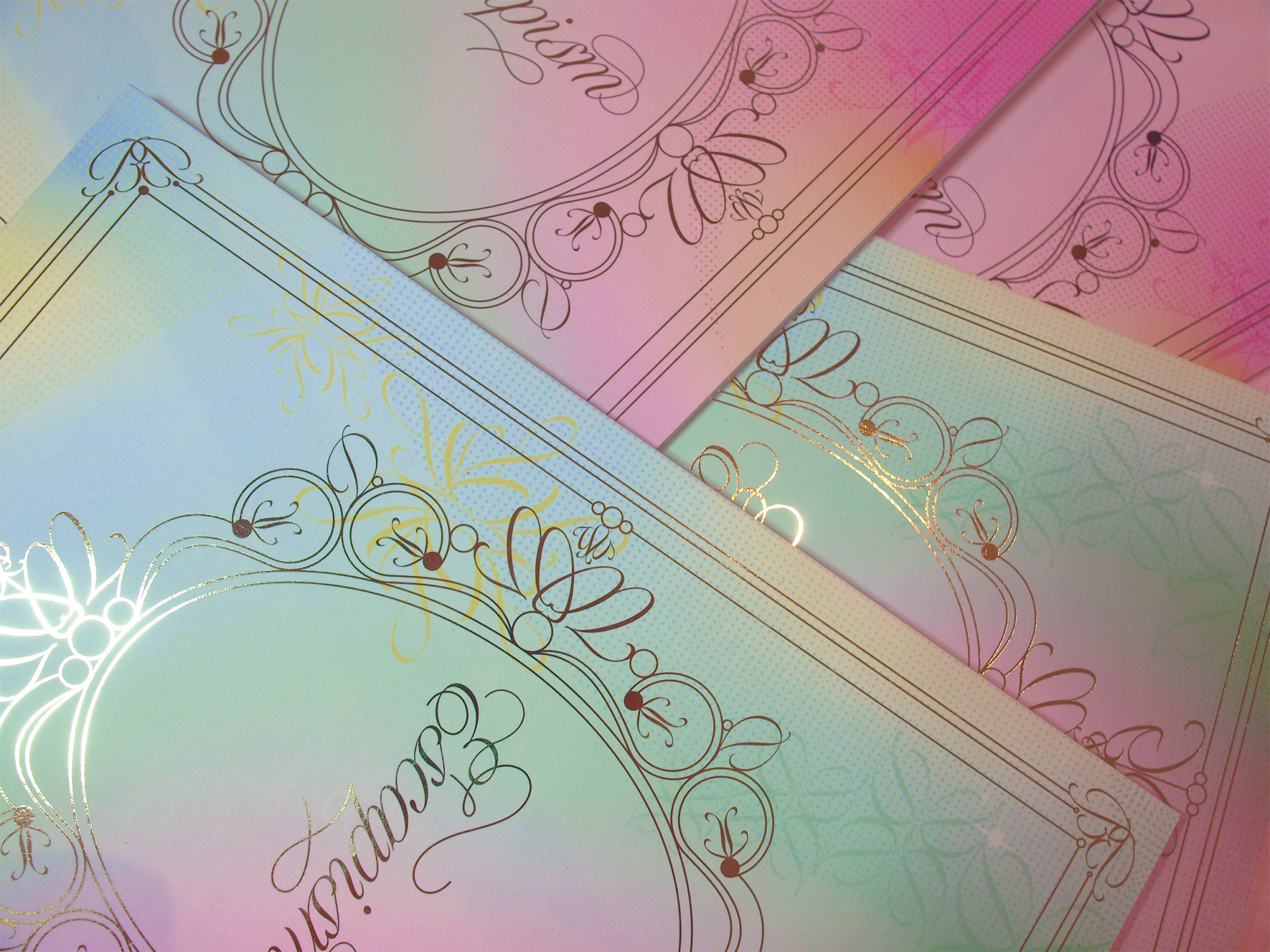
Escapism

Featuring extracts from Lewis Carroll’s Alice In Wonderland, Escapism celebrates reading as a healthy escape from life’s pressures and seeks to bring joy to its viewers. The vibrant colours, warm gradients and subtle textures take readers on a visual journey through various whimsical fantasy scenes, symbolising the feeling of entering into a new world when reading.

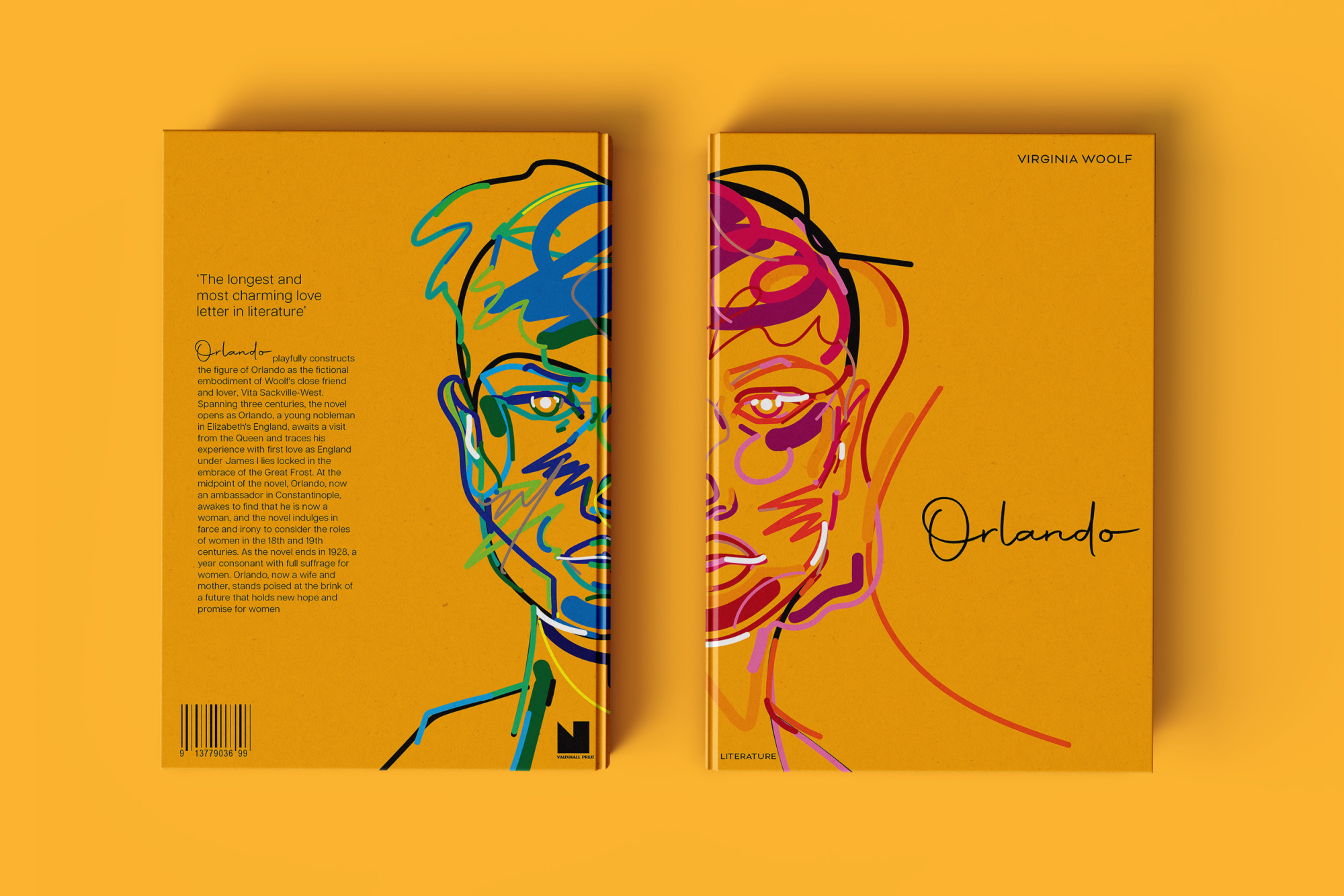
Orlando

Orlando is a redesigned book cover for Orlando by Virginia Woolf, that contrasts thick, thin, rigid and organic lines to convey the complexities of transitioning from one gender to another and celebrates the beauty of both male and female.

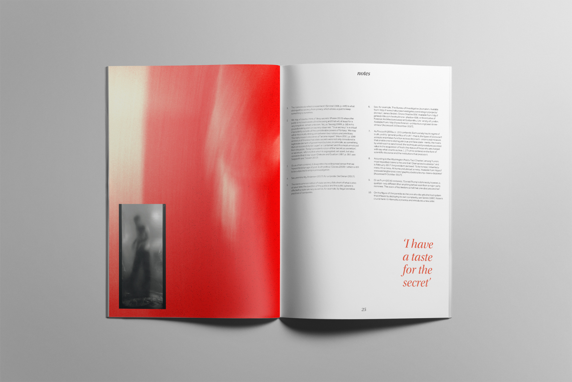
Truth vs Secret

Truth vs Secret is a publication that contrasts light with dark colours to symbolise the truth and the secret. It combines elements of visual chaos with negative space, exploring the relationship between the truth and the secret and the truth about the truth.

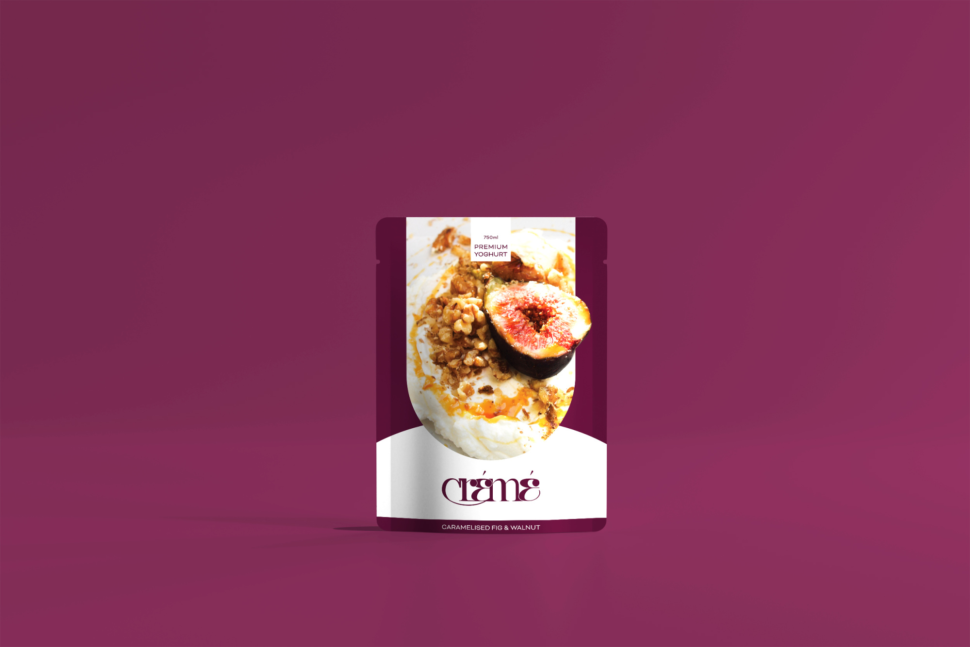
Crémé

Crémé involves the design of a brand mark and suite of six different flavours and packaging designs for a premium yoghurt brand. The bold colours feel friendly and inviting, communicating a delicious and high quality product.

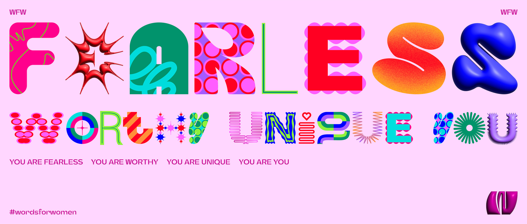
Words for Women

Words for Women is a campaign that seeks to challenge the subtle negative messages in cosmetic advertising that often go unnoticed, that teach women harmful and unrealistic ideas about beauty and self-worth. The campaign stands as educational material for both producers and consumers of the cosmetic advertising industry, providing examples of the positive approach producers need to adopt.