Britney Angelia Kusuma is a graphic designer and illustrator from Melbourne. She’s studying communication design at Swinburne University of Technology and is almost finished with her degree. Britney is really good at branding and publication design, where she comes up with cool ideas that people like. People know her for being honest and always trying her best. She loves learning and wants to keep getting better at design. Britney hopes to do important stuff in the design world and make things that are super creative and useful. With her talent and hard work, Britney Angelia Kusuma is going to make a big impact in graphic design.
Britney Angelia Kusuma
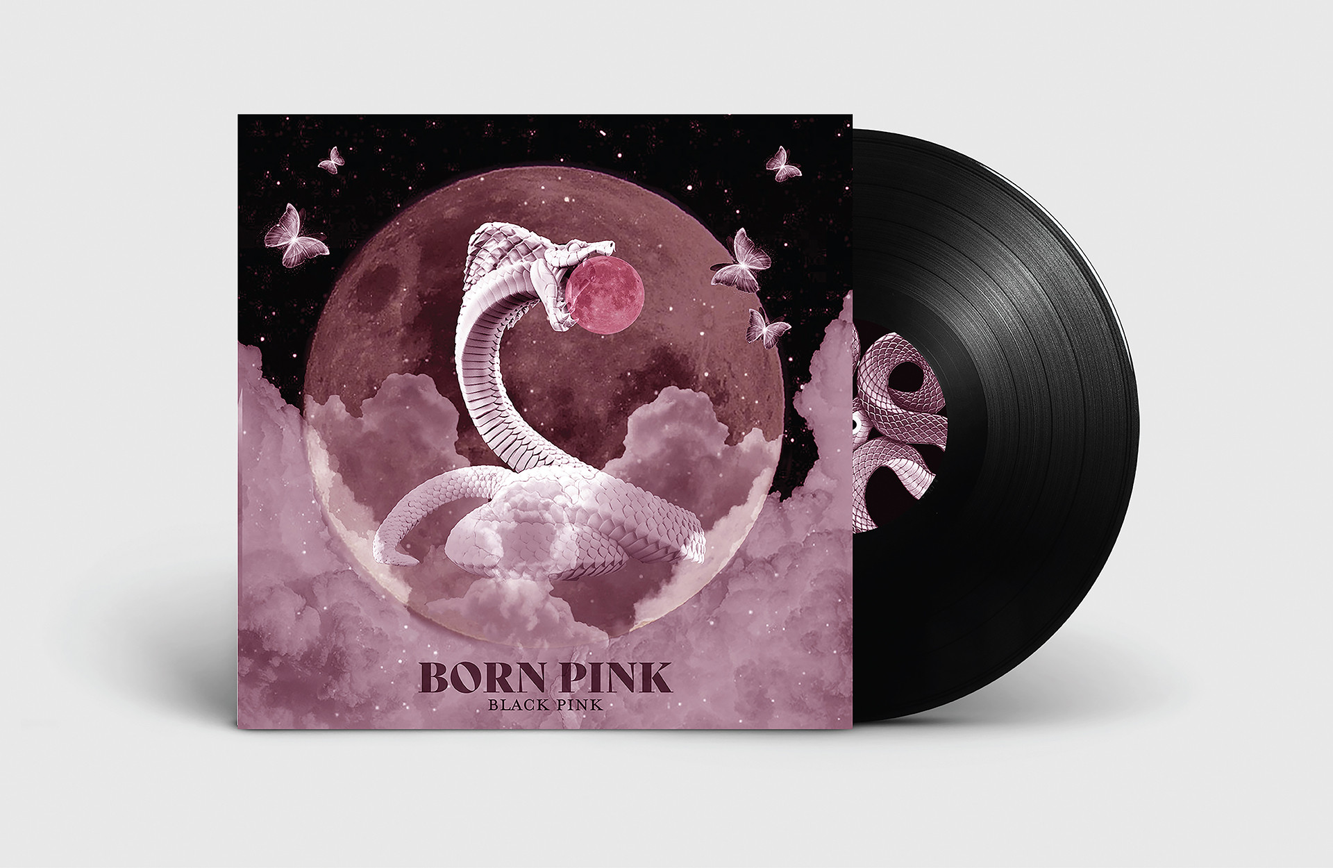
Gatefold Album
For this project, I was assigned the challenge of creating a gatefold album inspired by my favorite music genre and artist. I decided to utilize the Photomontage technique because of its ability to seamlessly blend various elements together in an artistic manner.
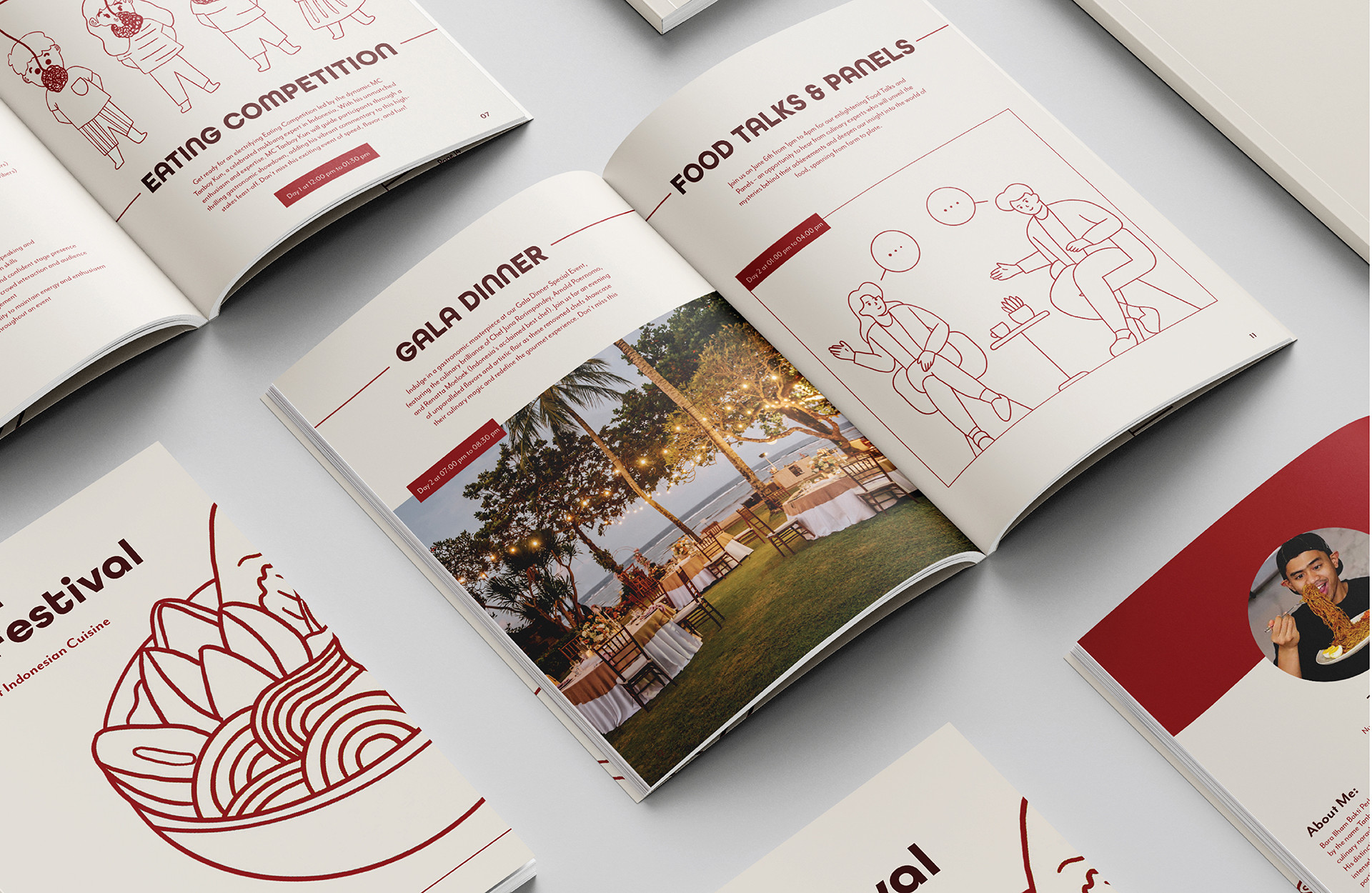
Sensasi Rasa Guide Book
For this project, I developed a printed festival guide for the fictional Sensasi Rasa Festival, a vibrant Indonesian food festival set in Bali. The festival guide showcases original illustrations specifically crafted to highlight the diverse events of the festival. The designs incorporate a color scheme inspired by the Indonesian flag, adding a patriotic and culturally rich touch to the overall aesthetic.
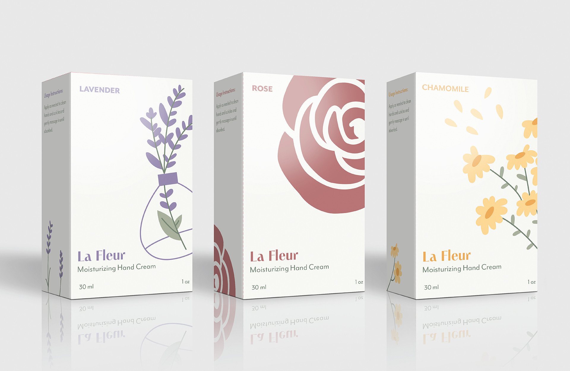
La Fleur - Packaging
La Fleur is a made-up brand that focuses on hand cream. In this project, I’m designing three boxes that reflect the beauty of flowers, targeting people who love floral scents. La Fleur’s hand cream embodies the essence of flowers, as the brand name translates to “the flower” in French.
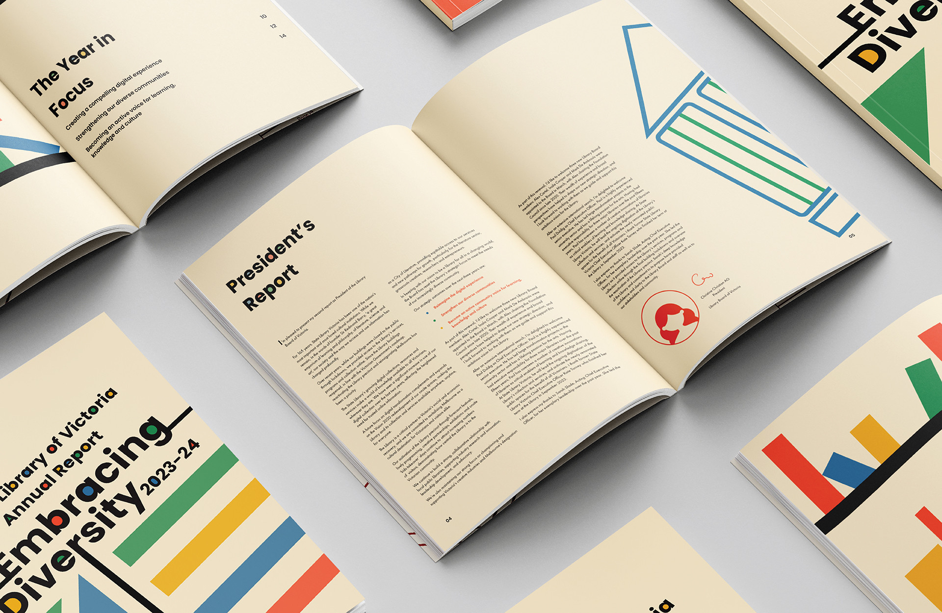
Annual Report
Annual Report design for State Library Victoria 2023-2024, entitled “Embracing Diversity”. The designs incorporate various shapes in a spectrum of colors, symbolizing individuals of different shapes and sizes. This idea aligns with one of their core values, namely ‘respect.’
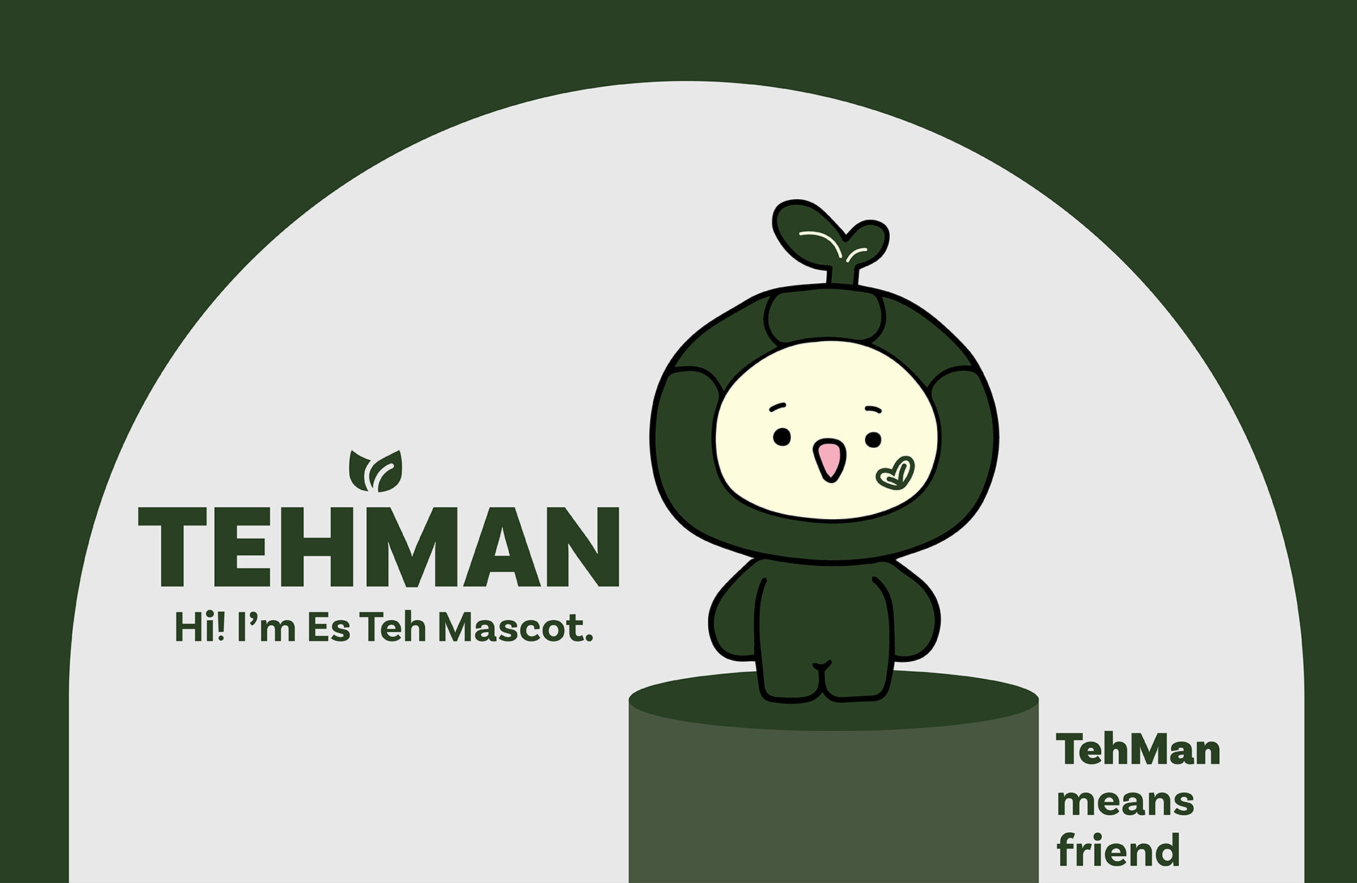
Es Teh Indonesia Mascot
For this project, I’m redesigning ‘Es Teh Indonesia’ and creating a mascot along with other brand collaterals. Es Teh Indonesia is a ice tea store in Indonesia. The mascot is a fun way to engage with customers, which matches one of their brand values—connecting with customers. The mascot features the brand icon, a tea leaf on its cheek and head, to represent the brand. I’ve also chosen green as the main color to represent the freshness of the tea leaves, which are key ingredients in the beverage.