Tammy Truong’s journey as a graphic designer is profoundly shaped by her lifelong passion for classical music. From a young age, Tammy was captivated by learning the violin, piano, and flute, and this musical foundation has become a key element of her creative process. Her ability to blend melodies with intricate designs manifests in both her digital and hand-drawn illustrations, enriching her visual storytelling and creating designs that resonate deeply with audiences.

Nature also plays a crucial role in Tammy’s inspiration. She often immerses herself in its beauty, using its diverse elements to inform and elevate her artwork. Her unique style merges music with visual expression, resulting in designs that are both harmonious and impactful.

Tammy holds a Bachelor of Design (2024) from Swinburne University of Technology, a Diploma of Business Administration (2016) from Australian Careers Business College, and a Diploma of Graphic Arts (2005) from Royal Melbourne Institute of Technology. Her expertise includes Adobe Creative Suite, traditional hand illustration, and business administration. She excels in creating brand identities, developing marketing materials, and managing projects, while also demonstrating strong communication and collaboration skills. Through her folio exhibition, Tammy offers a glimpse into the creative fusion of art and music that defines her work and drives her passion as a designer.
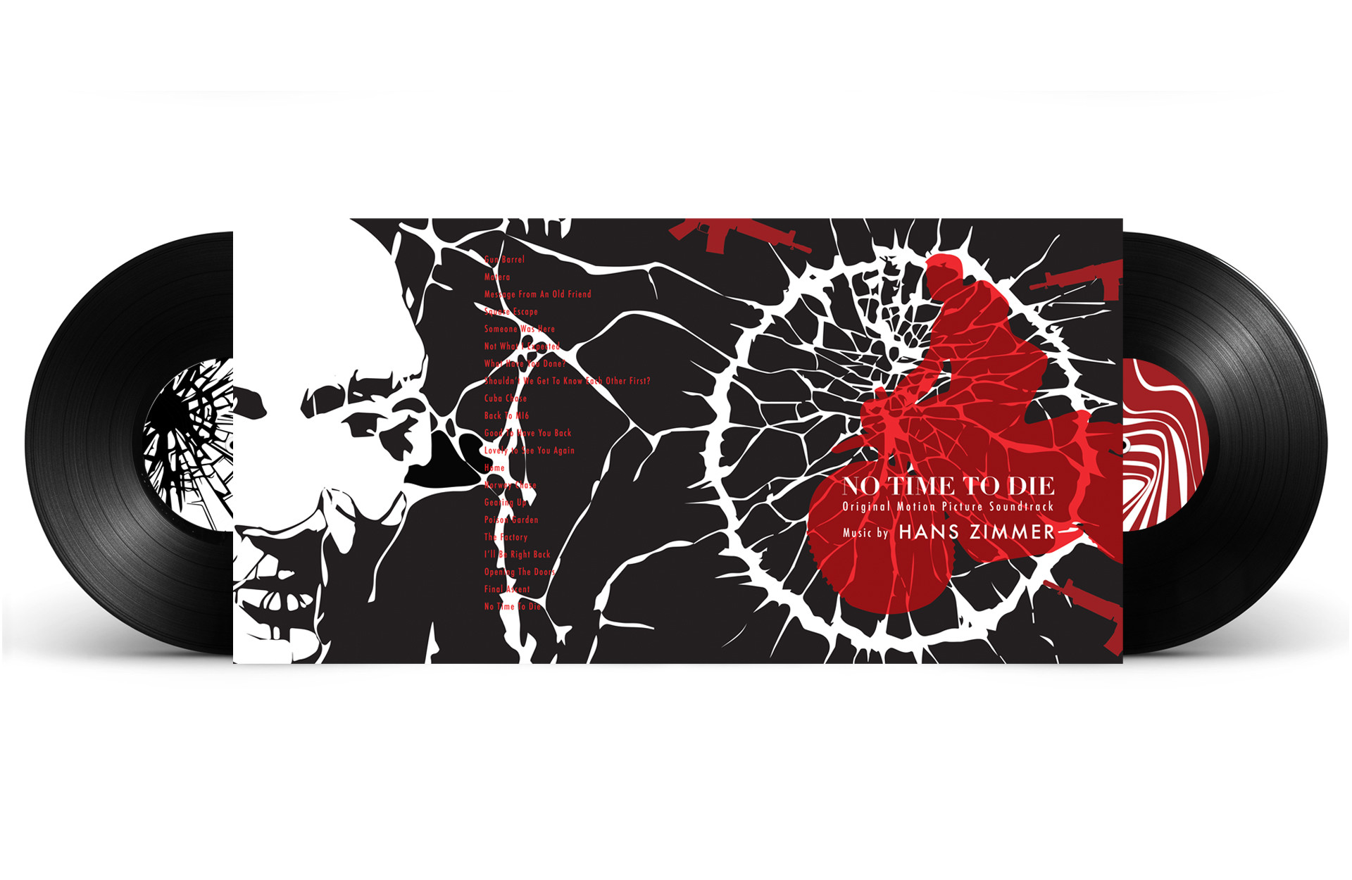
Album Design Package

For this project, Tammy Truong designed a 12-inch gatefold album package for No Time to Die, drawing inspiration from Contemporary Classical Music and the iconic themes of the James Bond film. Using a black, white, and red palette, she aimed to evoke the themes of violence, determination, and mystery that reflect Bond’s journey.
The design’s illustrations capture the intensity and emotion of his mission, resulting in a visually striking package that complements the soundtrack and enhances the overall experience.

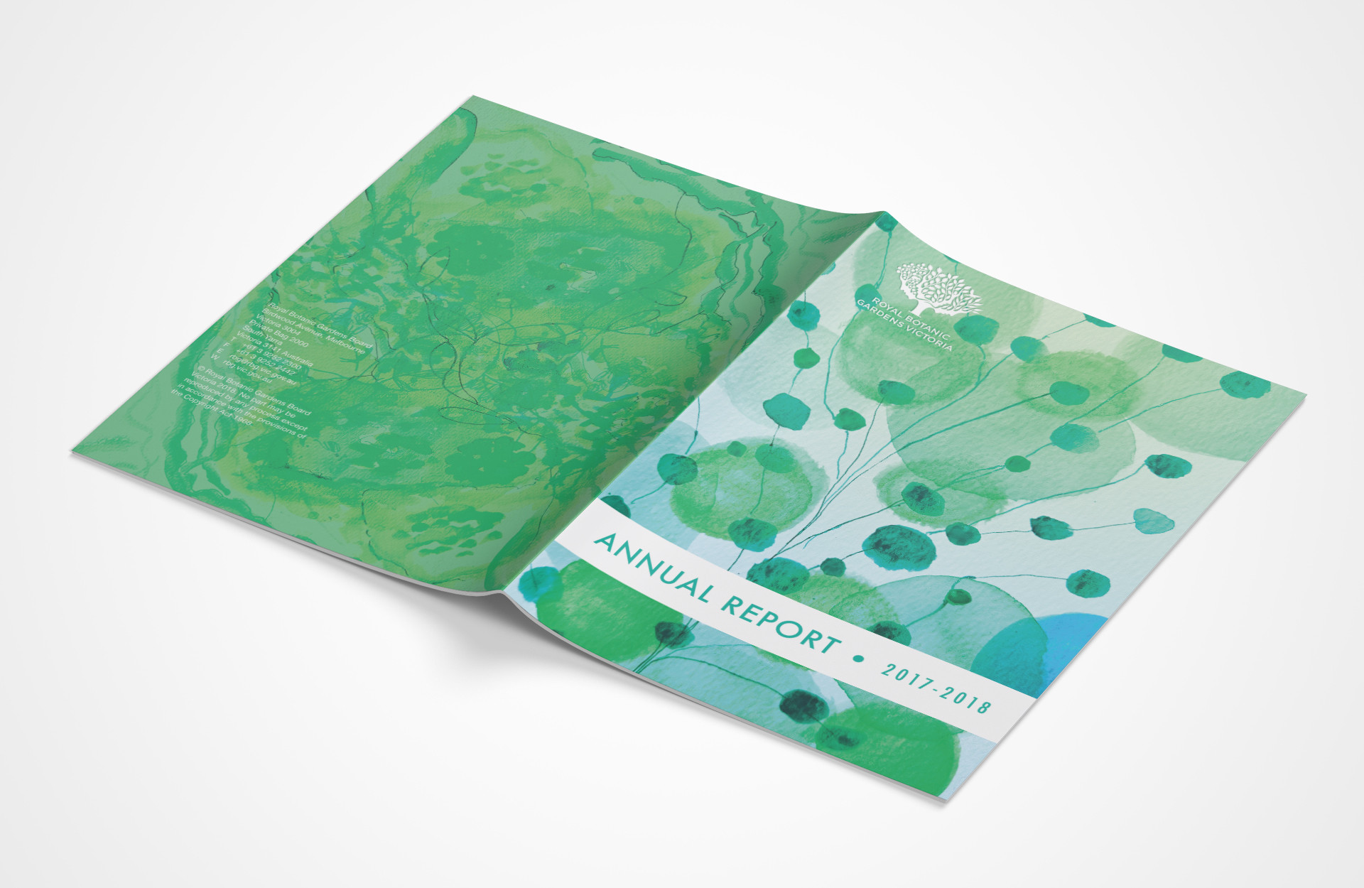
RBGV Annual Report

Tammy Truong designed an engaging and memorable annual report for the Royal Botanic Gardens Victoria, reflecting its mission in themes of environment, horticulture, science, and education. The A4 publication features bold typography, fresh layouts, and easy navigation between text and imagery. Using watercolour and mark- making techniques, Tammy created abstract botanical illustrations that align with the aesthetic, adding depth and visual interest. Her
attention to detail in typography and layout ensures a cohesive visual narrative that complements the content. The final design is professional, visually captivating, and effectively communicates the
Gardens’ message.

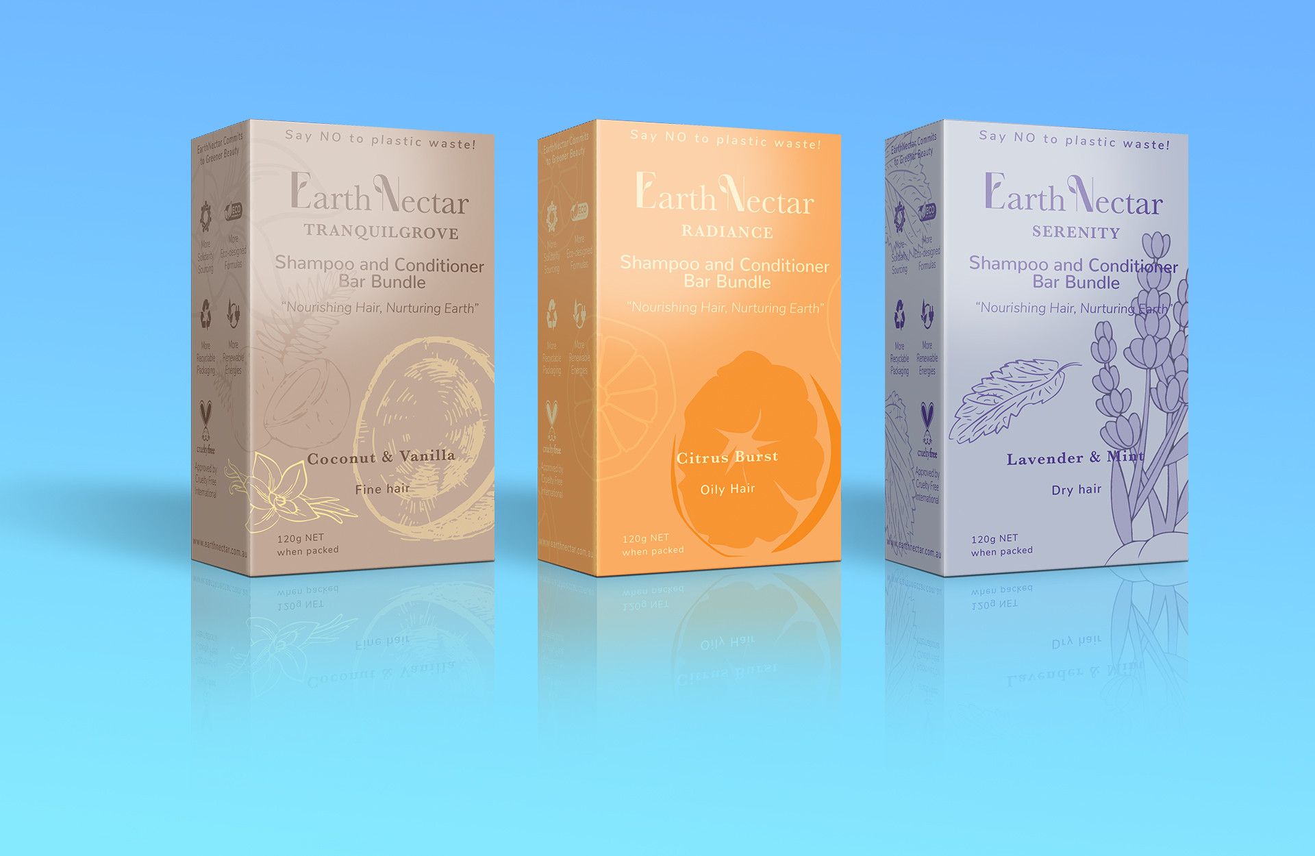
Earth Nectar Three Pack

Tammy Truong designed a branded boutique packaging range for Earth Nectar’s Shampoo and Conditioner Bar Bundle. Each of the three product packs features a unique colour signature and organic surface graphics, reflecting the brand’s natural, eco-friendly essence. The design balances individuality with a cohesive brand
identity, ensuring easy product recognition. Throughout the project, she applied prepress techniques to ensure the packaging was production-ready, resulting in a professional, nature inspired design that resonates with Earth Nectar’s target audience.

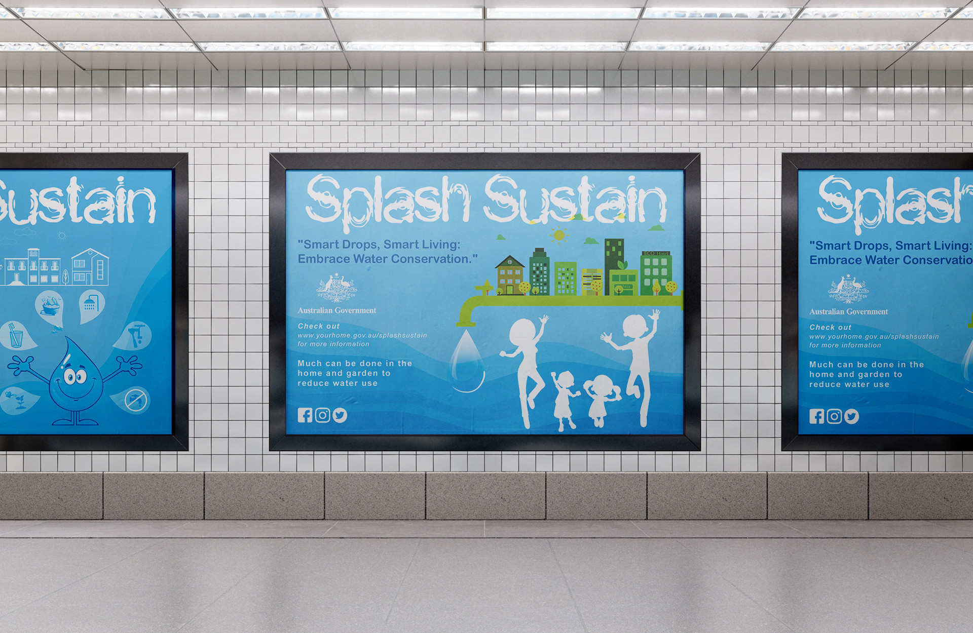
Splash Sustain Campaign

Tammy Truong designed the Splash Sustain campaign to raise awareness about household water usage and promote sustainable conservation practices in Australia. The campaign uses simple, fun, and colourful illustrations to emphasise community action and positive outcomes. Its happy, rewarding design encourages the public to adopt water-saving practices, showcasing the benefits of conservation. A blue dominated palette symbolises water and trust, while green accents reflect growth and sustainability. The tagline, “Smart Drops, Smart Living: Embrace Water Conservation,” captures the campaign’s mission. Clean, modern typography ensures clarity and readability across all media, making the message accessible and impactful.

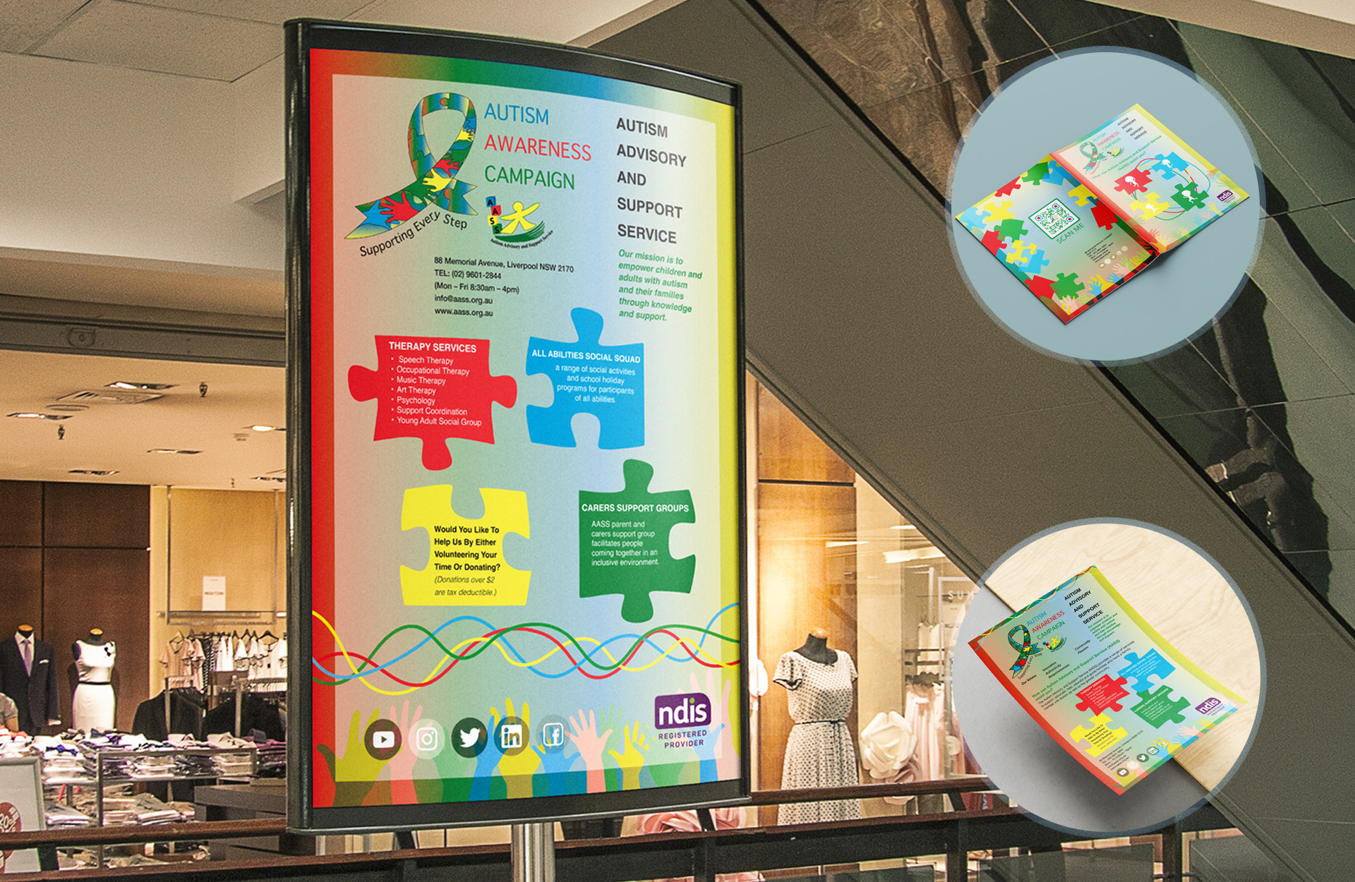
AASS Autism Awareness Campaign

Tammy Truong utilised research and communication design techniques to identify challenges within the Autism Advisory and Support Service (AASS). Noticing the organisation’s limited brand and service awareness, she applied design thinking to develop a comprehensive campaign aimed at promoting AASS’s services and increasing public awareness. Tammy crafted a compelling message that resonated with the target audience and highlighted the importance of supporting autism related services. The campaign was showcased across various industry design platforms, including digital, print media, and social channels. By leveraging communication design strategies, she created engaging media touch points that informed and involved the community, effectively raising awareness and promoting action in support of AASS.