Cailum Choi is a visual designer embodying a unified skillset of technical artistry skills and marketing experience. He is highly driven to perfecting his design craft and debating the best NBA players. Cailum is focused on creating enigmatic art that delivers above and beyond client vision. His array of niche interests ranging anywhere from anime to psytrance, cyberpunk to indie games or emo-punk to matcha green tea shines through in the influences on his design style.

Cailum is versatile in skillset and has simultaneously broadened his digital design capabilities whilst being focused on cementing his own abstract-futurist style. In this theme, he loves experimenting with the limits of his illustrative typography and redesigning the shape of letters and words to create evocative marks. Cailum has been able to apply his style through various projects storying a series of multidisciplinary skills ranging from illustration, branding strategy, marketing theory, typography and 3D design. Cailum’s constant need to scratch his creative itch, soothed only by his bottomless cup of green tea allows him to be focused and driven to creating highly visceral art.

Cailum holds a double Bachelor’s degree in Design and Business, majoring in Communication Design and Marketing, accentuating his passionate ability to connect exquisite art and design with highly specific target audiences.

Seoul Art Club

Born was a surreal scene created in a 3D space, the idea was to explore a chaotic and abstract landscape that would let the artistry of music producer, Seoul Art Club and their new album (graphically and sonically) sing for itself. A still from the animation doubles as the album cover and was aimed to employ a visual 'wow' factor and 'scroll stopping' effect on users hastily searching for new music on streaming platforms. The animation looks to visually resemble the contrast between Seoul Art Club’s ambient, scenic works and their lightning-quick experimental productions.

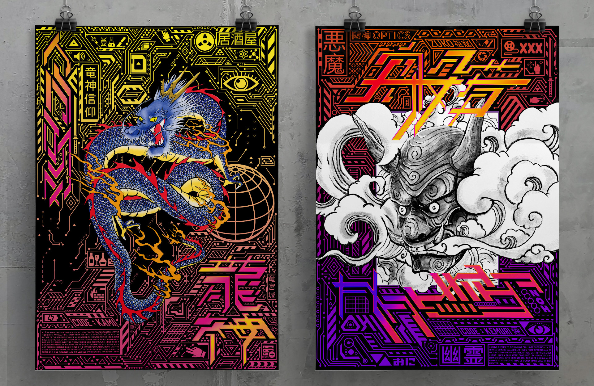
'Cyberspace' Poster Series

An ongoing exploration of the cyberpunk genre, directed by the origins of the tech-fueled movement, the Neuromancer series by William Gibson. Digitally illustrated and drawing upon traditional Japanese artistry combined with metaphysic technological symbols. To me, the cyberpunk theme is a feeling of blissful surrender, a constant rush of manufactured elation whilst drowning in an overstimulating sci-fi city. This impression is communicated through the neon linework and cluttered user interface hieroglyphs. Juxtaposed is the hyper graffiti-esque lettering less so in communicating its actual word, but rather the speed at which the technology, marketing and advertisements need to be consumed in this fictitious industrial sprawl.

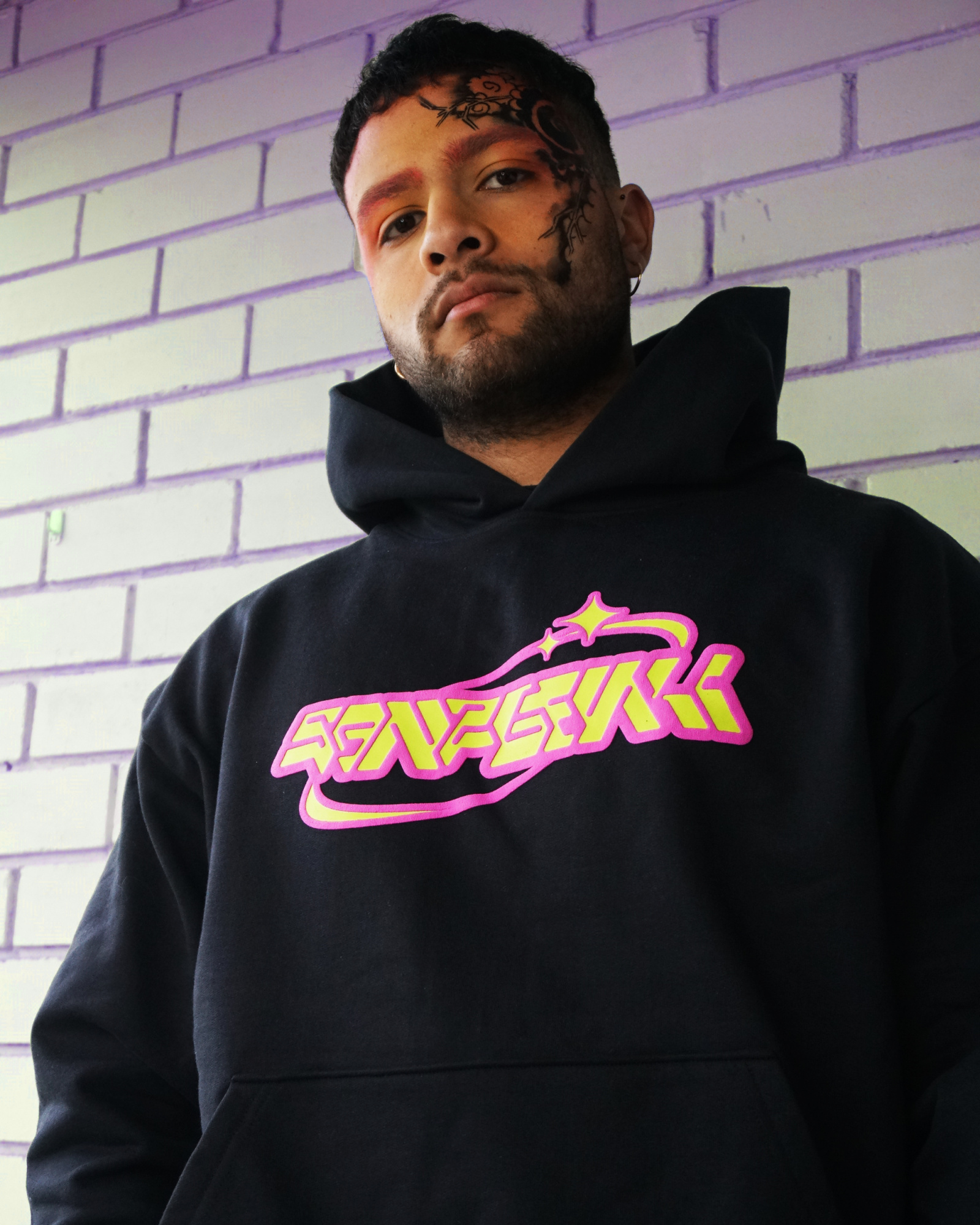
SANSGENKI

An integration of graffiti futurism into Y2K, anime bubbliness and materialised for Melbourne streetwear through embroidery and puff screen printing on urban wear garments. The final logo devised encompasses these values and communication goal in creating a distinctly outstanding and recognisable brand mark composed of a typographical component and a secondary illustrative mark. Part of the Y2K revolution was the newfound and now tacky technological advances that were created, often being over-the-top and far too glamorous. This included huge kawaii anime eyes and incredibly eclectic and bubbly tech-like fonts. SANSGENKI looks to re-position the Y2K movement to include these underbelly nuances that are often overlooked when Y2K is in the conversation.

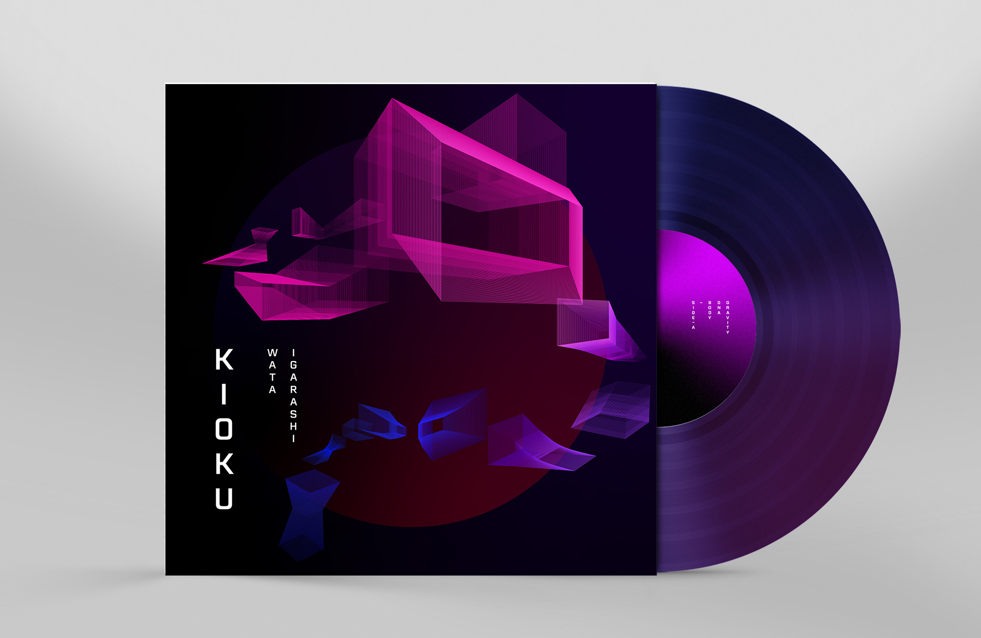
Kioku

Japanese techno DJ Wata Igarashi’s third EP, Kioku re-imagined with attention to his hypnotic, knife’s edge sound. The idea behind this cover represents my experience of witnessing Wata Igarashi perform his craft live. From start to finish, his set felt like a hypnotic journey, a sense of elevation that moved me through a series of frames representing each beat. The mid frequencies seemed to morph, changing the space of the dancefloor and shaping the movement of the crowd. This lead to the final outcome using a geometric journey of morphing shapes shifting in space and colour, creating a contemporary sense of psychedelic movement that acts as the main visual identity for this reconceptualisation of Kioku.

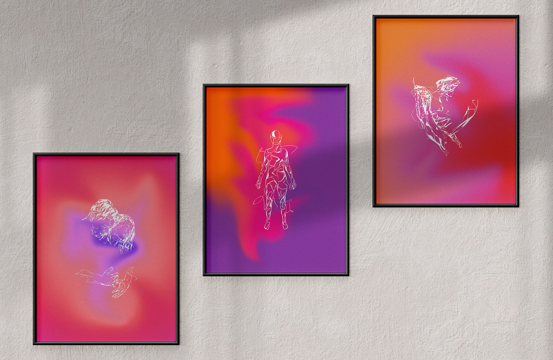
'Self' Poster Series

An emotive, abstract illustration series exploring themes of reflection, identity and positive self-talk. Viscerally communicated through fragmented, illusionary linework and powerfully hypnotic colours. The idea of ‘self’ is a journey. I believe self-talk to be one of human’s most powerful tools and especially for myself in shaping my own identity. The idea behind this series is to aid in facilitating a positive and real self-dialogue in others such that their first line of support can be themselves.