Hi, I’m Ed. I’m always eager to create innovative design solutions that push boundaries and expand my skill set. Over the past four years studying Communication Design at Swinburne University, I’ve embraced every opportunity for growth and creativity throughout all my projects. My studies have opened doors to exciting outcomes and experiences, allowing me to experiment and refine my craft in diverse ways.

A standout opportunity during my time at Swinburne was being able to go on the design-centred study tour to Vietnam, where I had the chance to explore design from a global perspective and gain a deeper understanding of cultural influences of design. This exposure not only broadened my creative thinking but also inspired me to bring fresh, diverse ideas into my work. In addition, I’ve been fortunate to gain industry experience as a Junior Designer at Melbourne Real Estate’s (MRE) in-house design studio. Here, I worked on a variety of projects, collaborating with a talented team to produce compelling design outcomes for print, digital, and branding materials. This hands-on experience allowed me to further develop my technical skills while learning to deliver high-quality results.

I’m particularly passionate about publication and print-based designs and interactive exhibition designs. However, I am always keen to explore new opportunities and diversify my experience in design.
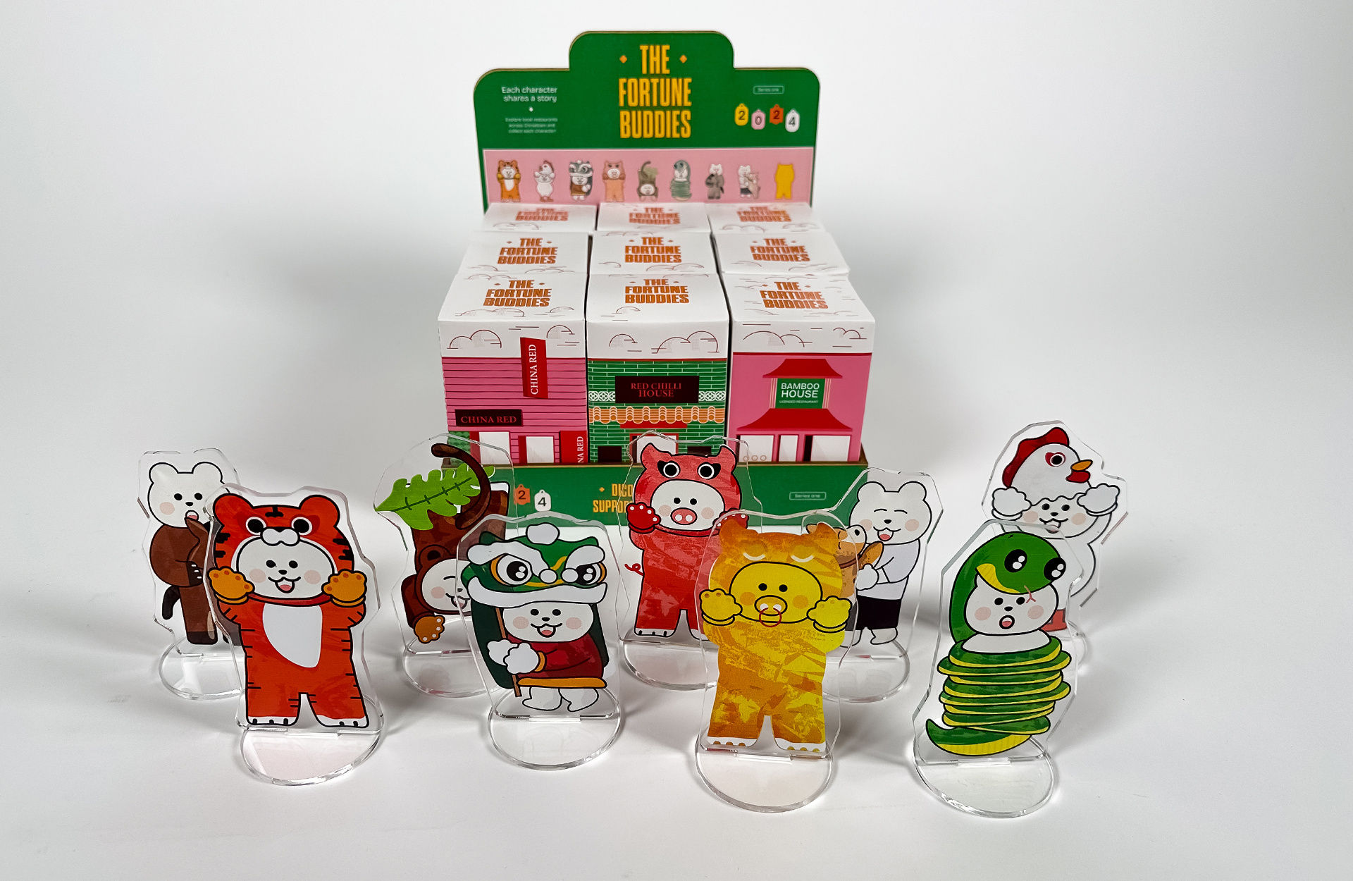
The Fortune Buddies

The Fortune Buddies are a series of collectable blind boxes that are part of a campaign sponsored by the Melbourne Food and Wine Festival. This is aimed at encouraging younger audiences to visit Chinatown. The boxes are themed after different local restaurants to increase foot traffic to these establishments. 

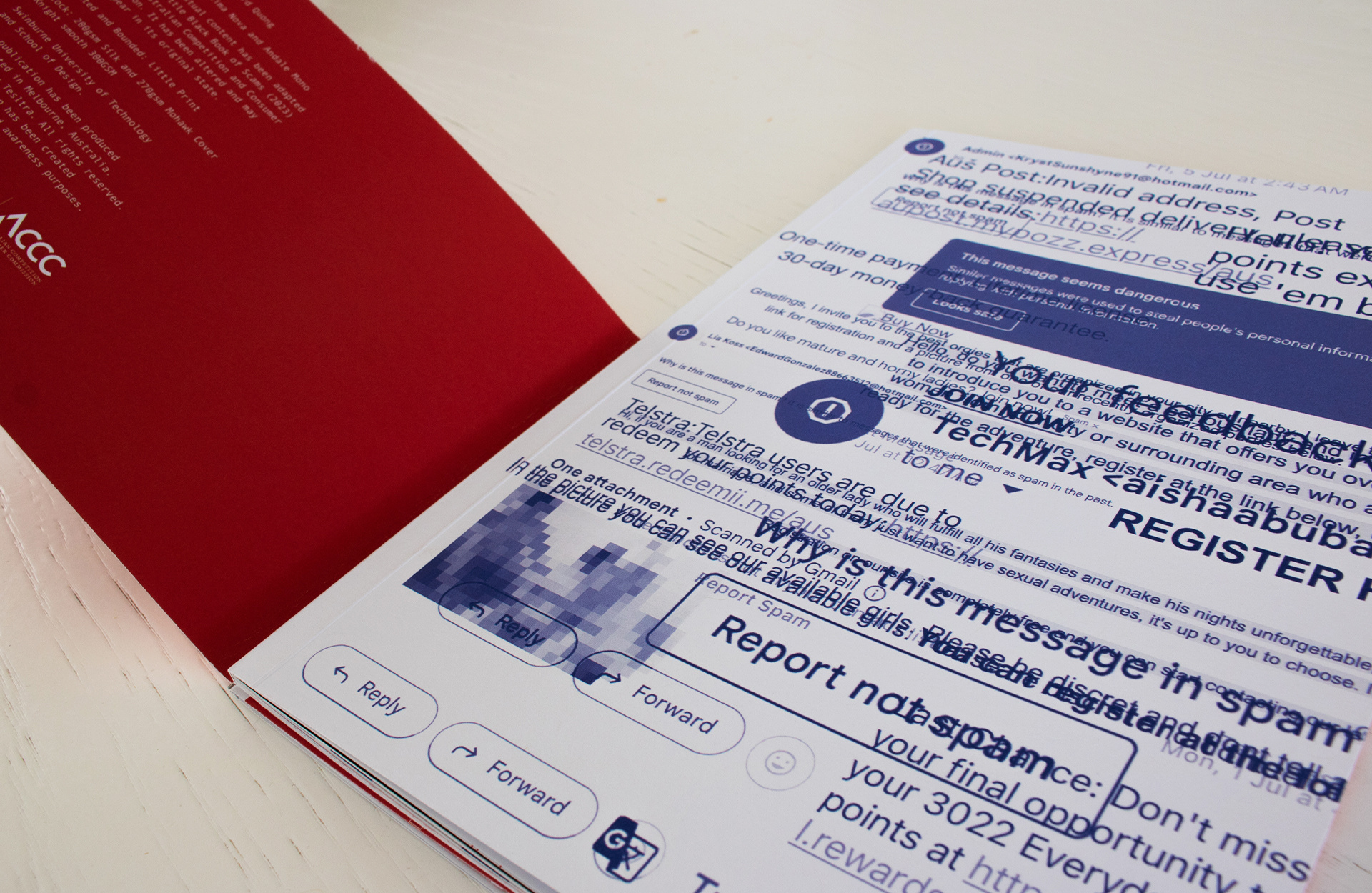
The Book of Scams

The book of scams typographically represents the dangers of online scams. As digital natives, younger audiences are often more vulnerable to the risks of online scams, due to their familiarity and comfort with the digital world. This booklet sheds light on the severity of these threats through creative typographical designs and visual contrasts that play with the reader's perception.

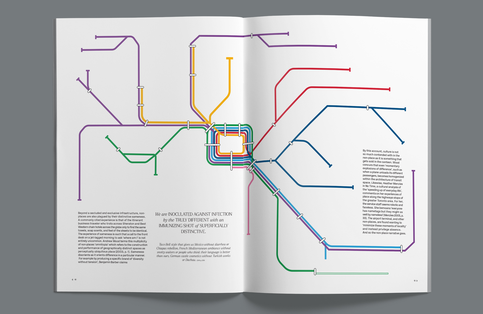
Baring life and lifestyles in the non-place publication

Baring Life and Lifestyles in the Non-Place is a book by Sarah Sharma that explores the impacts of digital technologies and new media on our everyday lives. She describes Non-Places as a location designed for nameless and faceless passage (train stations, airports, etc). In this publication, I have redesigned iconic Melbourne interfaces and transit wayfinding to dive into the chapter's discussion on consumerism and contemporary life.

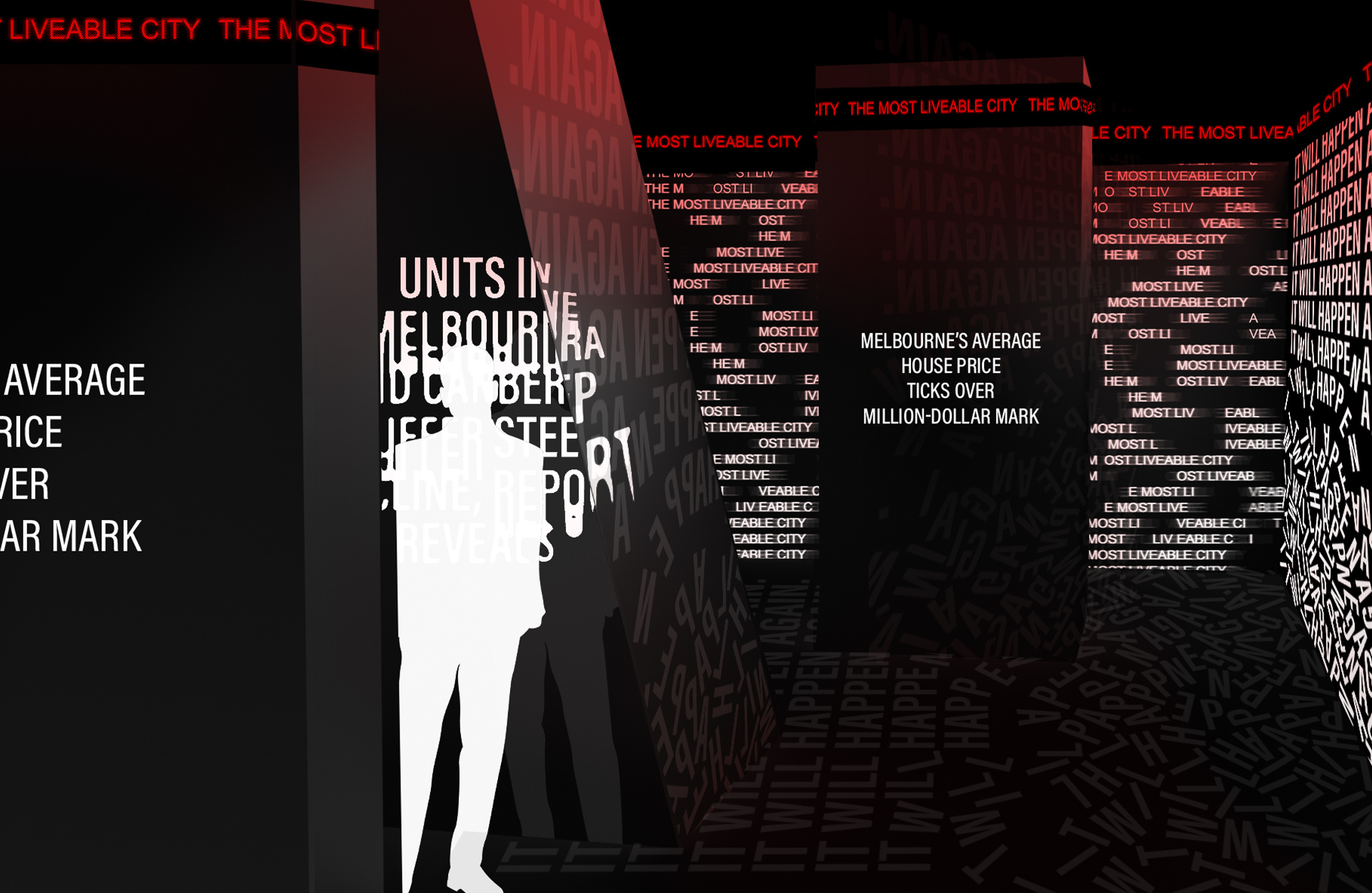
The Most Liveable City

This installation titled ‘The Most Liveable City’ explores the reigning title through the typographic presentations of news articles, that reflect the ongoing social issues in Melbourne. Through LED screens and reflective mirror surfaces, the installation aims for visitors to view the city's perception from different perspectives.

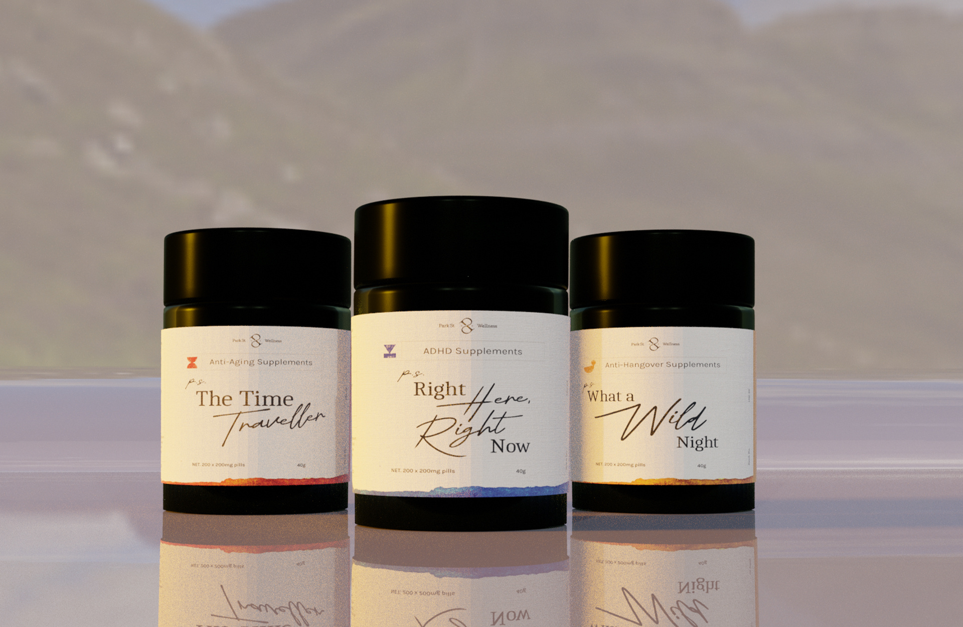
Park Street Wellness


This was a live client project for Park Street Wellness in South Melbourne, I had the pleasure of working on this project with a talented team of three other designers. After debriefing the client's communication problems, I was tasked to create label and pill bottle designs for a range of supplements, including ADHD, anti-hangover, and anti-aging products. To ensure the designs were not only faithful to the client’s vision but also visually compelling, I took the initiative to quickly learn Blender and create custom 3D mockups. This allowed us to present the designs more dynamically, providing better visuals of how they would appear in real life and elevating the overall presentation.