Joshua Predgen

As a designer, curiosity drives my process and attention to detail shapes my work. Im graduating this year with a Bachelor of Design in Branded Environments, I’m drawn to creating honest and authentic spaces that highlight the beauty of raw, natural materials. I see design as a way of solving problems creatively, with the goal of achieving a sense of permanence in a world that’s always changing.

I specialize in layout and spatial design, as well as branding and graphic design. I love shaping visual identities, whether for emerging brands or established ones in need of a refresh, creating work that feels genuine, engaging, and built with intention.

My process begins with thorough research and brainstorming to understand the client’s story, audience, and goals. I believe that every project should be grounded in a clear narrative, and I take the time to uncover the values and emotions that drive a brand or space. From there, I explore materiality and form, considering how texture, color, and structure can translate that story into a tangible experience.

My time at Swinburne has been incredibly rewarding, giving me the skills and confidence to turn my design ideas into reality. Thank you for taking the time to look through my work. If you’d like to chat or connect, feel free to reach out via email—I’d love to hear from you!
Tetsu to kl Trade Space

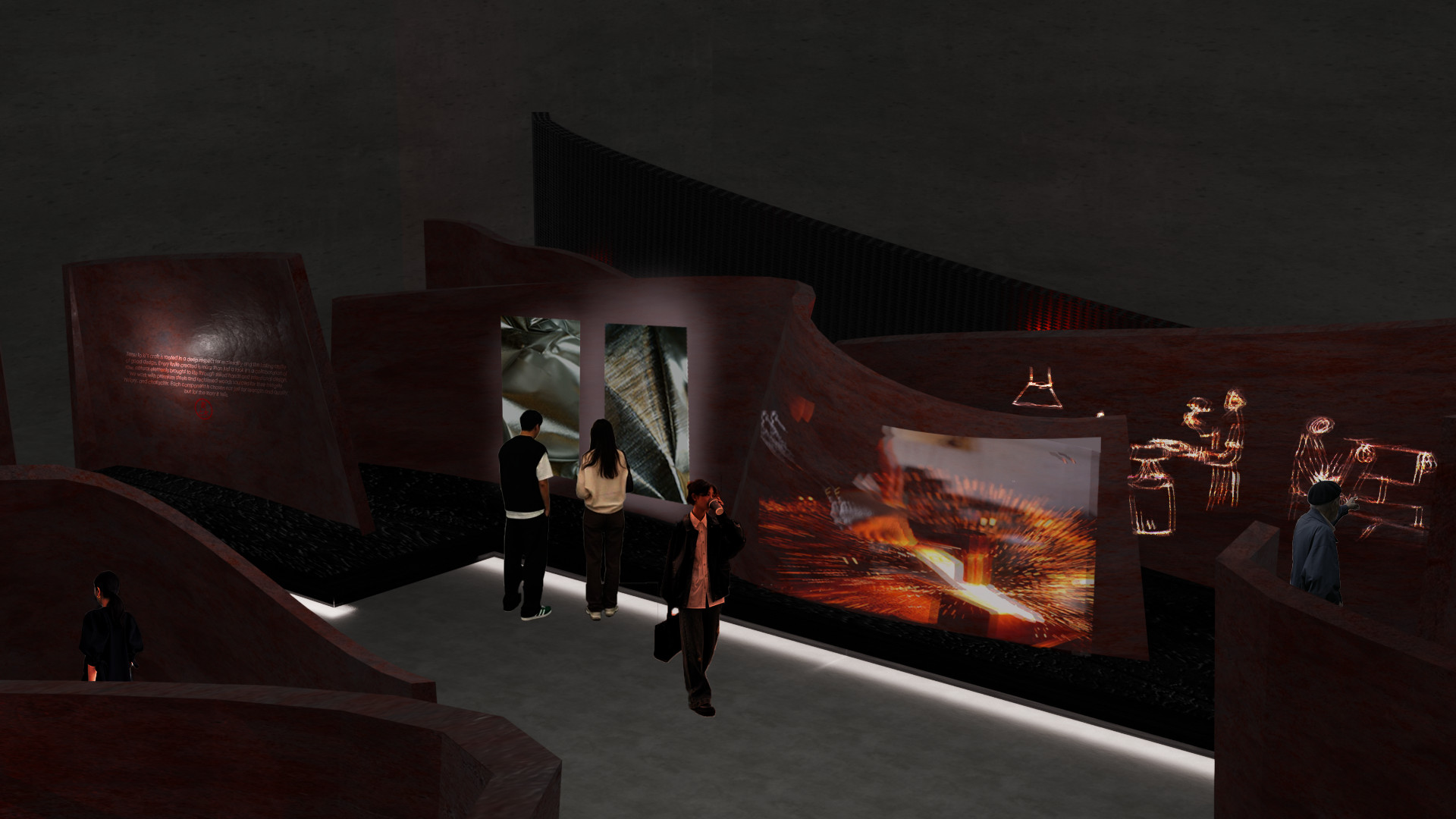
Tetsu to Ki (Iron and Wood) and is a commemoration of knife making as a craft, an exploration of the dialogue between material and purpose. Through the union of iron and wood, the work reflects on the balance between strength and warmth, precision and touch. Each element is considered, not for ornament, but for function and feel. In celebrating materiality and purposeful design, Tetsu to Ki honors the quiet intelligence of the hand and the enduring connection between maker, tool, and material.

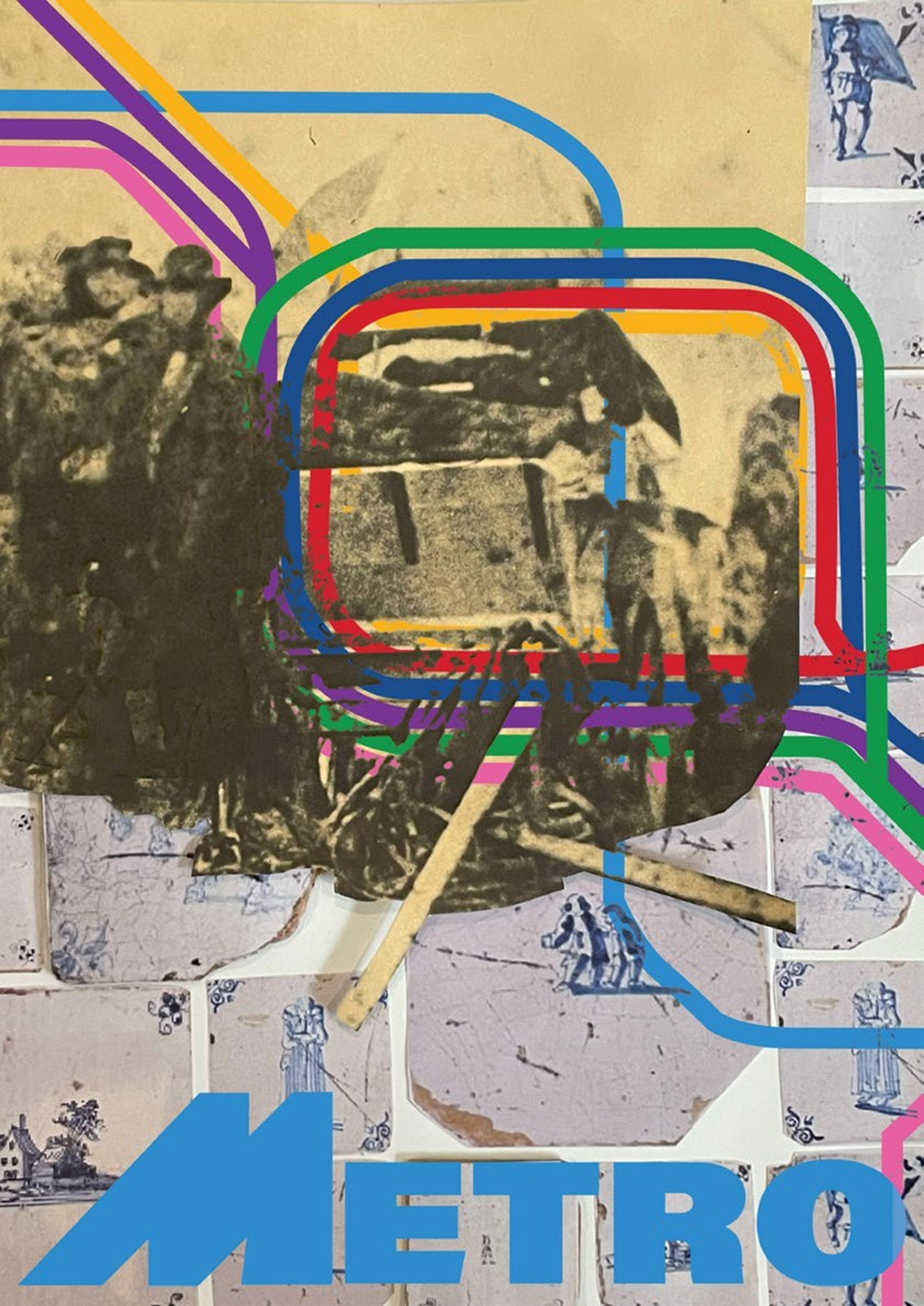
Metro Brand Identity Poster

The metro tunnel excavation uncovered fragments of the city’s forgotten stories.
This vitrine brings those discoveries to light, connecting the movement of today’s commuters with the lives that once shaped the ground below.
The poster symbolizes the convergence of past, present, and future. A visual bridge between memory and modernity.

Neighbourhood Post Flagship store

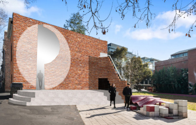
This project reimagines a historic building on Peel Street as Melbourne’s flagship postal store, celebrating its heritage character while redefining the postal experience for a contemporary urban context. By carefully restoring original architectural details and introducing light-filled, flexible spaces, the design balances history with modern functionality. The bold amphitheatre and local art displayed create a dynamic, engaging environment that transforms the store into a civic hub. A place where past and present coexist, connecting the community with both the building’s story and the evolving role of postal services.

Association Futsal: Futsal Fun 4 Everyone

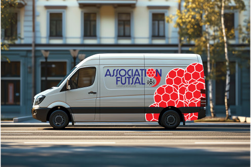
This project challenged me to rebrand Futsal Oz, a beloved indoor soccer centre, with the goal of revitalizing its identity and enhancing its connection with players and the local community. The rebrand focused on creating a bold, energetic visual language that reflects the fast-paced, dynamic nature of futsal with while strategically positioning the brand to attract new clients and expand its reach.

Expanse

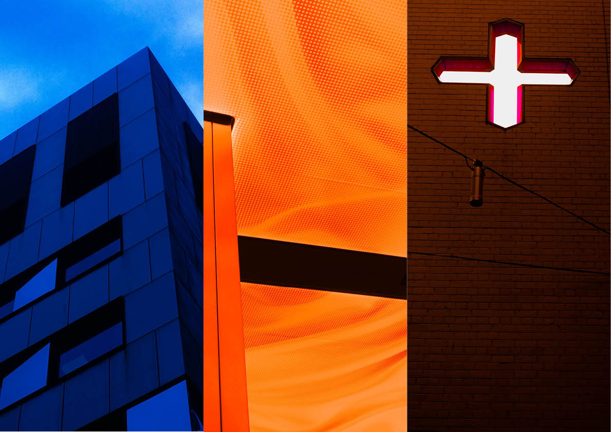
Expanse is a celebration of space through photography, exploring how environments shape the way we feel, think, and experience the world. The project emphasizes the dynamic relationship between space and perception, capturing the emotions and ideas that architecture and interiors evoke in their inhabitants.