Darika Chittsawangdee

Darika Chittsawangdee is a graphic designer with a passion for both digital precision and hands-on creativity. Her practice spans branding, print publications, and 3D modelling, exploring how design can connect the tactile with the digital and the functional with the expressive.

Driven by curiosity and a strong attention to detail, she approaches each project as a process of discovery. Her work often begins through experimentation, allowing ideas to develop through both structured design systems and playful visual exploration. Whether creating a publication layout, developing a brand identity, or modelling a 3D object, Darika aims to craft design outcomes that feel thoughtful and intentional.

She enjoys working across different mediums and tools, combining analogue and digital processes to expand the possibilities of visual communication. This adaptability is central to her practice and reflects an open and inquisitive mindset, grounded in the belief that good design is as much about problem-solving as it is about creative expression.

Ultimately, Darika’s work reflects a commitment to clarity, craft, and curiosity. She creates visual experiences that invite people to pause, connect, and see things from a fresh perspective.
Yarra Yering Rebranding

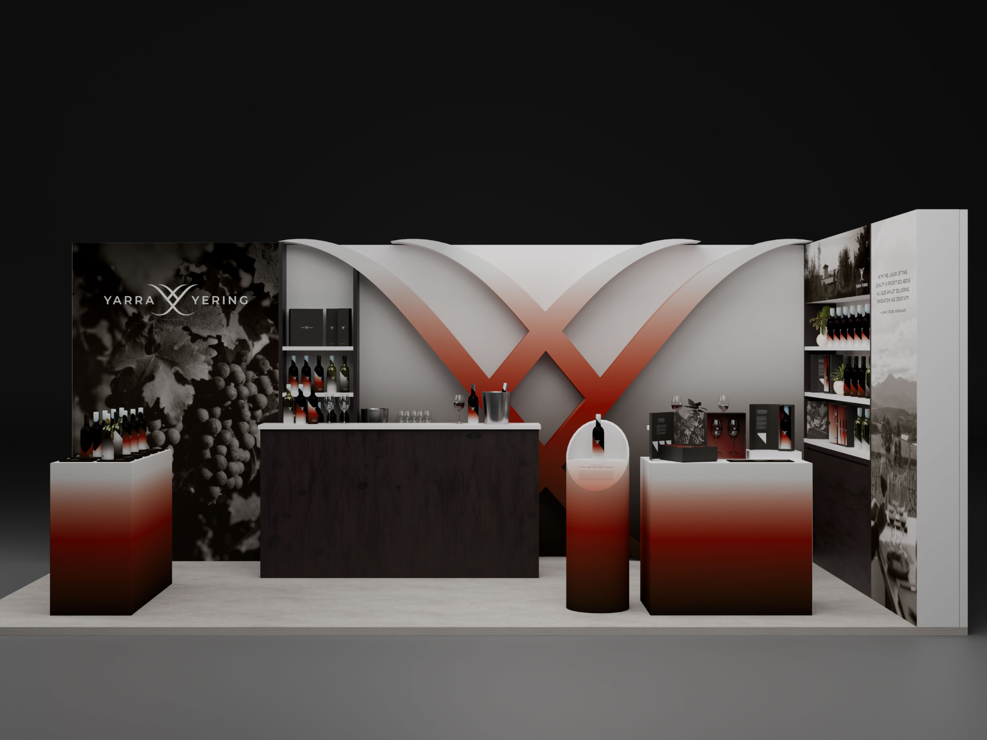
Yarra Yering is a family-owned winery in Yarra Valley that has been in the business for over 50 years. Yarra Yering is known for producing unique and premium wines, focusing on small-batch winemaking with naturally low yields. Its wines are highly regarded for their elegance, finesse, and structure.

The strategy for this rebranding is to reposition the brand from being seen solely as “an iconic wine for collectors and connoisseurs” to something more forward-looking: “a legacy of elegance. A new chapter in taste,” positioning Yarra Yering not just as a premium wine, but as a symbol of contemporary lifestyle and cultural relevance. By broadening the brand’s presence into spaces like digital media, creative collaborations, and cultural storytelling, this rebranding is opening the door to a new generation of wine lovers who value experiences and emotional connections just as much as quality.

Dancing with Coronaspheres

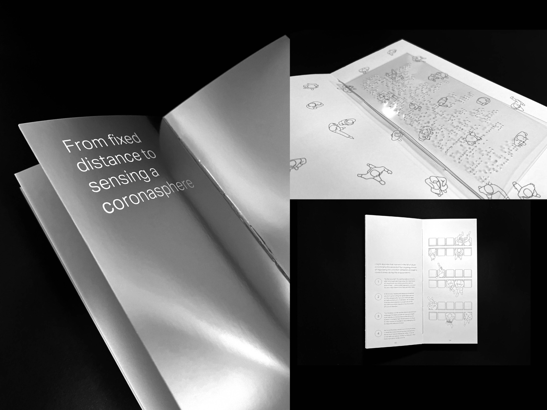
This publication design is based off Kate Elswit’s article “Dancing with Coronaspheres: Expanded Breath Bodies and the Politics of Public Movement in the Age of COVID-19.”

The research article explores the Kinespheres developed during the COVID pandemic, focusing on the shift in social distancing regulations. As individuals became more aware of their surroundings, they became more responsible for others' surroundings. This shift in responsibility led to a shift in protesting and social activities. Despite the pandemic, distancing remains a challenge, and efforts have been made to improve interaction and maintain a sense of community.

The publication design focuses on using various materials, including translucent paper, reflective paper, and clear acetate, to portray the space and invisibility concepts that the article mentioned. along with typography and illustrations that give the design a clean and airy feeling, which also adds to the invisibility concept.

Uniting Perspectives, Expanding Minds

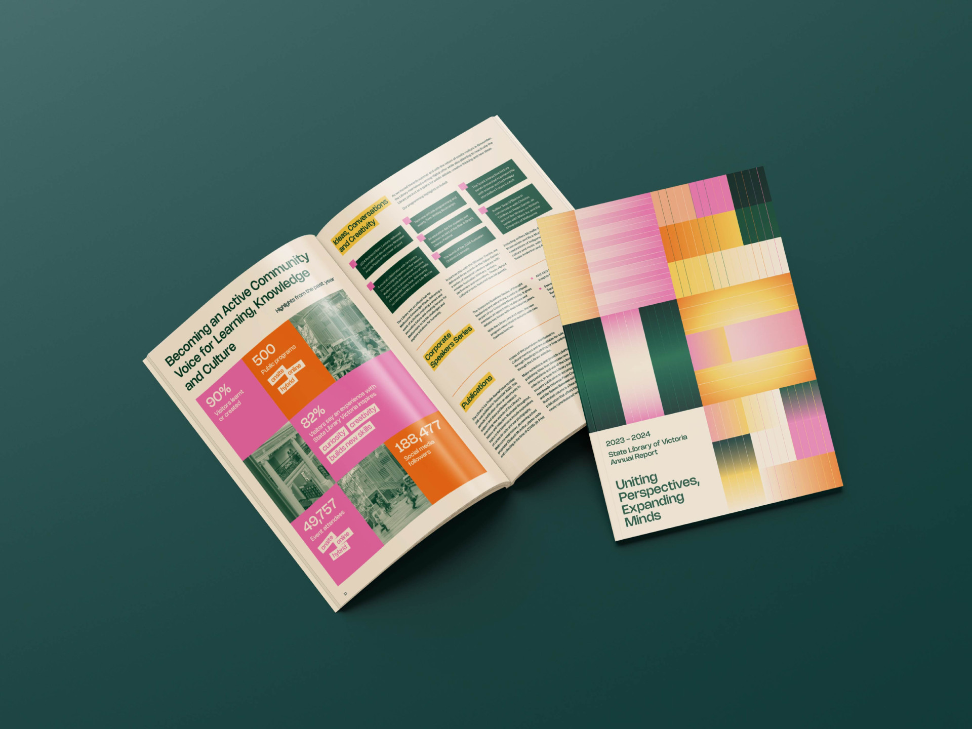
This publication is a design apporach for the State Library of Victoria's "Library Board of Victoria Annual Report 2023-24".

The annual report design focuses on the vibrant and diverse community and culture that the State Library of Victoria welcomes, with people from different ages and cultures coming together in one place to exchange knowledge. The design uses a variety of vibrant colours blending with one another to simulate the coming together of the diverse community, accompanied by geometric shapes and bold text to create an amusing visual.

The Discovery of the Unknown Radiation

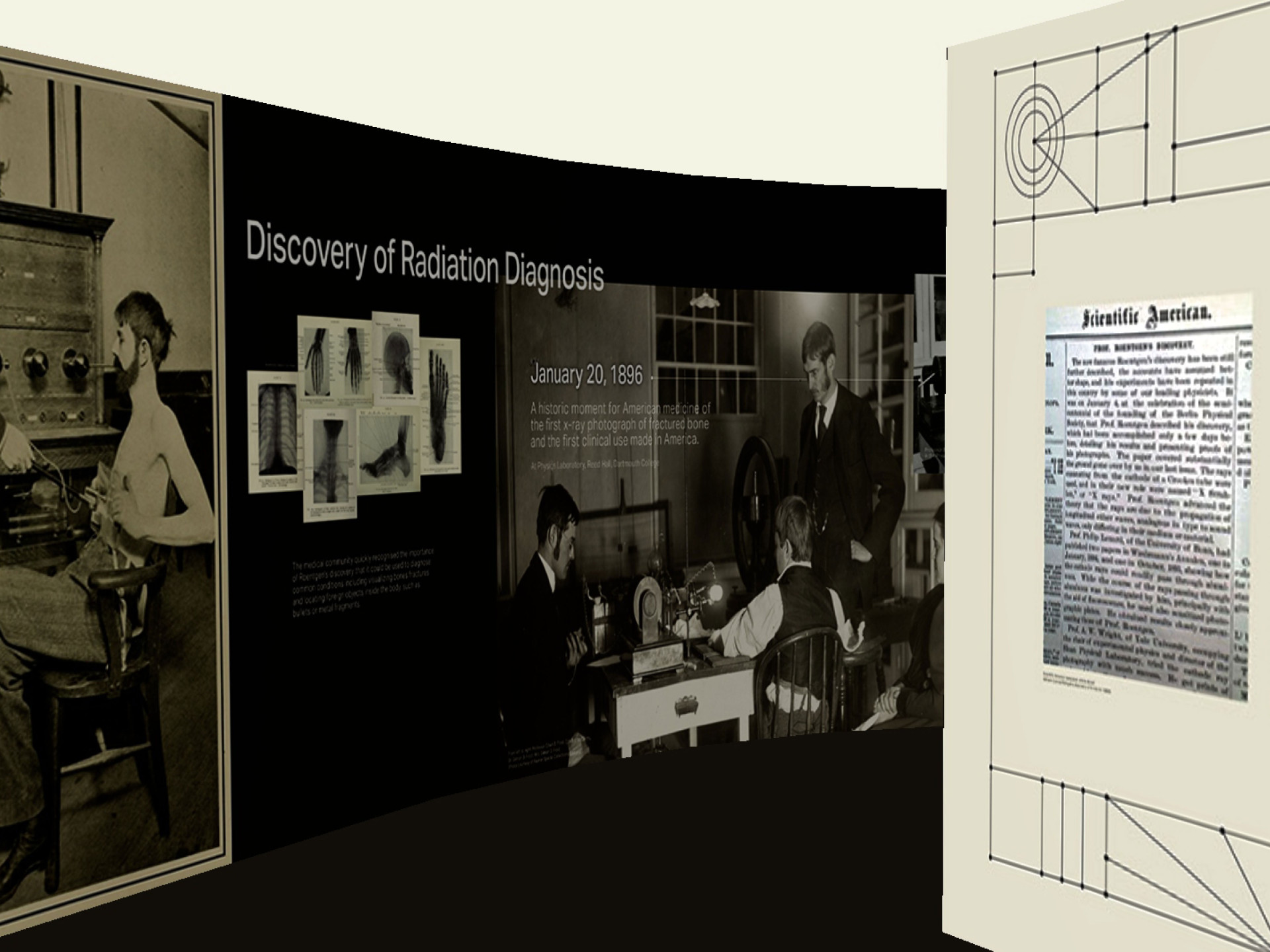
An Exhibition about the early discovery and harmful effects of X-ray.

After the discovery of the unknown radiation that we know today as X-rays, many were captivated by the potential benefits of the power it possessed, and many industries were able to utilize it for medical, cosmetic, and entertainment uses. While not aware of the harmful consequences it caused, people went on with countless experiments and suffered the painful effects till the development of radiation protection was established. Thanks to those who came before us, we can all accomplish a lot of things with x-rays today.

This exhibition’s design approach is based on the dark and light hues of the x-ray scans. With using the darker hues to convey the mysterious discovery and create a more mystical atmosphere, and as the narrative unfolds, the mood is then eased up and the lighter hues are used. And with the use of simple graphics and typography, the design will be clean and contemporary while showcasing the history of early x-rays.

Spira Watering Can Packaging

Spíra by Grafa: artisan gardening tools made to last a lifetime
for every considerate garden.

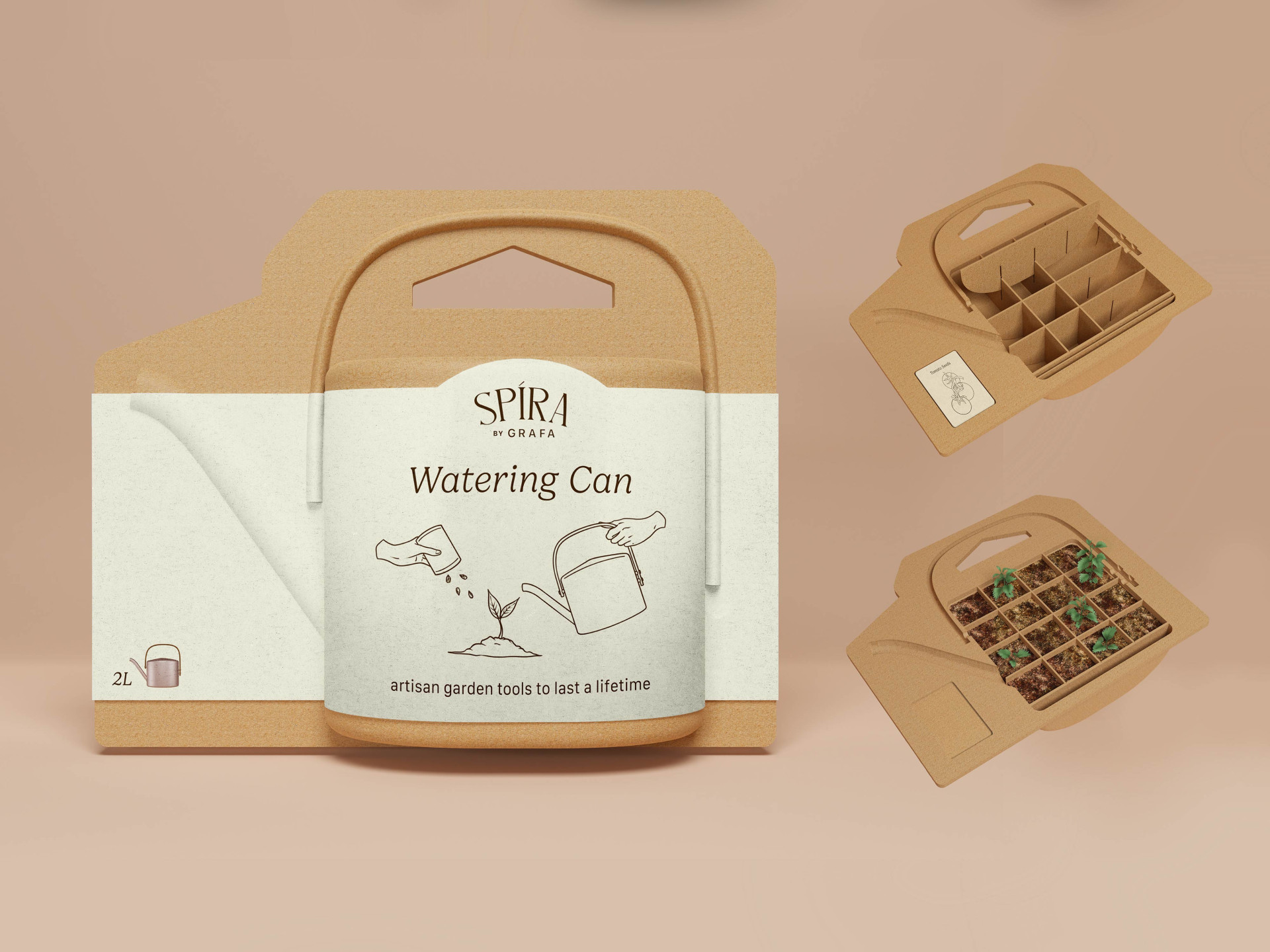
This project focuses on creating sustainable and innovative packaging for a new product, a watering can, from the material to the disposal of the pack. Developing an ideal design that balances the ergonomic features and the sustainability of the pack.

The packaging is designed with a repurposing feature that turns it into a plant cell tray. Simply take out the divider provided in the packaging along with the seed packet, then slide the divider into the slits along the side of the inner edges of the packaging. Once all of the dividers are in place, the packaging will be perfectly divided into sections, ready to grow fresh sprouts. With the use of a plant cell tray, the fresh sprouts would also have a stronger root system as there would be less root disturbance. The material used can also later be easily recycled.