Matthew D’Rose

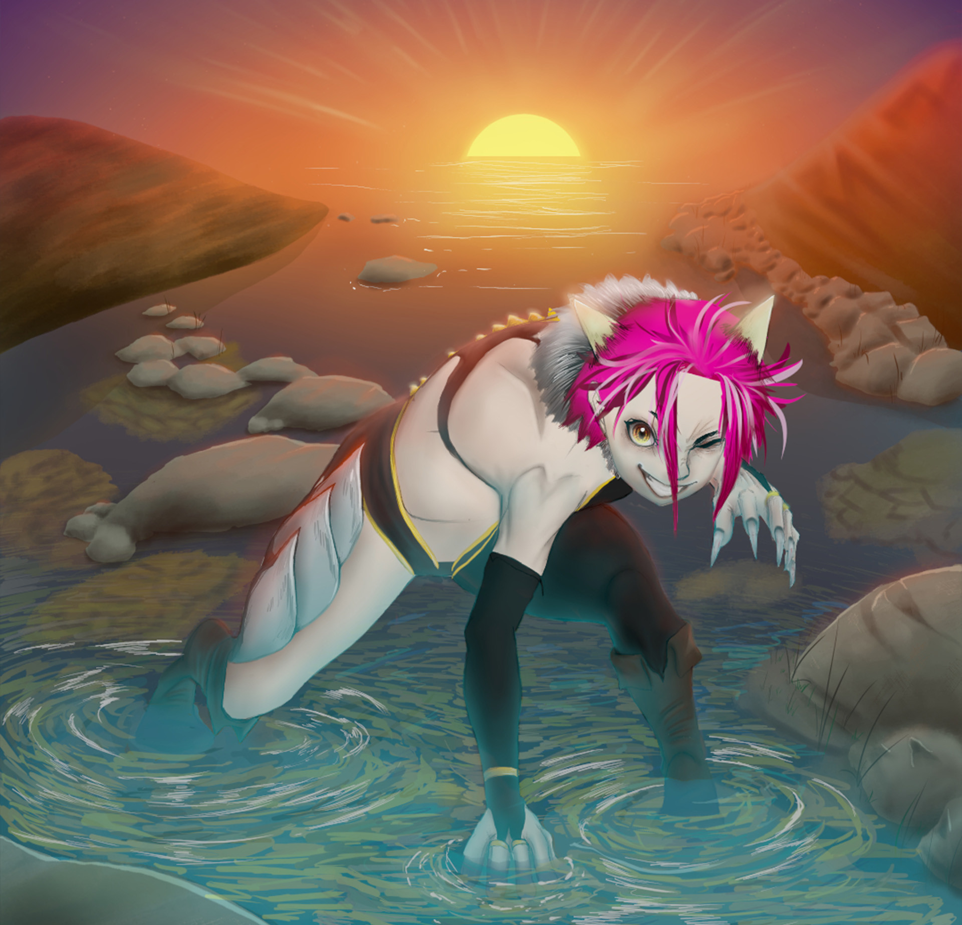
Hi, I’m Matthew D’Rose, a designer driven by a passion for bold, decorative, and story-rich visuals. My work blends vector and raster-based art to create compositions that feel both timeless and alive. I believe design isn’t just about clarity, it’s about connection, storytelling, and crafting experiences that linger in audiences' minds. Above all, I strive for exceptional beauty in everything I create.

I hold a Diploma in Design and a Bachelor’s in Communication Design from Swinburne University, where I built my technical foundation and creative discipline. Over time, I’ve come to specialise in publication and book design, a place where my style of design is most at home and where narrative and aesthetics intertwine. My goal is to help authors and publishers bring their stories to life through visual worlds that invite readers to feel before they even turn the first page.

In my practice, I approach every brief with excitement, curiosity, and adaptability. My work is intense and punchy; feedback is fuel to me, and I’m never afraid to experiment in pursuit of something memorable. My greatest strength lies in the mix of passion, determination, and precision, qualities that allow me to navigate creative challenges and deliver designs that not only please the eye but also hold lasting meaning.

A Court of Thorns and Roses Redesign

The idea behind these covers was to create something that better aligned with the themes and aesthetics of the story, something striking, bold, and dangerous. I used darker, broodier colours with elegant floral designs paired with Gothic arch motifs to deliver a collector’s set fans will never forget.

ChaCha Silly Drinks

The motivation behind this fictional powdered drinks packaging was to create branding for lovers of cozy vibes, warm drinks, and autumn’s beauty. To capture these elements within a small box, I used cute characters and comforting aesthetics to communicate the charm and simplicity of sweet, beautiful drinks.

China Town Campaign

When creating the China Town poster, I was tasked with promoting tourism to this unique cultural hub through posters and a single social media asset. To achieve this, I drew inspiration from traditional oriental posters and design elements found within the Chinatown space itself. This approach allowed me to create a fiery, dynamic design that leaps off the screen.

Freddie - To Our Eternity

This character is a part of a book I have been writing called To Our Eternity. The image invites audiences to peer into Freddie’s soul through a dynamic pose that conveys his inner pain. The dark lighting enhances his sense of mystery and internal suffering, while the aurora, a streak of light, symbolises the goodness that still lies within him.

Kimmy - To Our Eternity

This was a piece of art I did for my art page to promote a book I had been working on during my time at Swinburne. The image depicts the character Kimmy in an action pose, showcasing a bit of her personality through her outfit, look and pose.