Noah Portelli

I'm Noah, and I am a graphic designer with a BA in Communication Design at Swinburne. I'm interested in experimental, expressionistic design. I like to play around in the abstract and 'anti-design' fields to heighten my work. I focus on pushing my concepts to achieve something untraditional and unique.

I strive to keep my voice intact in everything I do. Graphic design has always been a passion of mine, and I find myself trending toward designing off feel rather than purely technical perfection. I am always happy to collaborate, enjoying others' unique voices, but I've always worked effectively as an individual when I close myself in with some music. I have a more unstructured workflow that shifts depending on the nature of the project.

My love for other art forms, such as fashion, movies, and music, enhances and largely informs my creativity and is a part of my everyday life. Music especially informs my designs as I listen to certain genres and moods that find a way to influence my direction.

When viewing my work, I always ask what kind of songs it evokes, which parallels how it can make you feel. I often don't go too crazy with wanting specific throughlines for people to recognise in my work; it's largely about how it can make you feel. Enjoy my folio.
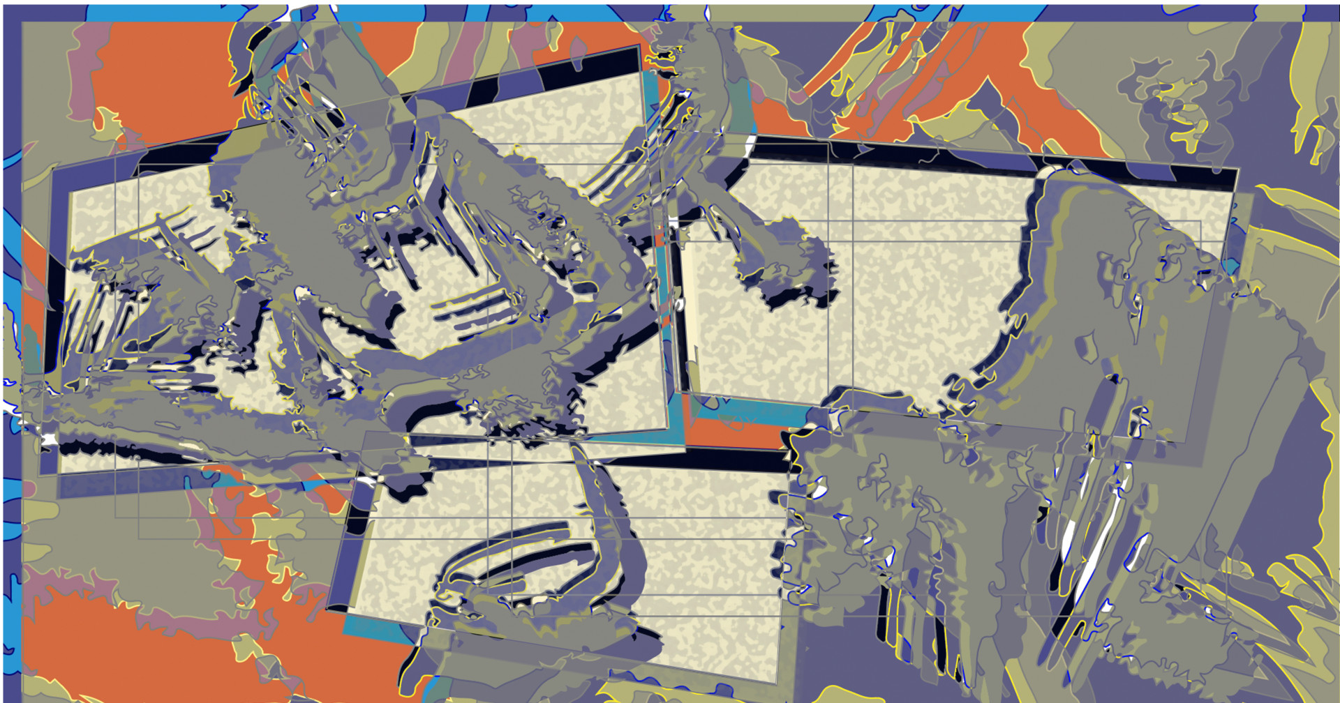
Sediments

Tasked with creating a graphic for a fictional museum that focused on a collection of our choosing that were under various topics. The final outcome was to focus on form and colour, I chose ‘Dynamic Earth’, as I always look for inspiration in my environment. 

I would then decide to focus on sedimentary rocks, exploring the spontaneous and random patterns within these sediments that reflect a feeling of energy and chaos. 

My main inspiration was when I came across images of cross sections of these sediments under a microscope, it felt like organised chaos, which I like to explore in my designs.

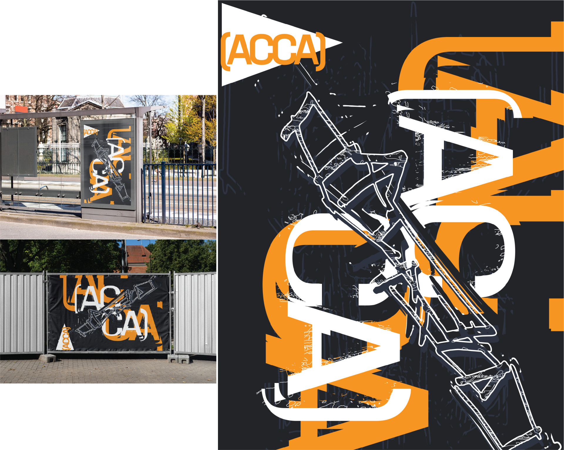
ACCA

We had to choose a Melbourne museum to create a new poster for. I chose ACCA  because it had the most interesting mix of materials and form, which was the focus of this final assessment, materiality and form. 

My ACCA poster focuses on the texture and weathering of the metal that covers its exterior. The combination of harsh angles pictured with a loose, sketched geometric concept that outlines the form of the structure. 

It reflects the texture of rusted metal, and the more abstract lettering in an effort to highlight the contemporary art aspect.

Metal Works

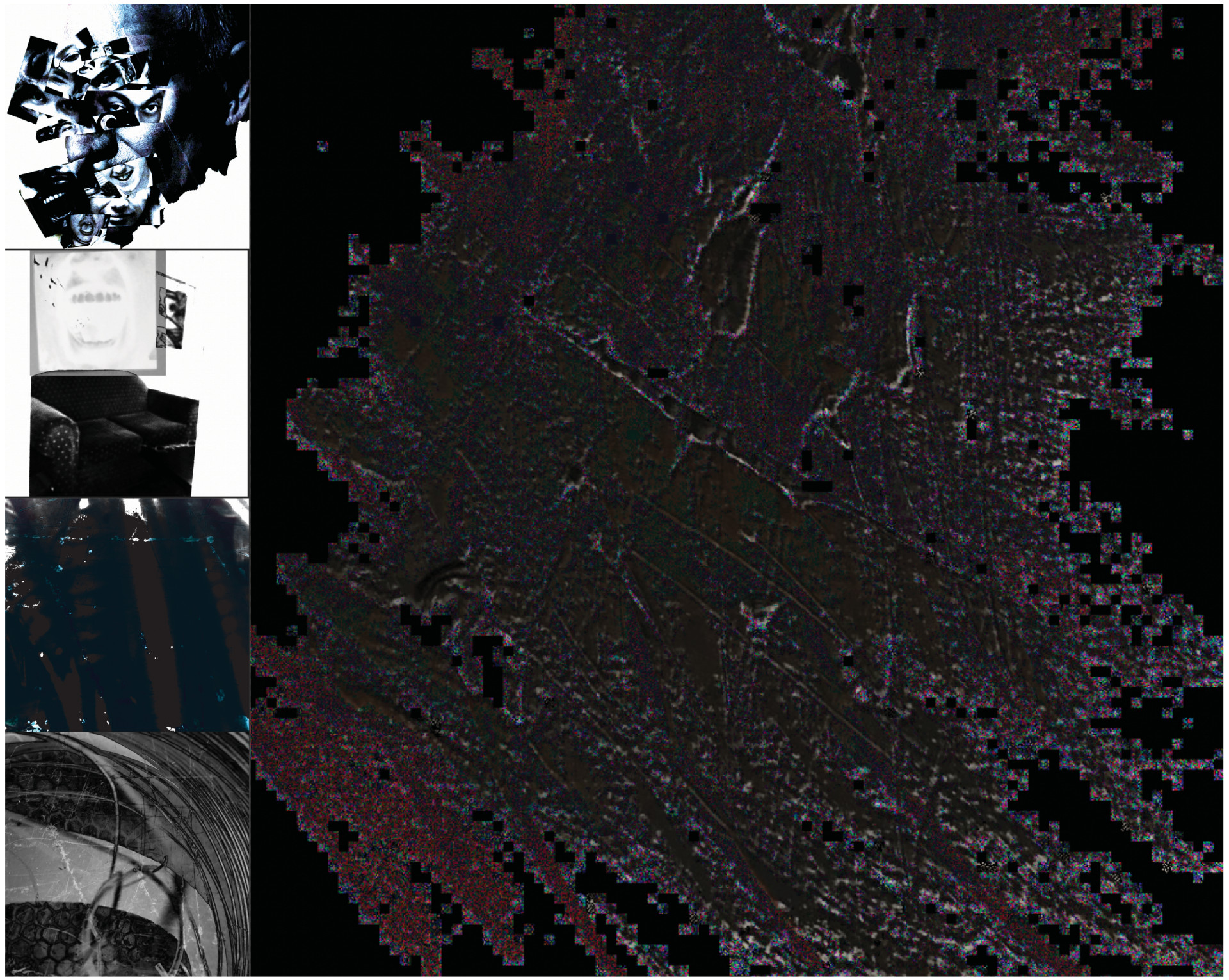
Choose a genre of music, and then explore four sub genres to create artwork that reflected their sounds. For every outcome we had to ustilise at least one different medium of design. 

This was a very enjoyable project as music has always informed a lot of my design and is imperative in my process. I chose the genre of metal as I’ve always enjoyed it, and there is so much emotion and movement within it.

We then had to study these genres and create mood boards and playlists to help inform our outcomes. My main objective was to be listening to these playlists while creating the artworks and letting the sound inform the designs. 

My four sub genres: 

/sludge
/industrial
/progressive
/deathgrind

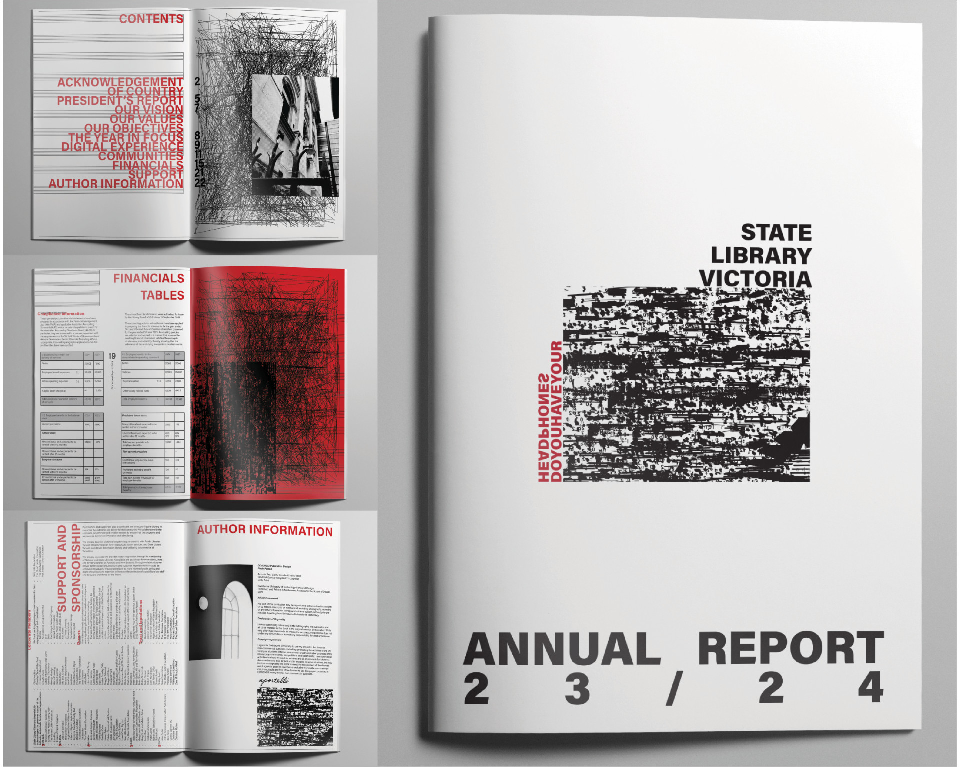
Do You Have Your Headphones

Choose a Melbourne landmark from a list and construct an annual report for, I chose the State Library of Victoria. There had to be an overarching theme that related in some way to the location you chose, I sort to explore the relationship between the use of the library and how everyone is always listening to music with headphones there. 

I first thought of this when thinking what I do when I’m there, and then in my subsequent visits I found that the large majority of people do the same. All of the text was provided for us and we ha to try and fit in the page limit and create an experience around it. 

I used old sheet music tabs I had and manipulated it, breaking it down to create all of the abstract imagery, combined with my photography of the library. Aiming to again, flesh out my concept and ustilising the actual medium to inform the design.

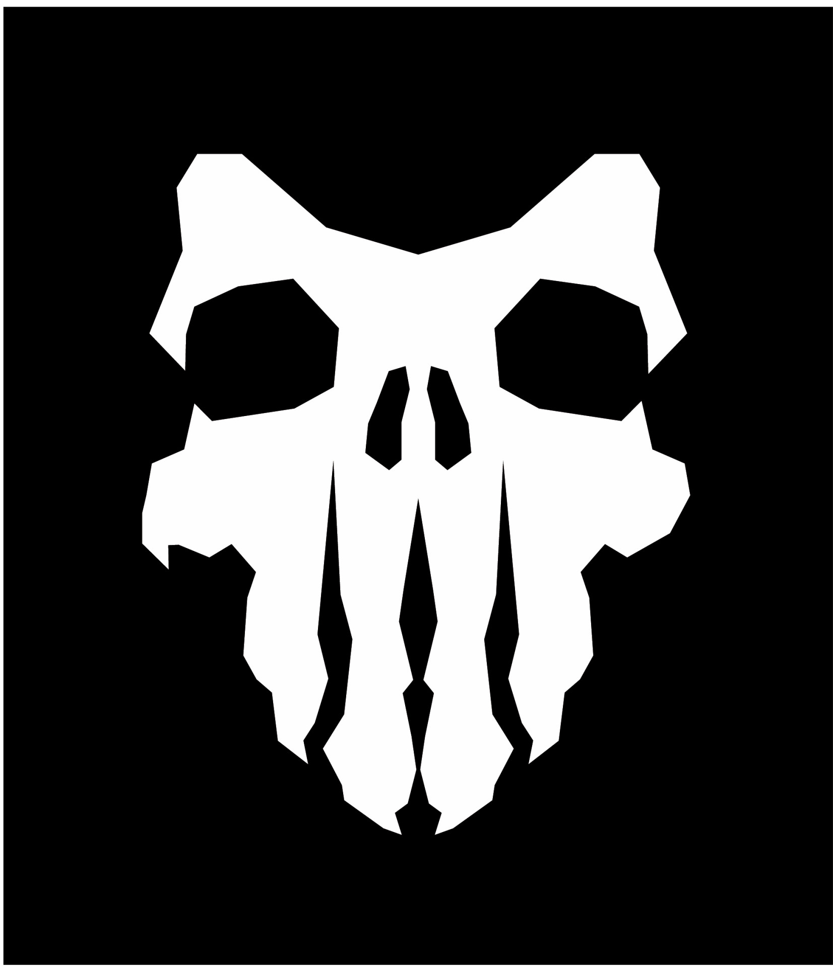
Puma Anatic

Had free rein to pursue whatever project we could think up. I chose to go in the direction of creating a brand, a sub-brand for Puma that focused of high fashion design. 

Within this brief I created, I explored the process of designing a shoe concept for the launch of this brand, and constructing the collateral round what would be an exclusive new product. The deliverables consisted of a new name, brand mark, website, social media, posters, and a shoe box.

I wanted to succeed where I had fell a little short in previous branding classes, I set out to create something that was high concept, and right down my alley. I have a passion for fashion and experimental graphic design, so I decided on the  concept of mixing human and puma anatomy. The outcome is strong and striking, fit for a concept sub-brand. 

Puma Anatic strives to focus on innovating within the niche hybrid market of high fashion sportswear. I wanted the mark to feel modern with an edge, and the shoe concept along with the collateral to feel innovative and unique.