Communication Design grad working across graphic design, photography, and branding, and lately been diving into motion design and UI. I also do illustration as a little side hustle! My work sits between playful experimentation and thoughtful storytelling. Whether with a layout, a paint brush, or a lens, I’m always chasing new ways to make ideas feel alive.
Tanrak T.
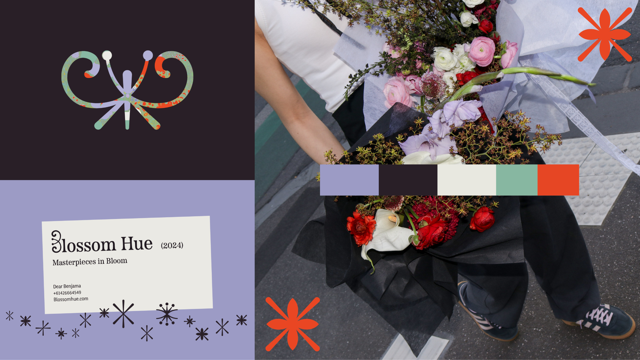
Blossom Hue: Artistic Floristry
Blossom Hue is a flower studio rooted in the belief that floral arrangements are not merely products, but true works of art. The rebranding reflects this vision by incorporating artistic elements as part of its visual identity, such as the golden spiral, picture frames, gallery labels, and references to historical floral paintings. Unlike traditional museum pieces, Blossom Hue offers floral masterpieces that you can appreciate, hold, and owncaptured perfectly in the tagline, "Masterpieces in Bloom."

Metamorphoses: Photography & Publication Identity
Metamorphoses is a photographic series inspired by Ovid’s Metamorphoses, exploring the connection between emotional and physical transformations. The project includes a photobook, promotional posters, merchandise, and a short motion video.

Bark Out: Live Session Identity
A playful identity for a YouTube live session channel featuring small gigs in third spaces. The logo shows a dog mid-bark with a bold exclamation mark, creating a strong, distinctive visual symbol for the brand.
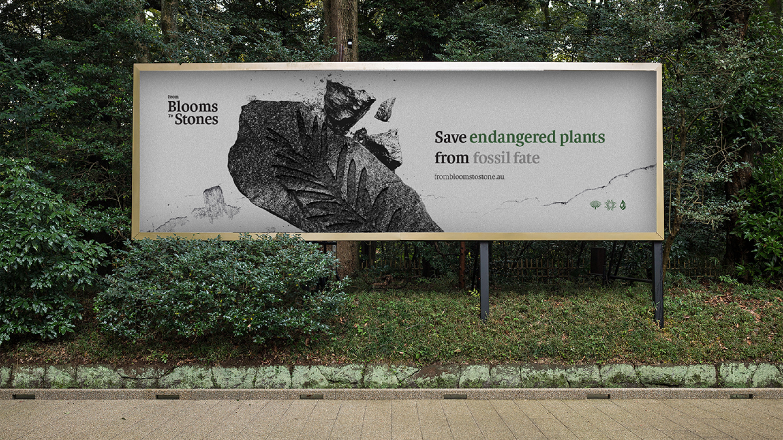
From Blooms to Stones: Campaign Design
“From Blooms to Stones” aims to raise awareness about endangered plant species native to Australia, highlighting that they will soon disappear from nature if no action is taken. The strategy aims to create emotional and critical impact, inspiring conservation efforts and meaningful action.
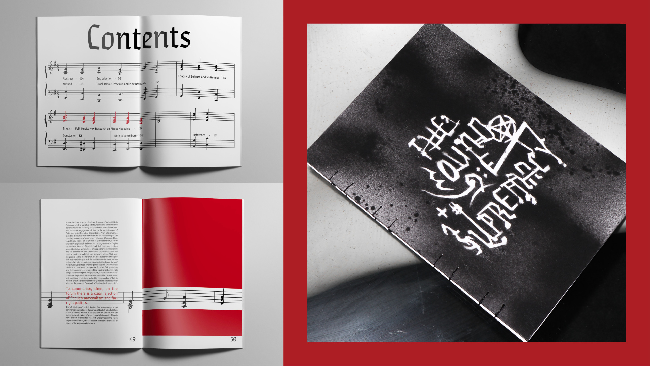
The Sound of Supremacy: Experimental Publication
Based on Karl Spracklen's article “Nazi Punks Folk Off: Leisure, Nationalism, Cultural Identity, and the Consumption of Metal and Folk Music,” this booklet explores far-right ideologies infiltrating black metal and English folk music. The idea of ‘infiltration’ is visualized through spray paint seeping across pages, while musical scores and symbols guide the narrative. The design bridges text and image, revealing the complex ties between leisure, nationalism, and cultural identity in these genres.