Hello! I’m Lalana Ray, an energetic communication designer with a passion for creating cheeky, striking identities and campaigns that resonate with audiences and drive meaningful change. My work often tackles social issues, drawing inspiration from everything around me, motivated by purpose and a desire to create impactful designs. I believe that understanding the audience is key to developing vibrant campaigns that evoke emotions, whether it’s a chuckle, a sense of concern, or sheer awe. I’m excited to channel my creativity into projects that are not only eye-catching but also make a big impact.
Lalana Ray
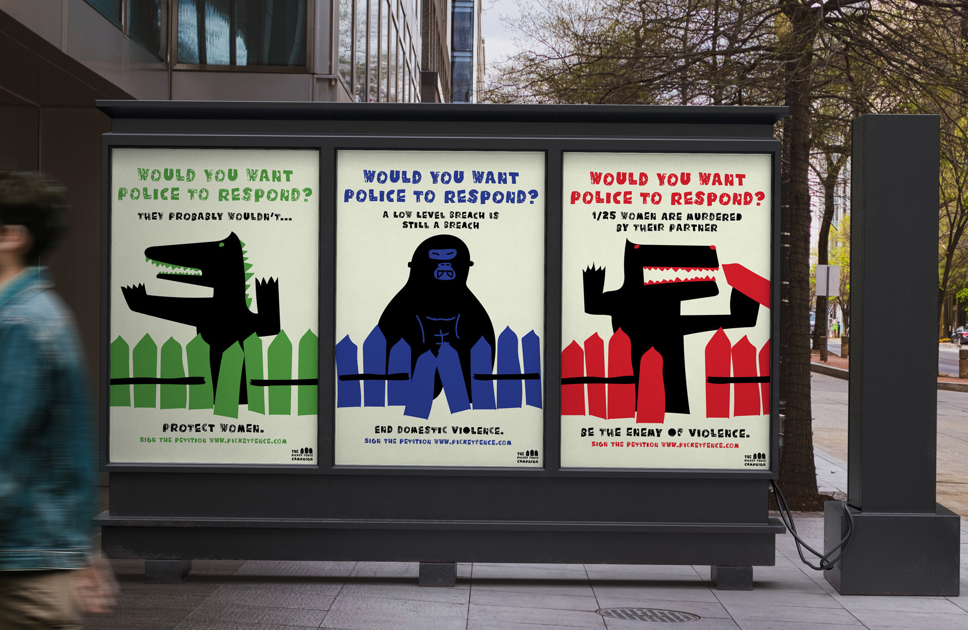
The Picket Fence Campaign
The Picket Fence Campaign raises awareness for police inaction regarding 'low-level breaches,' a significant factor in domestic violence. In Australia, an average of one woman was killed every eight days by an intimate partner in 2023-24 (Australian Institute of Health and Welfare, 2025). A low-level breach refers to minor violations of a victim's personal safety in a relationship, characterized by behaviors such as unwanted contact or property damage that often go unaddressed by police. These behaviors test the limits of police response, allowing partners to escalate to more serious forms of violence. Utilizing child-like illustrations of monsters, the unified brand identity symbolizes the fear experienced when a dangerous partner breaches the domestic home. This approach evokes concern and action, encouraging viewers to sign the petition and support the movement to protect women from 'low-level breaches,' emphasizing that a breach is still a breach, regardless of its severity.
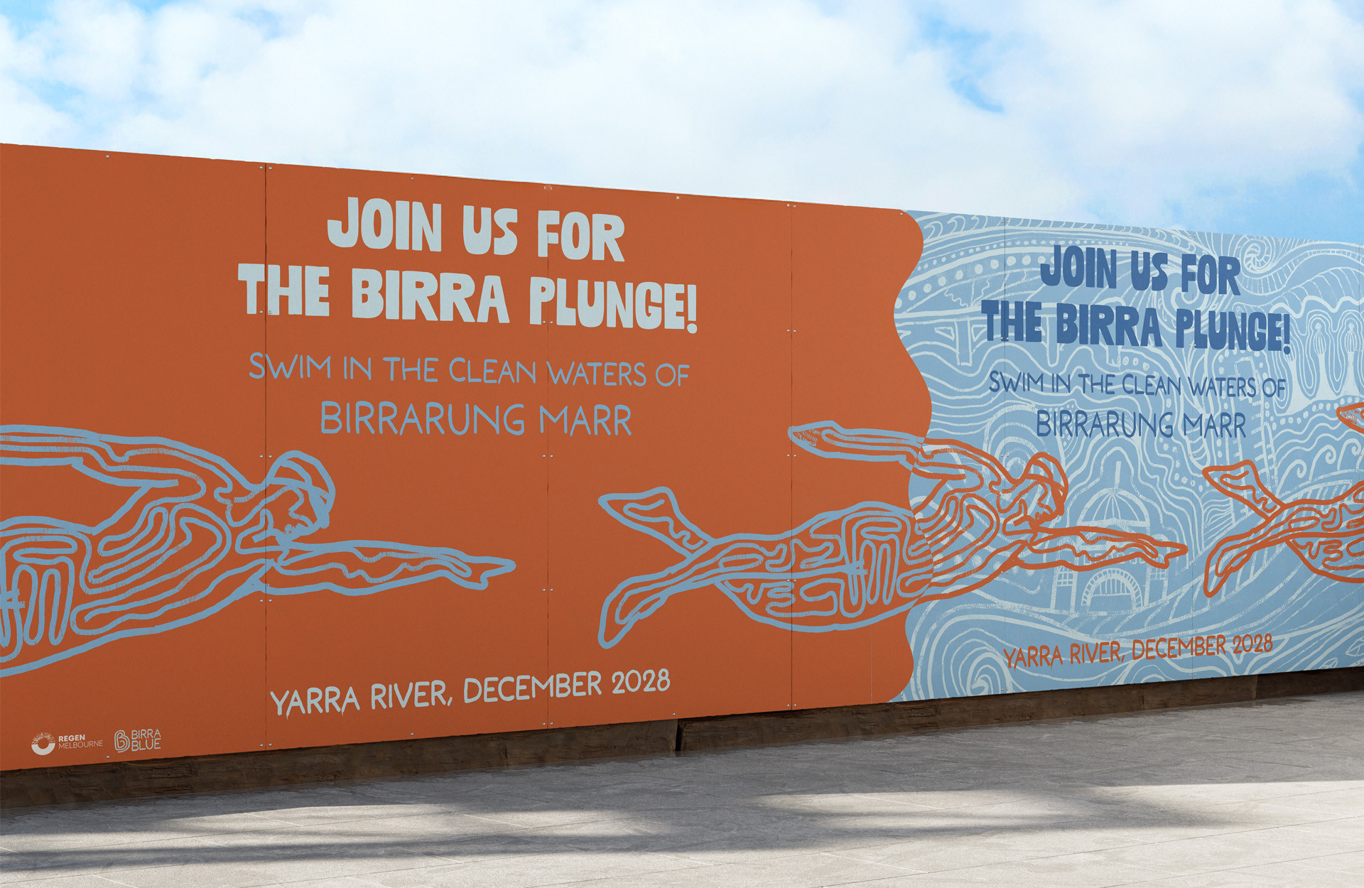
Birrablue
The Birrablue initiative by Regen Melbourne features a comprehensive brand identity and campaign strategy across both printed and digital media, aimed at restoring the Yarra River to its pre-colonial health, making it swimmable again in the heart of the CBD.
The identity incorporates artwork with hidden Melbourne landmarks, complemented by a natural colour palette inspired by Australia’s stunning landscape. The illustrations reflect the river’s flowing and evolving nature, celebrating the local environment while fostering a connection to the Wurundjeri Woi-Wurrung and Boonwurrung peoples, the traditional custodians of the land. This design approach positions Birrarung Marr as a vibrant community hub, fostering engagement and promoting environmental awareness.
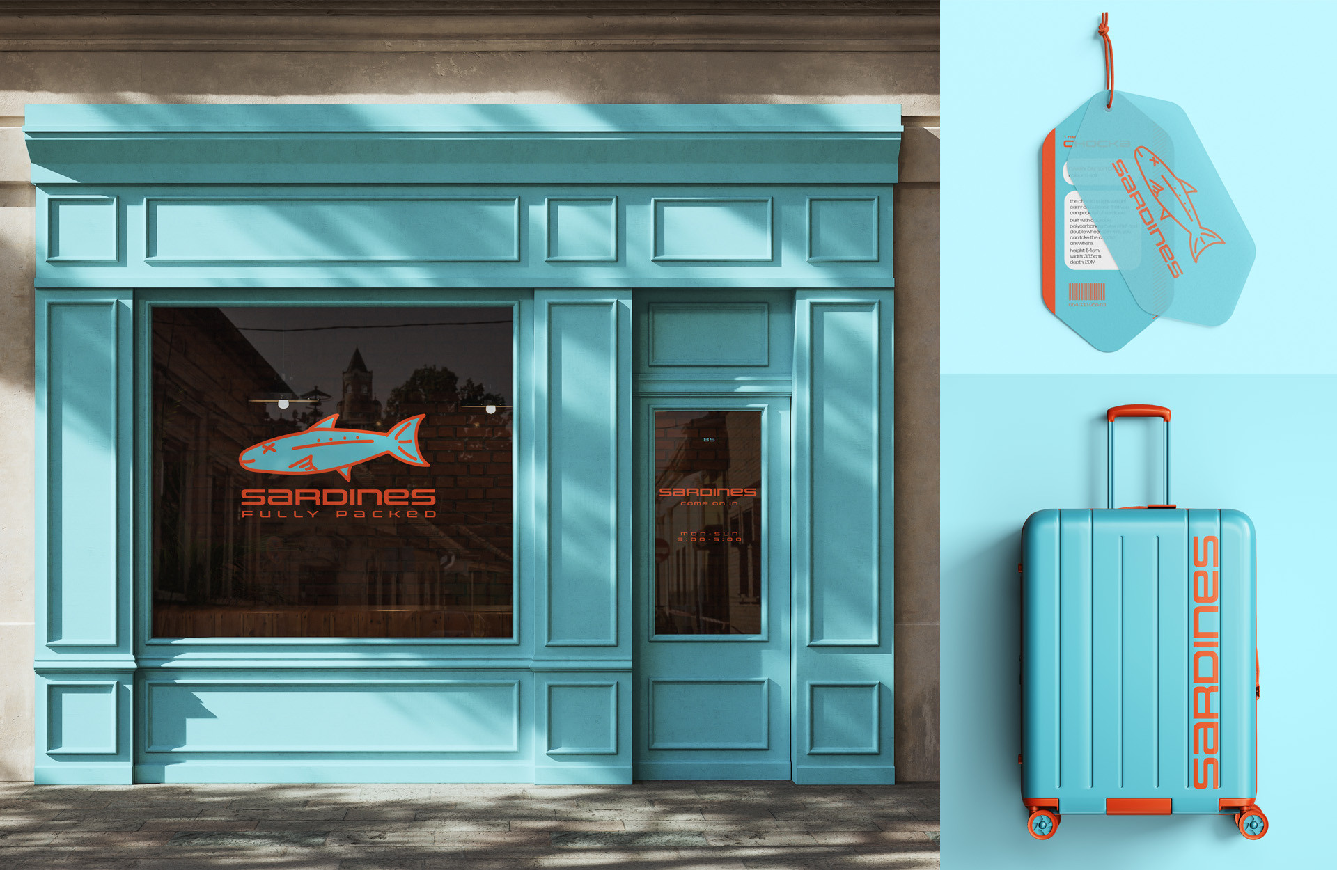
Sardines
Introducing Sardines: the playful rebrand of Lanza, an Australian luggage company. Inspired by the phrase 'packed like sardines,' this new identity infuses vibrance and humor into the travel experience. Drawing from Melbourne’s eclectic inner-city culture, Sardines embraces bright colors and zany illustrations. These elements create an engaging and lively identity, resonating with the target audience’s desire for fun, stylish and functional travel solutions. This fresh approach positions Sardines as the go-to destination for unique, functional luggage, inviting Melbournians to embark on their next adventure with a smile.
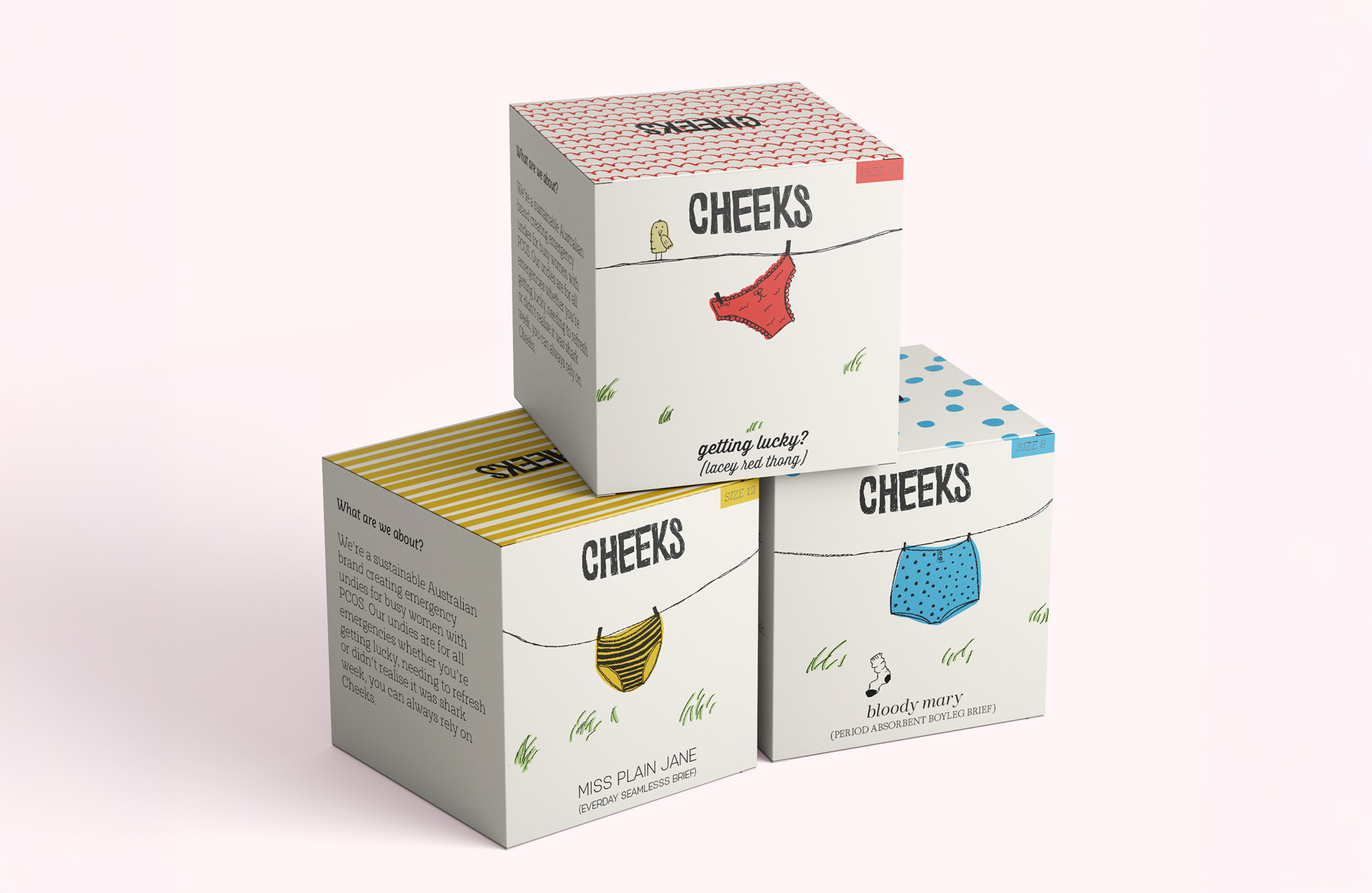
Cheeks
This is Cheeks a charming and playful emergency underwear brand designed for busy women with PCOS. With a coherent brand identity applied across printed packaging and digital platforms, Cheeks offers convenient, reusable underwear for emergencies and special occasions, available in vending machines at train stations, offices, and universities. The brand identity features vibrant illustrations and age-appropriate humor, making the products approachable and fun to use. This design choice enhances the user experience, transforming emergencies into manageable moments of empowerment. By breaking the stigma surrounding period emergencies, Cheeks encourages women to feel confident and supported. With a focus on sisterhood and reliability, Cheeks establishes itself as a brand that women can connect with and trust.
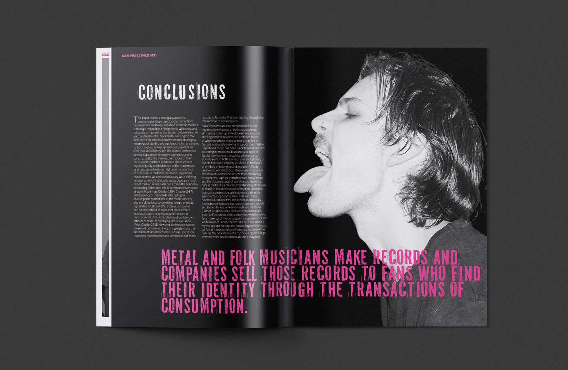
Nazi Punks Folk Off, by Karl Spracklen
Presenting Karl Spracklen’s, Nazi Punks Folk Off, a print publication that dissects the infiltration of Neo-Nazis in the punk music scene of the 1980s through dynamic visual strategies. This visual language employs a striking color palette of black, white, and hot pink, capturing the raw, chaotic energy of punk culture. Utilizing my own photography, the design brings to life the rebellious spirit of the era, while bold contrasting colors reflect the defiance inherent in punk aesthetics. The typography mimics the hand-drawn style characteristic of punk zines, enhancing the publication's authenticity. By incorporating dynamic imagery and a layout that evokes movement and chaos, this publication engages readers and immerses them in the historical context of the punk movement, to provoke thought and discussion about its cultural implications.