Isabella Suafoa

I’m Isabella Suafoa, a communication designer with a focus on branding, creative direction, and digital design. I enjoy turning ideas into something people can connect with. Design that’s considered, engaging, and human. My practice sits where concept meets function, blending storytelling and design thinking to create brands that feel intentional and alive.

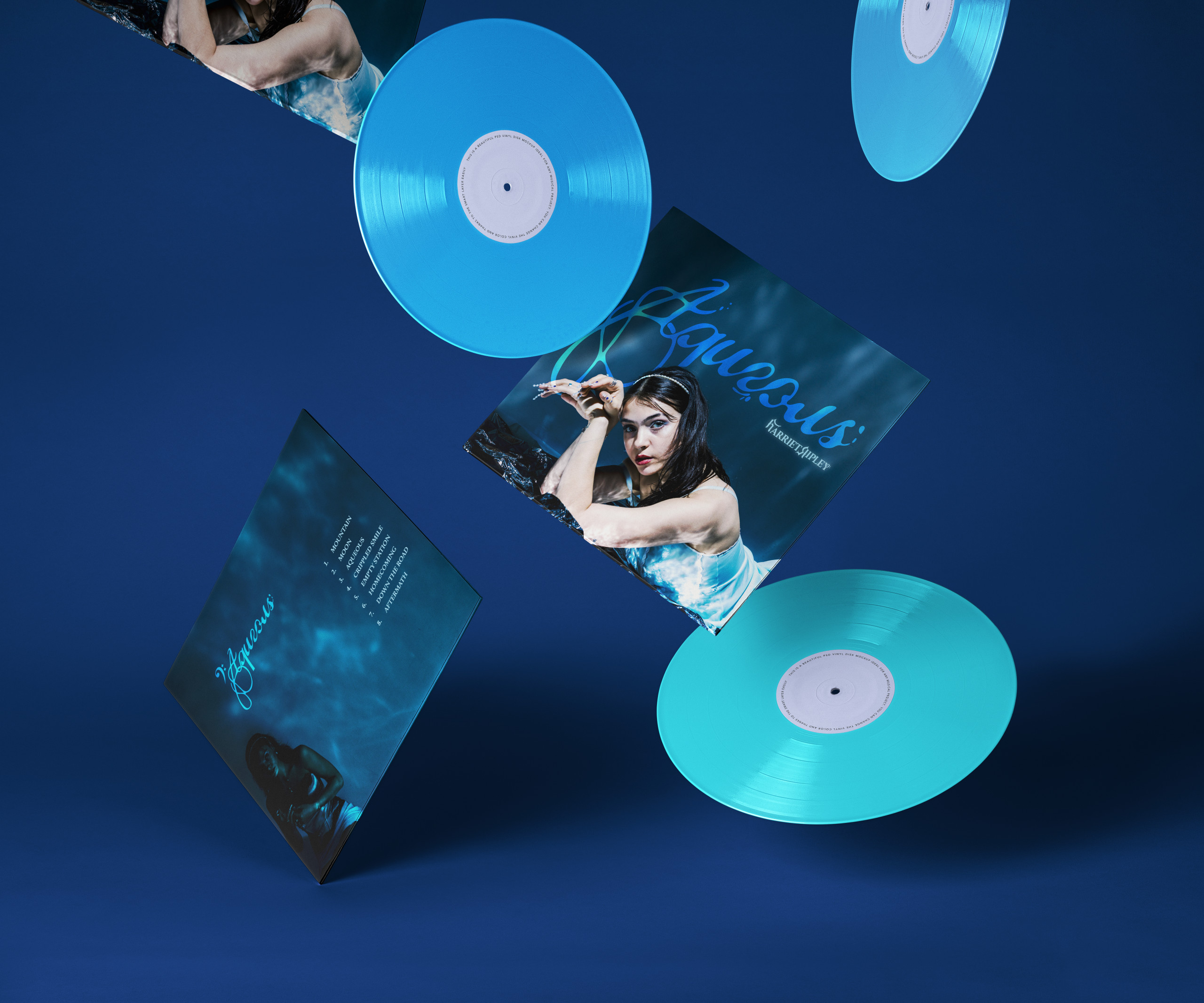
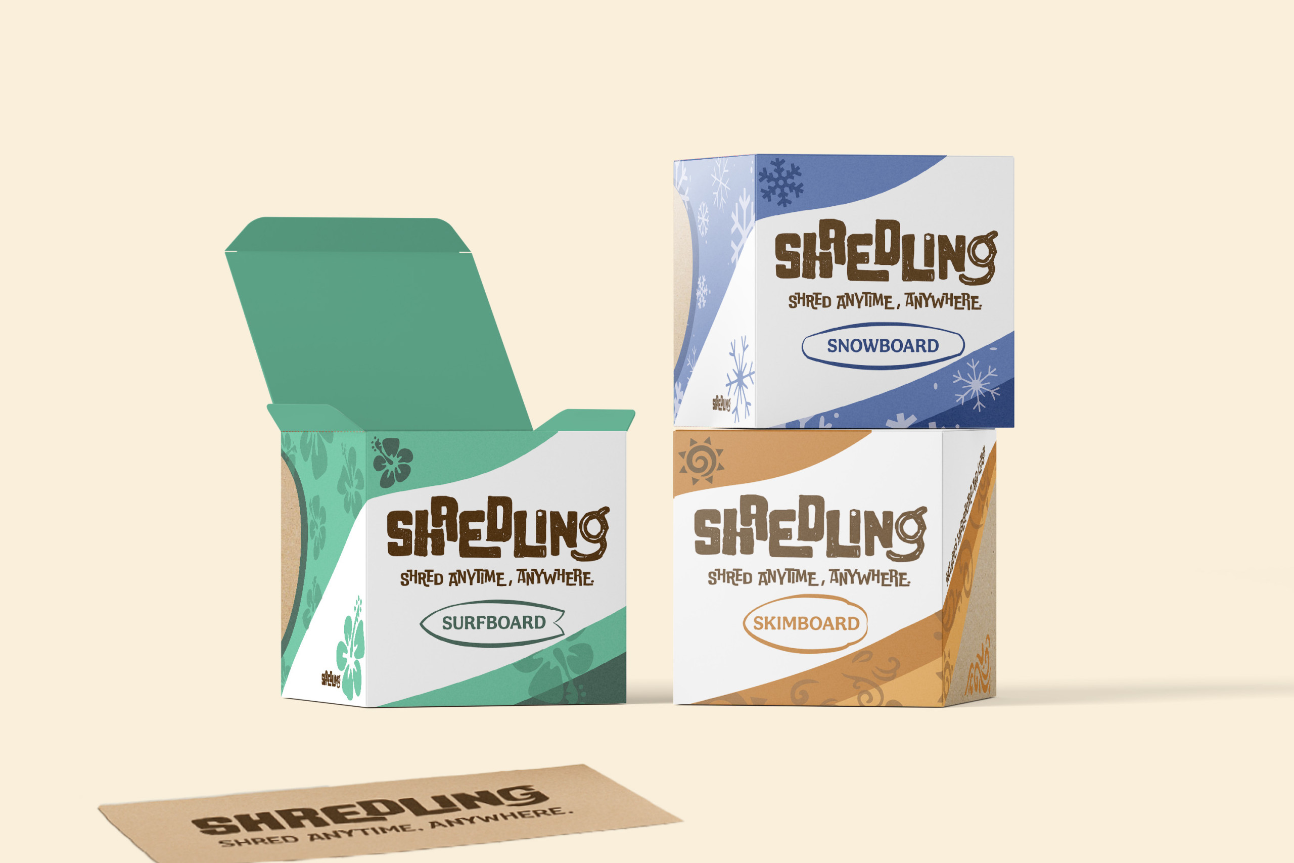
I enjoy working with artists, musicians, and lifestyle brands to develop visual systems that express their personality and purpose. From surf wax tins to album covers, my projects are built around connection; how design can bring people together and bring a vision to life. Recently, I’ve worked with emerging Australian musicians such as Harriet Ripley to translate their sound into cohesive visual identities that feel true to them. I also enjoy working on projects that explore lifestyle and culture, often using photography, packaging, and editorial design to create a sense of place and emotion.

During my degree of Communcation Design at Swinburne University of Technology, I built a strong foundation in concept development, and production. My work is shaped by collaboration, craft, and the same rhythm that inspires me outside of design: the ocean, live music, and community.

When I’m not behind a screen, you’ll usually find me surfing, training my dogs, or sketching new ideas on scrap paper. I love seeing how design fits into real life. How it can connect people, tell stories, and make the everyday a little more meaningful.

Harriet Ripley | Music Branding

An identity system built for Melbourne-based musician Harriet Ripley, blending personality and professionalism across her digital presence. The branding includes a full brand guideline, album cover, EPK, and website, all designed to reflect her sound and artistic direction. The outcome captures her mix of vulnerability, strength, and rhythm.

Shredling Fingerboards

A playful brand created for a fingerboard product inspired by surf culture. Shredling brings the feeling of catching a wave into your hands, using colour, motion, and organic textures. Each board box is designed to reflect a different terrain, (surf, skim, and snow) combining illustration, packaging, and tactile design.

Canadian Club Campaign

A campaign designed to reposition Canadian Club as more than just a beer alternative. This project focused on photography, packaging, and art direction to highlight the brand’s refined identity. Through styled shoots and social visuals, the work explored how Canadian Club can still be a refined whiskey brand.

Stupid F**k Album Cover

An album cover in collaboration with Melbourne punk-performance band Stupid F**k The Silly Clown. The design captures their chaotic, theatrical, zero cares energy through bold handwritten type, raw composition, and playful clown imagery. It balances humour and aggression in a loud, unapologetic visual statement.

Earthbound Festival

A concept design for a camping and music festival celebrating connection, nature, and sound. The identity draws from psychedelic and earthy tones, creating a visual world that feels immersive and alive.