As a student of advertising and design, I approach every design issue seeking a key insight or takeaway that can inform the overall creative solution. This analytical approach to design has evolved throughout my time at Swinburne University, where I studied theoretical advertising processes as part of my Media and Communication degree, alongside design methodologies in my Design degree. This combination has provided me with an enriched understanding of creative problem-solving. I apply this design mythology to my passion for crafting jewellery and look forward to completing my apprenticeship equipped with strong skills in communication, marketing and design.
Juels Valpied
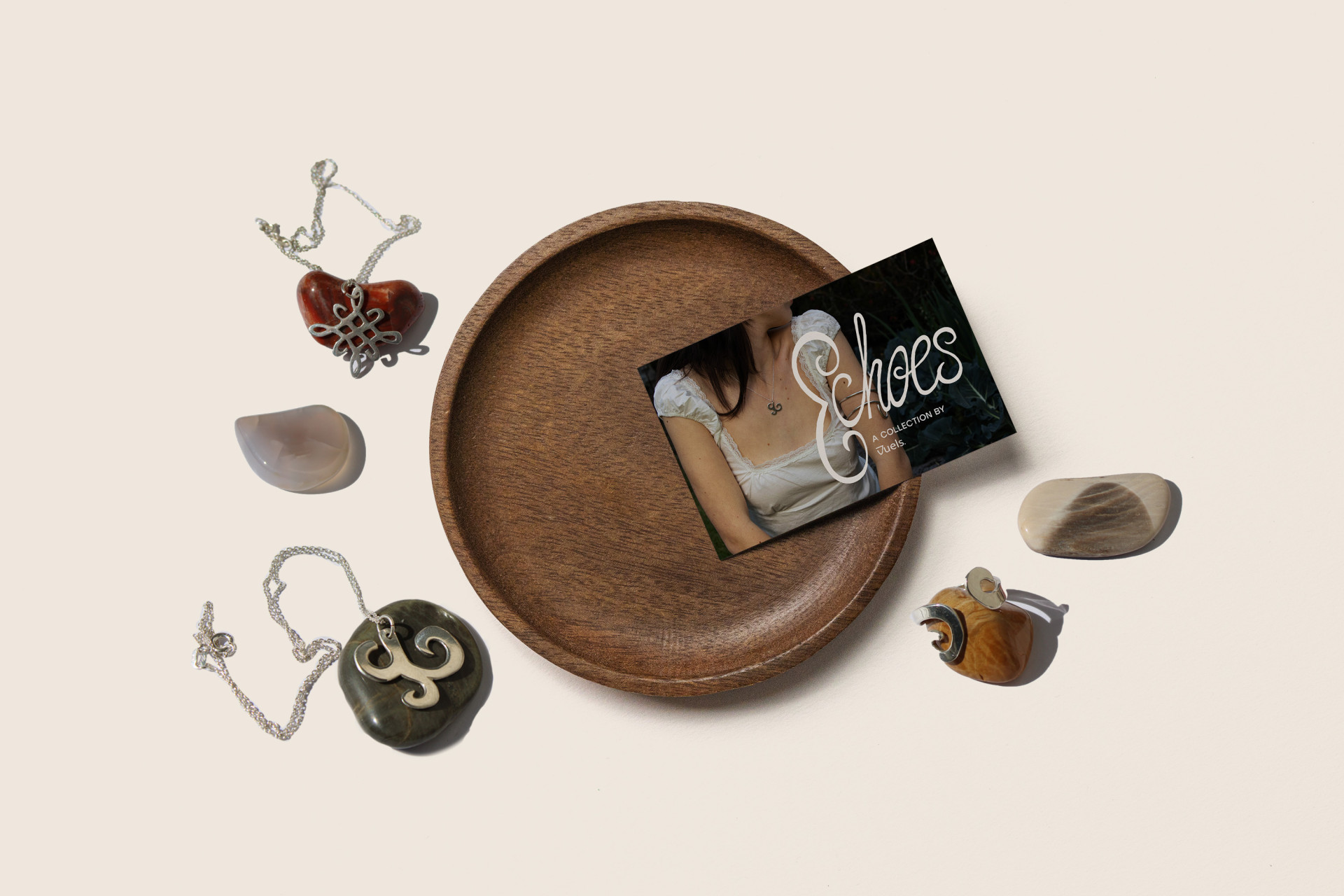
The Echoes Collection - Design Casptone
The brief asked me to design a cohesive collection identity to be delivered across multiple touchpoints and expand the jewellery brand’s overall reach and reposition it to a younger demographic.
The solution was The Echoes Collection, where each aspect of the design is carefully considered to emulate each jewellery piece. The campaign was delivered across multiple traditional and digital touchpoints with social media being the main platform for the brand to share the news of the shift.
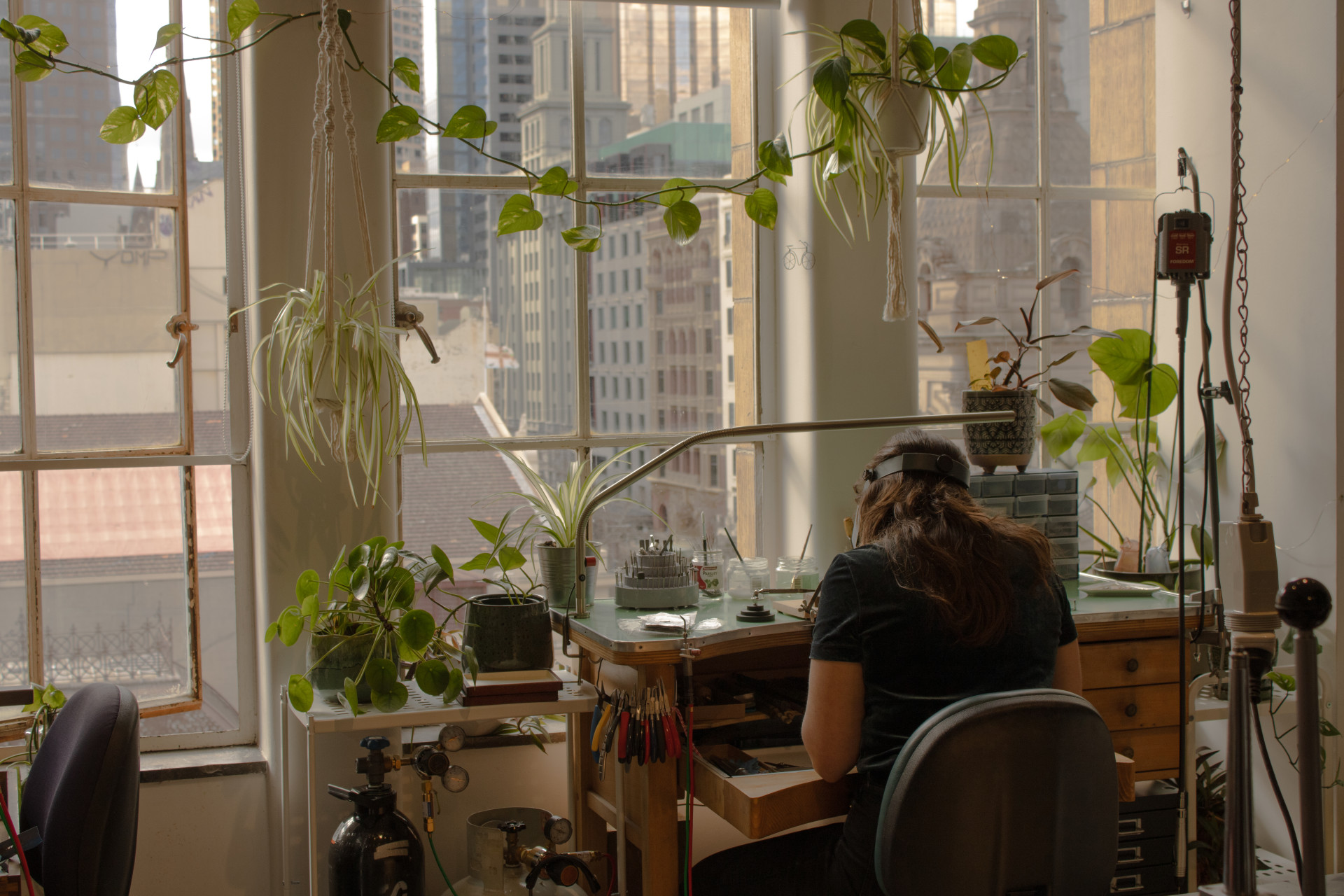
Studio Photography - Webb + Steele
The brief asked me to capture the warmth of the Webb + Steele Studio to use across various platforms including their social media and website.
The solution was the following images that capture the quiet serenity of the studio, the yellow hues invite the feeling of warmth and love that goes into every piece of jewellery created at Webb + Steele.
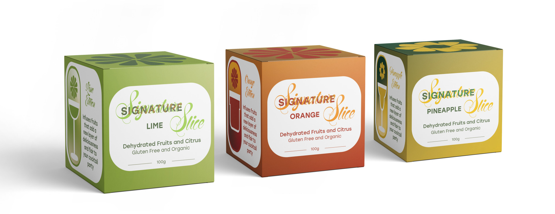
Signature Slice - Packaging Design
The brief asked me to design a cohesive brand and packaging system for three distinct variants of one product, each differentiated by colour and unique graphics, accompanied by a double-sided folded insert. that serves a purpose of your choice such as storytelling, promotion, or instructions.
The solution was Signature Slice, the dehydrated fruit and citrus brand that utilizes three distinct colour pallets that blend together to create a strong and cohesive brand image that stands out on the shelf.
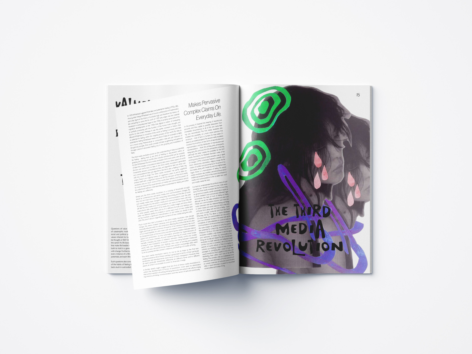
Walking Catastrophe - Publication Design
The brief asked to design a visually expressive and conceptually rich publication that reinterprets a selected text through experimental visual language, demonstrating a strong personal style, thoughtful typographic structure, and a flexible grid system suited to both text and imagery.
The solution was Walking Catastrophe, the human condition. A publication that utilises hand made collage imagery that as you flick through the publication sinks further and further into madness. Mimicking the texts overall narrative of loosing sanity.
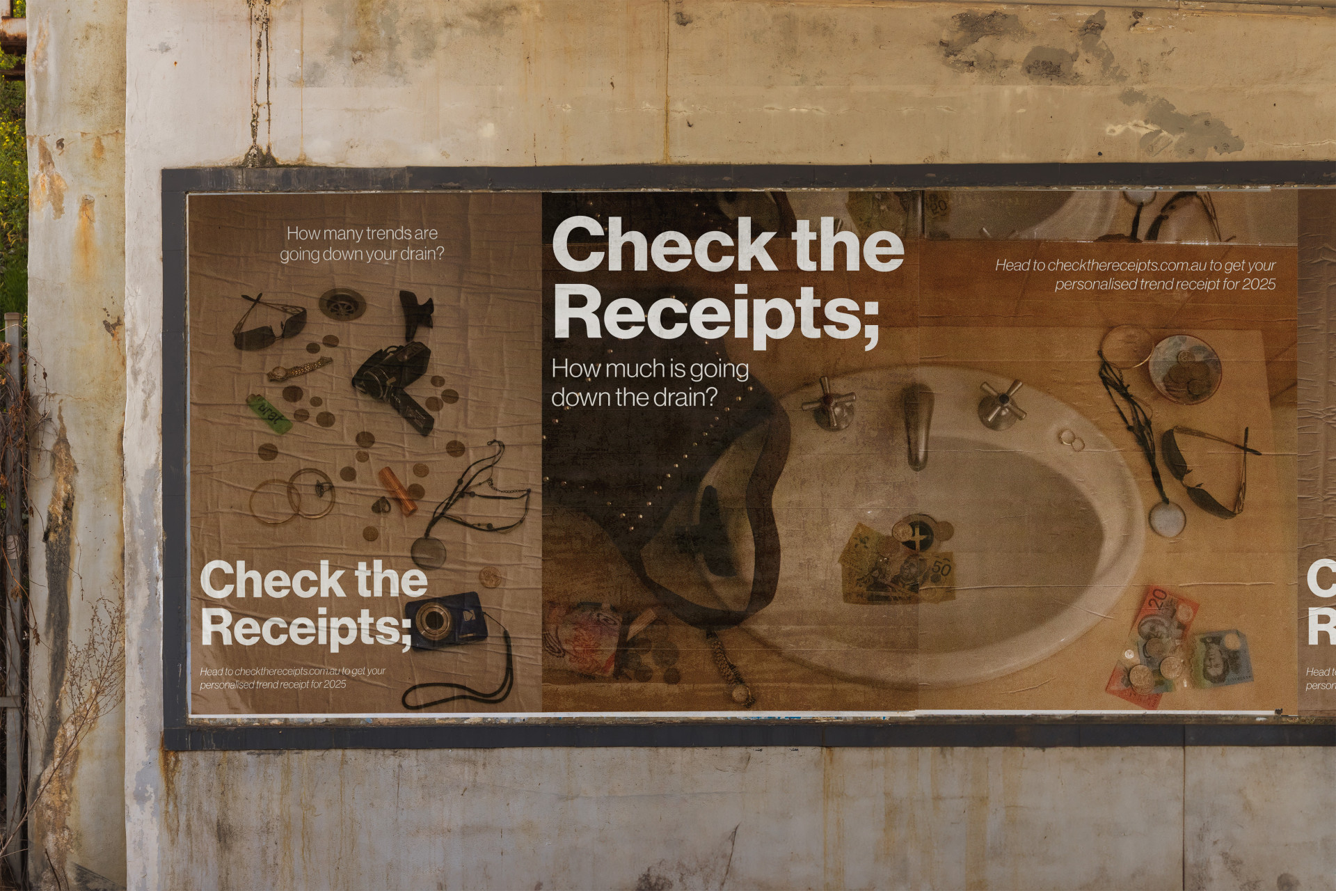
Check The Receipts - Communication Design Strategy
The brief asked me to explore the power of persuasive communications through an awareness campaign for a current social issue. I chose to look at fast fashion and overconsumption within pop culture and social media trends.
The solution was Check The Receipts, a campaign that partnered with Ad Busters to produce multiple touchpoints on tradition and digital media. The online side of the campaign invited users to complete a short quiz to receive their 2025 Trend Consumption Recap, which users where then encouraged to share their results to social media. The campaign stretched across new years, aiming to have users make resolutions to be better about their consumption habits.