Sam Bottrell

I am a final-year student at Swinburne University of Technology, completing a double degree in Design (Communication Design) and Business (Marketing). My work explores the intersection of creativity and strategy, focusing on how visual storytelling and brand communication can build meaningful connections between people and ideas.

Throughout my studies, I have developed a strong foundation in brand identity, digital communication, and campaign design, with an emphasis on aligning creative outcomes with research-driven marketing insights. My projects cover branding, digital media, and social campaigns, combining analytical thinking with a refined visual sensibility. Tools such as Adobe Illustrator, Photoshop, InDesign, and XD support my design process, while frameworks like Keller’s CBBE model and Kapferer’s Brand Identity Prism guide my strategic approach.

I am passionate about creating design solutions that are both visually engaging and conceptually grounded. Recent projects include a rebrand for the Melbourne Aquarium, an awareness campaign for ABC Friends Victoria, and a digital storytelling project centered on sustainability.

My goal is to work in a creative studio or agency environment where design and marketing come together, contributing to projects that inspire social impact, authenticity, and innovation. I aspire to build a career that balances strategic thinking with creative expression, helping brands communicate with purpose and clarity.
Urban - Publication and Branding

Brief:
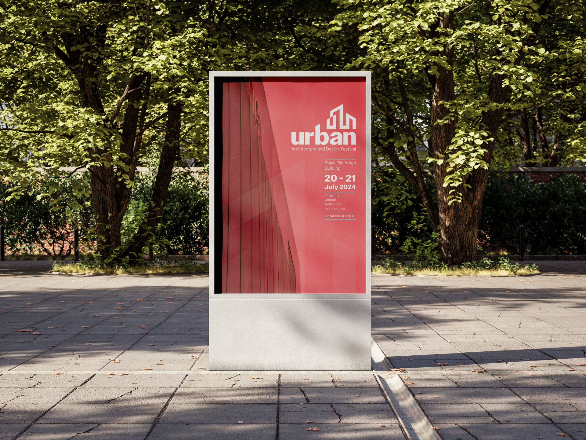
Urban requires a multi-page publication and poster for its annual architectural and design festival to bring together people within the industry, new people exploring their interests, to connect and network.

Solution:
A unique brandmark was created with the figure mark resembling a building whilst spelling out the letter ‘UBN’ to represent the name Urban.
The angle of the figure mark also lines up perfectly with the letter 'b'.
The balance between the negative and clear hierarchy helps to create an effective composition.

Ocean Guard - Branding

Brief:
Ocean Guard is a not-for-profit ocean conservation organisation seeking a rebrand as it transitions from reef and kelp conservation to work related to sea life and the ecosystem around it.

Solution:
The new logo supports the communication statement of being a ‘leading organisation in protecting and restoring the ocean’.
This can be seen by exploring the idea of the Greek god Poseidon who is the protector of the sea and is represented by the trident.
This is also backed up by the design decision to use the shield to enclose the rest of the design, as it symbolises power and protection, which aligns with the goals of protecting and conserving the ocean.

Ukiyo - Branding and Packaging

Brief:
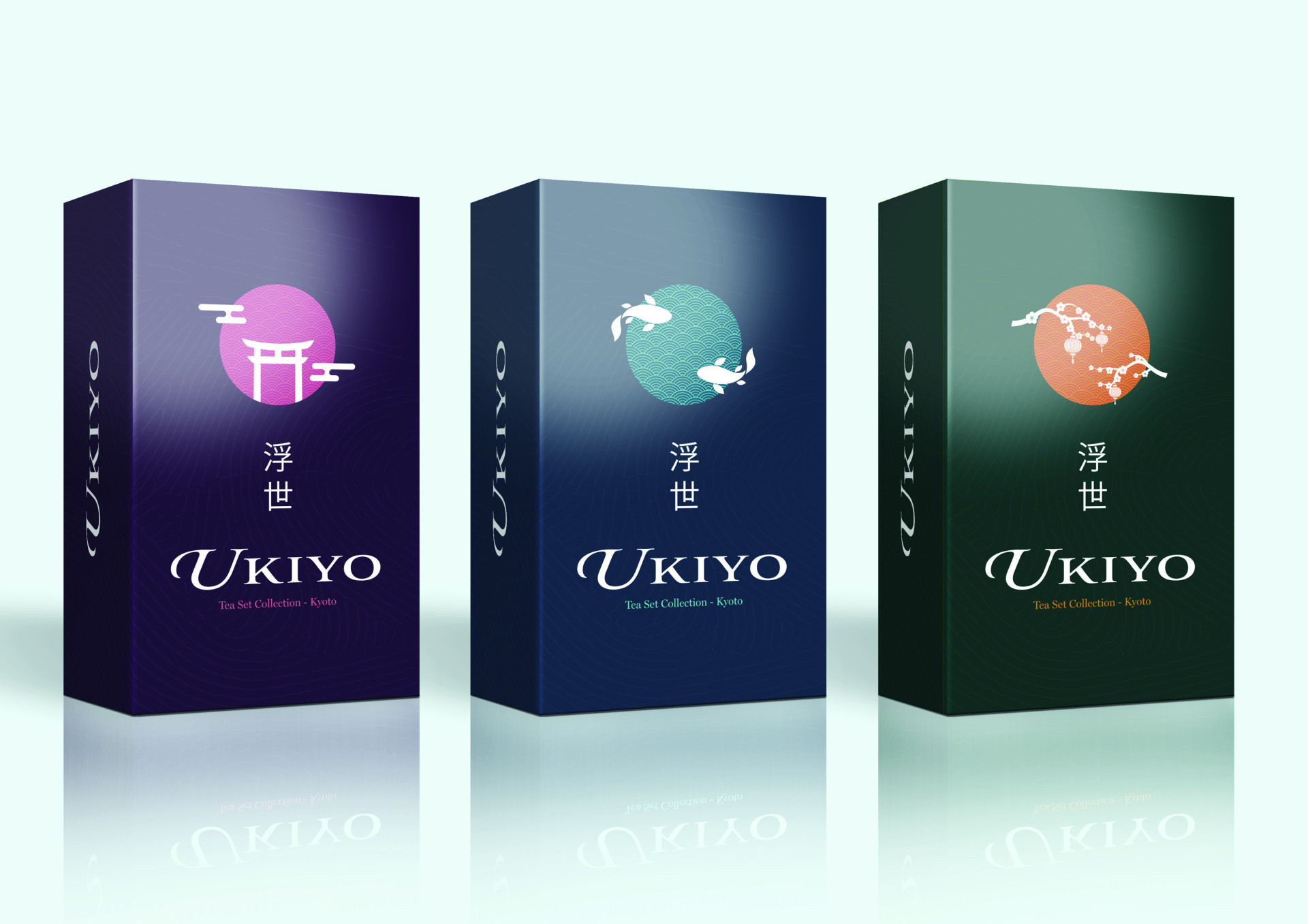
Ukiyo is a high-end traditional Japanese tea brand, seeking branding including a logo and surface graphics for their new tea set collection.

Solution:
This resulted in an elegant set of three boxes, featuring sophisticated graphic elements to evoke a high-end aesthetic.
Inspired by the Japanese flag, the logo incorporates a circle and a wave pattern to convey a sense of refinement.
Each product variation has a unique graphic element integrated into the logo, representing a traditional Japanese symbol.
The colour combinations were thoughtfully selected to enhance the premium feel, complemented by a custom pattern inspired by a bird’s-eye view of Japanese tea farms.

Melbourne Aquarium - Branding

Brief:
Melbourne Aquarium seeks a rebranding to align with its updated mission to "Connect, Educate, Protect." The new brand identity should reflect the Aquarium's dedication to marine conservation, engaging experiences, and educational initiatives, aimed at connecting audiences to the wonders of ocean life.

Solution:
The rebrand features a dynamic brandmark inspired by water movement and coral shapes, symbolising the Aquarium’s conservation mission and the vibrant marine world. Flowing lines capture ocean fluidity, while a cool blue and green palette reinforces this connection, creating a cohesive identity that invites audiences to explore and protect marine life.
This refined branding positions Melbourne Aquarium as a leader in marine education and conservation, inspiring visitors to connect with and care for the ocean and marine life.

Spaces – Publication

Brief:
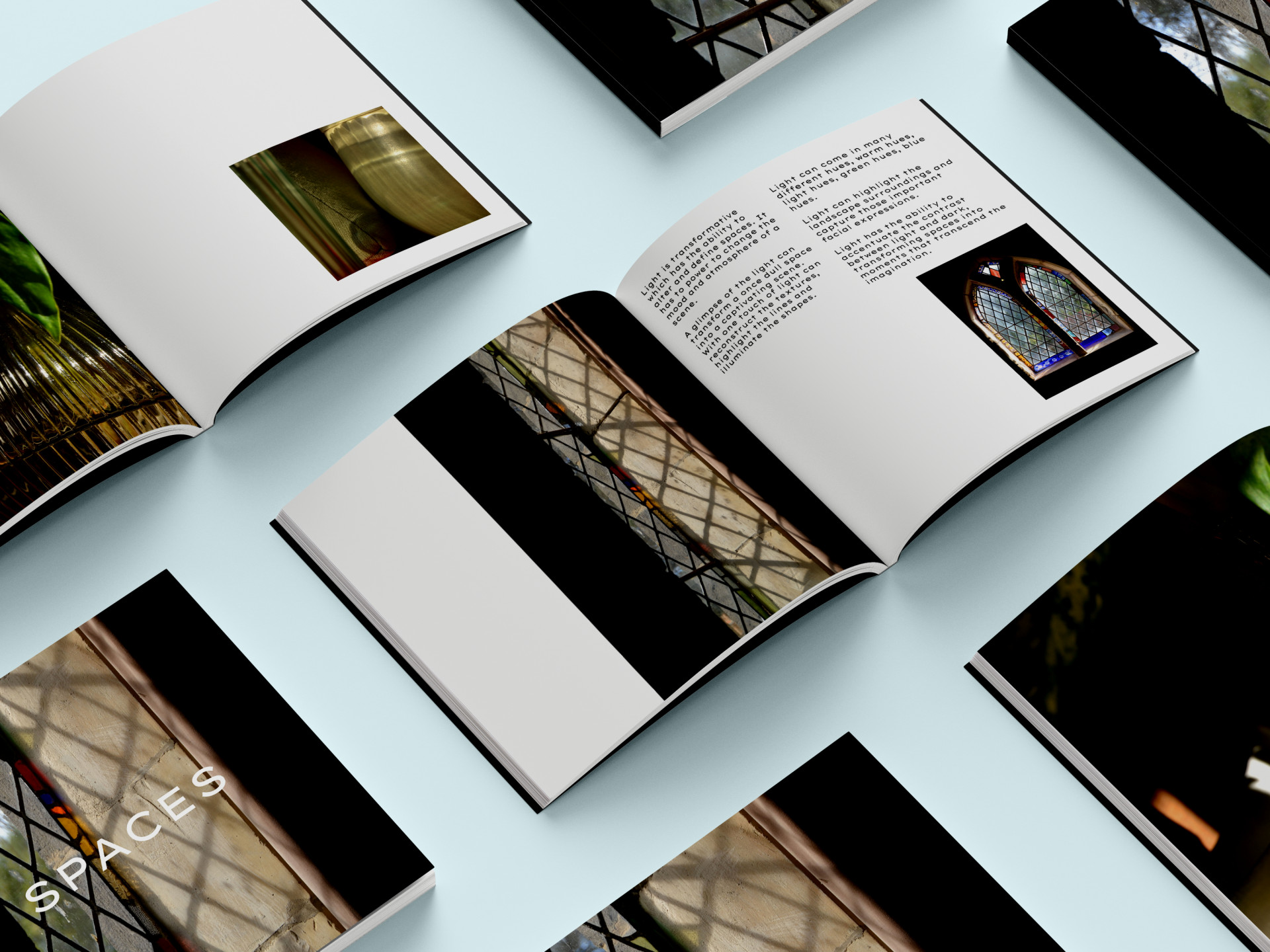
Spaces required a publication that explores how light and composition transform various environments. The aim is to capture the interplay between light and space, revealing how subtle shifts in illumination can redefine mood, atmosphere, and the physical characteristics of a setting.

Solution:
Through striking photography, "Spaces" highlights the transformative power of light, showing how it accentuates textures, lines, and shapes.
Each photograph captures different hues—warm, cool, and natural—emphasising how light interacts with architecture, landscapes, and expressions to create immersive, visually compelling scenes.
This approach offers readers a deep appreciation of light’s role in reshaping and redefining spaces, making ordinary scenes extraordinary​.