Dougal Etheridge

I’m Dougal Etheridge, a multidisciplinary designer working across communication design and photomedia. I believe that great design comes from curiosity, strategy and emotion to connect with audiences through visuals that feel genuine and memorable.

The areas in which I thrive include Art Direction, Brand Strategy and Visual Storytelling. I approach art direction with curiosity and character, and I thrive by drawing out the essence of a brand and expressing it with its own unique flavour. The strategy behind my work prioritises the audience and insights I can gather to ensure the project hits the mark and yields effective engagement. Most passionately, I enjoy sharing stories as a way to put personality behind any project. I believe that visuals can speak louder than words and I enjoy the craft behind capturing a meaningful image.

Over the years, I have built a small clientele through some freelance projects with local hospitality venues and small businesses. These include URKU Chocolate House, RENU Exterior Cleaning and Marbl Steakhouse. I have also produced a range of speculative works across advertising and branding, exploring visual identity, audiences, positioning and storytelling.

When I’m not wearing my design hat, I’m either bartending, training Jiu-Jitsu, or working on some other passion project. My interests typically follow some sort of creative persuit, and even when they don’t, I can’t help but to see it through a creative lens.
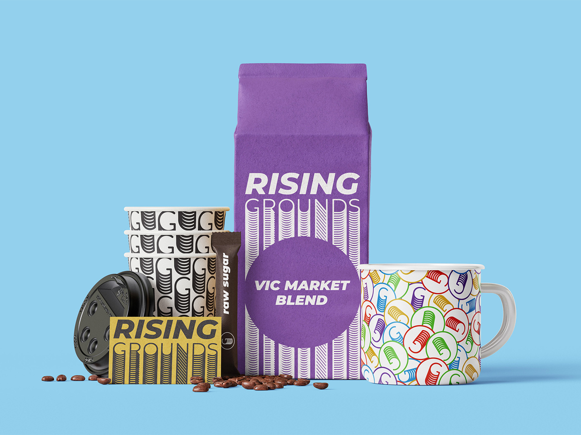
Rising Grounds: Social Enterprise Rebrand

Rising Grounds is a rebrand concept for STREAT, a Melbourne café social enterprise that supports disadvantaged youth through hospitality. The goal was to design a whole new identity to a brand that wasn’t represented well enough in Melbourne’s competitive café culture The deep rebrand better communicates the brand mission, celebrating growth, optimism and community with a name and tagline that reflect both social impact and great coffee. The result is a brand that feels alive, contemporary and true to the people it represents.

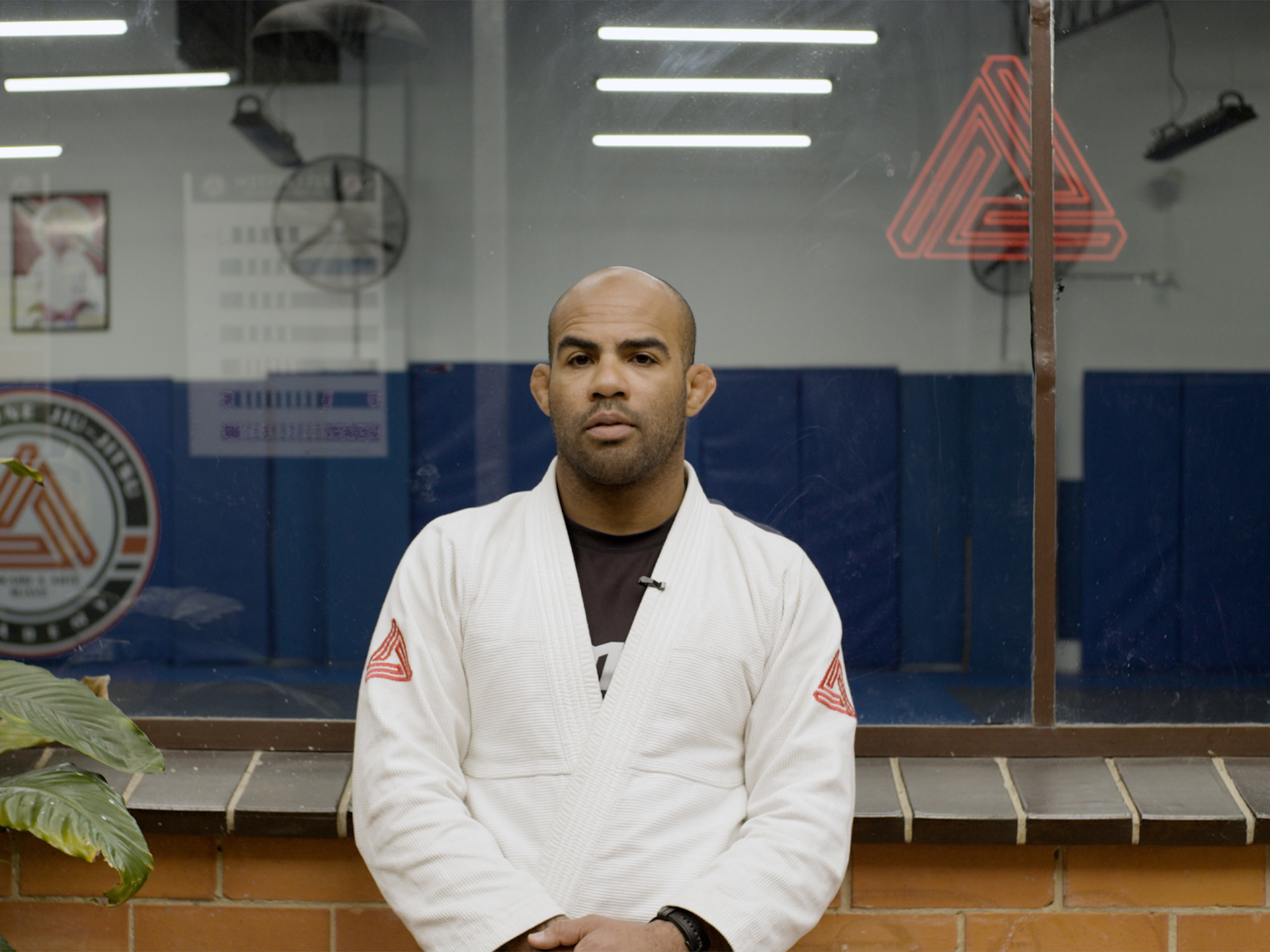
Melbourne Jiu-Jitsu Academy: Documentary

This documentary offers an insightful glimpse into the world of Brazilian Jiu-Jitsu through the lens of a prominent academy in Melbourne. As well as illustrating the physical aspects of the sport to those who may be unfamiliar, it delves into the philosophy, practice and teaching of BJJ, emphasizing its role in personal development, community and wellbeing.

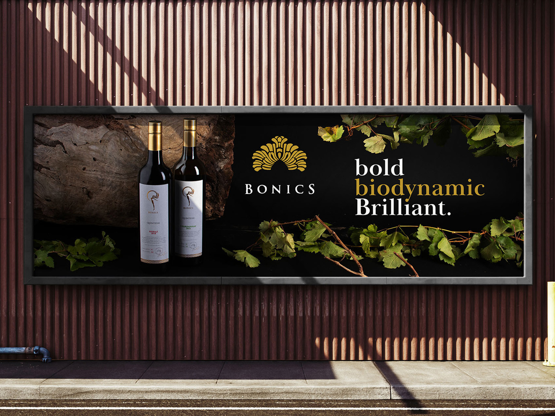
Bonics wines: Photography and advertising

A studio shoot and advertising application for Bonics Estate, a premium organic wine brand. The objective was to capture the bottles in a studio setting that reflects the organic nature of the wine. The challenge was lighting them in a way that felt natural while still revealing the form, and reflections of each bottle. I used natural textures like vines and raw wood to reflect the wine’s biodynamic origins, paired with dark, moody lighting to highlight its rich, premium character.

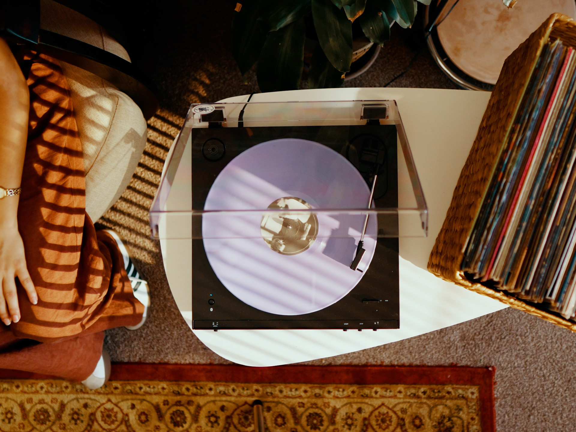
Audio Technica: Advertising

Speculative advertisement for Audio-Technica, designed to highlight the immersive quality of their high-end audio equipment. The concept explores the contrast between digital distraction and the intimacy of analogue listening, portraying music as a form of escape and transportation through interaction with their products.
This idea for this spec ad came about after filming some cinematic shots of an Audio Technica turntable. Just from this aimless shooting session and listening to countless LPs, we were inspired to capture the product and our interaction in the form of advertising, even with minimal budget. We got planning and wanted to incorporate some form of narrative to make it feel relatable and to communicate the escape from digital to analogue. What started with a slow and jazzy beat quickly turned into something much more energetic and fast paced, which perfectly captured this theme of immersion.

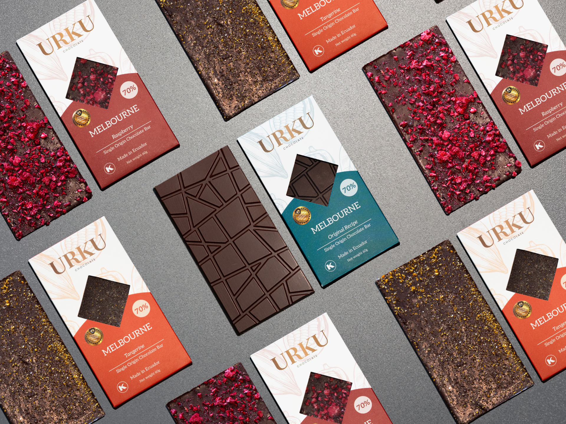
URKU: Product shoot

A studio shoot for real client, URKU Chocolate House, capturing the texture and premium feel of their beautifully crafted chocolates made from Ecuadorian cacao. The aim was to show off the richness and detail in each variety of their new line of chocolates through simple, focused compositions. Here I have also composited photos of the chocolate and packaging into a single clean composition to be used for a hero or banner image at a larger scale.