Terry Ngo

Hey! I'm a passionate Melbourne-based Graphic Designer specialising in branding and publication design. With a background in Communication Design, I create thoughtful and engaging design solutions that balance creativity with meaning. Whether developing brand identities, publications, or character designs, I adapt to the unique needs of each project - bringing concepts to life through strong storytelling and cohesive visual strategies.

I recently completed my Bachelor of Design, majoring in Communication Design. Before that, I earned an Advanced Diploma of Graphic Design, a hands-on course focused on real-world projects with clients ranging from university departments to Major Melbourne-based events and studios. These two distinct educational experiences of practical industry work and academic design foundations have shaped my craft, allowing me to approach creative challenges with both professional insight and strong research-driven design thinking.

Currently, I've begun my first professional journey working at a printing company as a Print Production Operator, where I'm responsible for pre-press preparation and finishing production. This experience has deepened my understanding of the production side of design, allowing me to make more informed creative decisions that consider print requirements, material choices, and precise file preparation.

I'm always seeking to grow, both as a designer and a collaborator, developing stronger communication skills and empathy with others. My work spans on a range of styles from emotive, creative, and playful solutions to clever, professional, and refined designs. I enjoy following design trends and integrate them within my designs when relevant, creating contemporary and engaging designs that connect with current audiences.
Blurring Life & Work - Publication Design

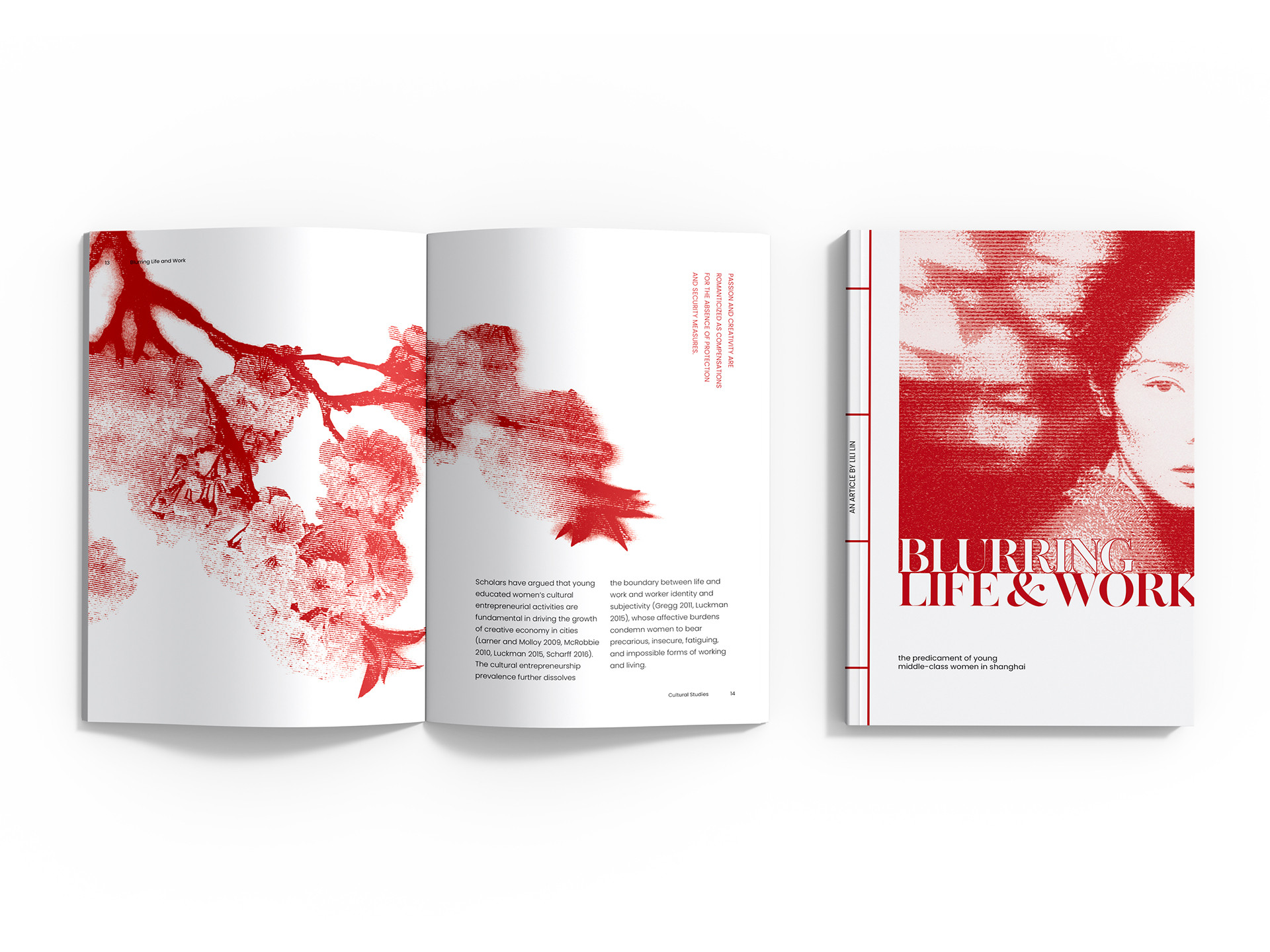
The publication design centres around the theme of 'blurring' - in the context of this article, it is essentially the boundaries between freedom and struggle, exploring how middle-class women in Shanghai struggle to break away. Image treatments emotionally reflect this core theme in a dark visual connotation. Inspired by traditional Chinese textbooks, the publication embodies many of its elements, acting as the base of the design. The first instance is through a unique book binding technique called 'Chinese stab binding'.

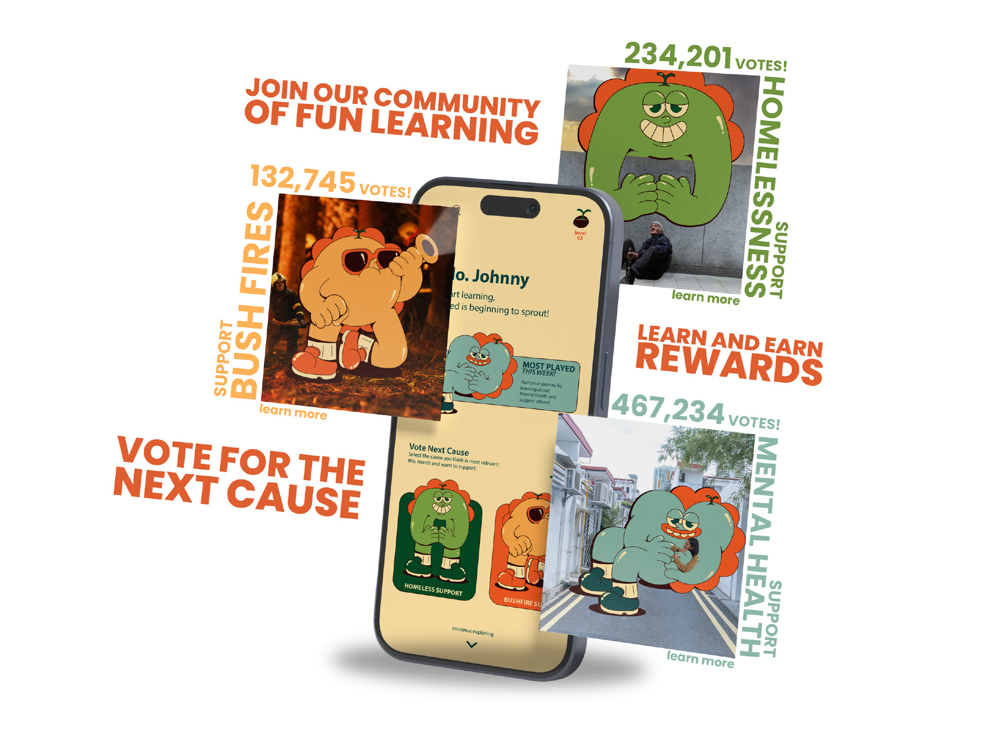
SeedsAction - Brand Design

'SeedsAction' is a youth focused educational platform for donation support topics. The idea is to plant charitable minds early within young individuals, growing adults with knowledge and hearts to actively contribute to social causes later on life. This project is a concept brand, engineered to portray my values as a designer - creating impact through meaningful design solutions. It utilises playful characters that become 'mentors' to children throughout a range of interactive learning experiences.

Casterton Memorial Hospital - Rebrand Design

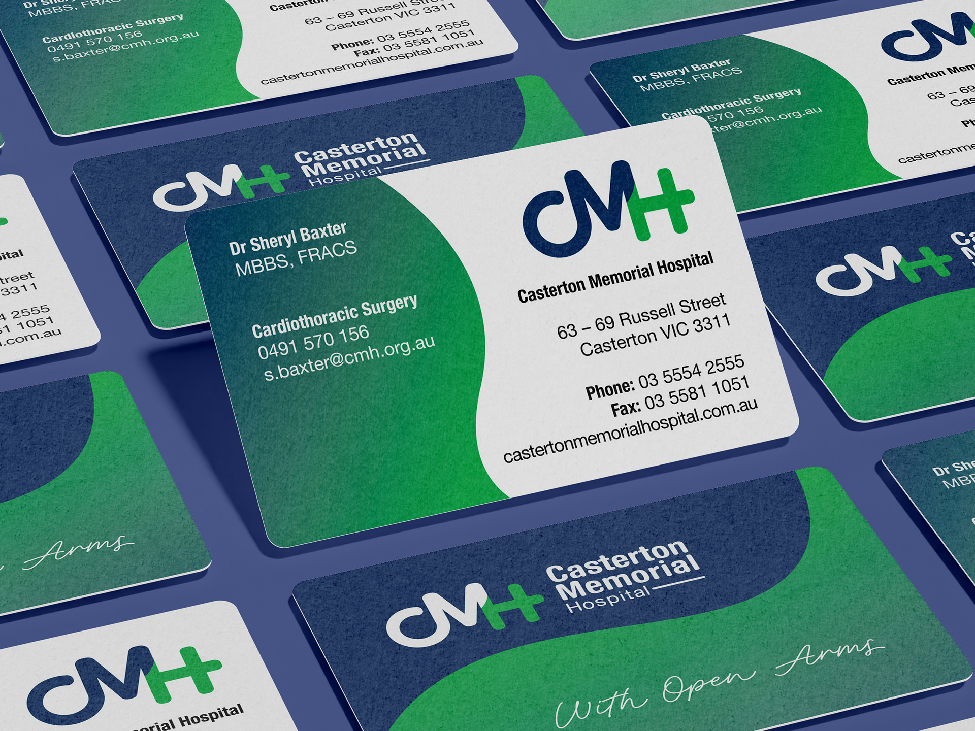
Casterton Memorial Hospital is a local healthcare facility in Casterton, Victoria. This project is a rebrand for the Casterton Memorial Hospital, an elderly nursing home. It includes a logo redesign, stationary items, and brochure to meet industry standards. Utilising a visually appealing design, with a focus on accessibility for an elderly audience through design catered for readability.

Resauces - Rebrand Design

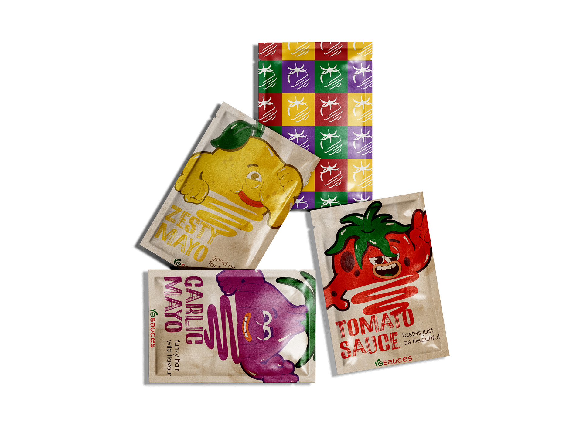
The essence of the Resauces is, its not just about repurposing unwanted produce, but making it a wanted product as a delicious and high quality product, with sustainability still as its core value. Furthermore, this is conveyed through the unique personality of the brand, the vibrancy and playfulness to its sustainable initiative. Rather than focusing solely on the bad, they offer positive change that reflects on the notion of repurposing unaesthetic produce.

Metamorphosis Reboot - Publication Design

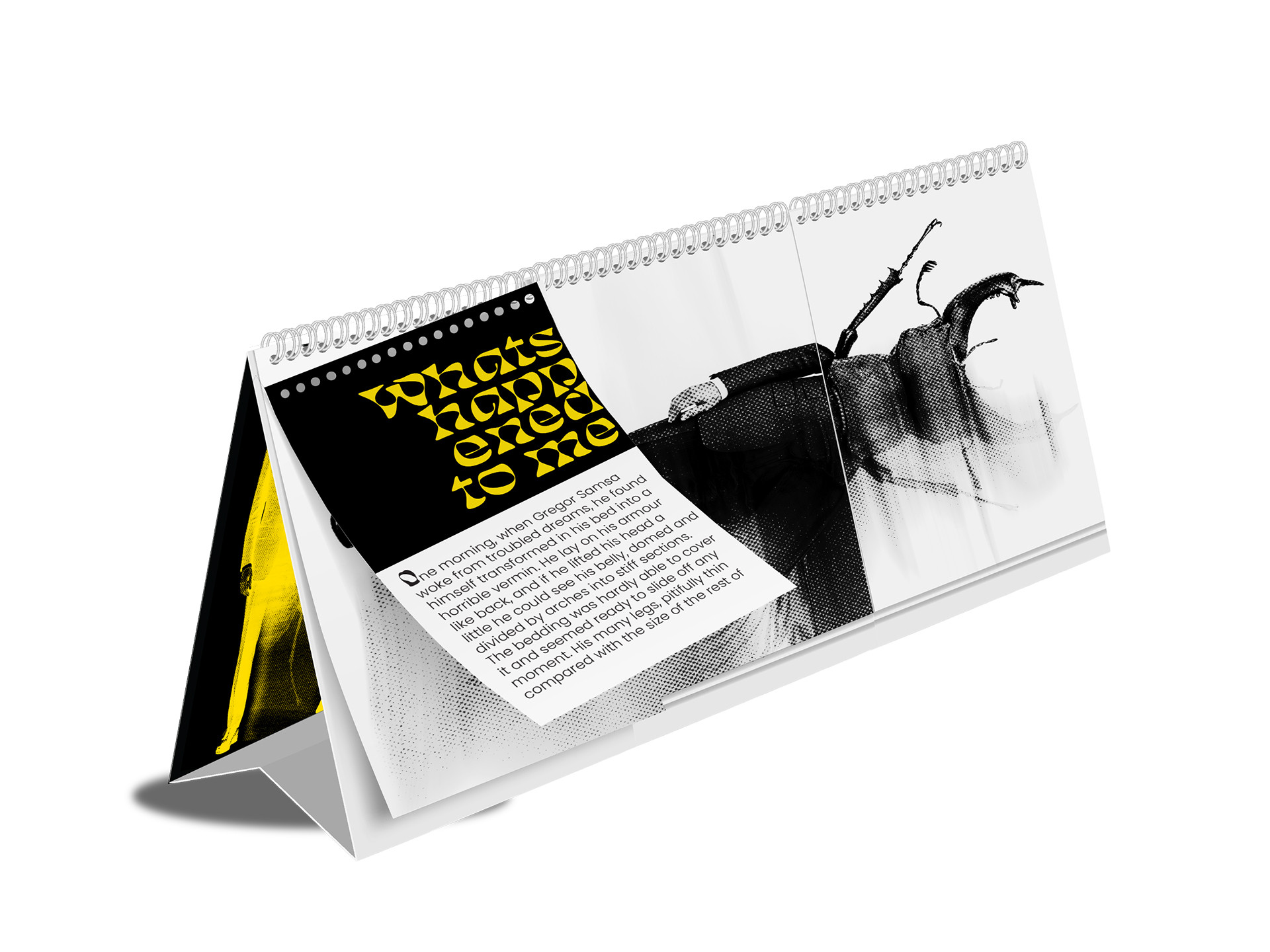
The text I have selected is from the novel Metamorphosis by Franz Kafka. It explores the life of Gregor, a travelling salesman that wakes up one day to find out he had transformed into an insect. It explores how Gregor slowly loses his ability to humanly function. My position for the reboot focuses away from just visual depictions of Gregor’s transformation and instead aims to portray the emotional and mental depictions of the story into an immersive and physical way. It will be a hands on storytelling, where the visuals and format reflect both the inner breakdown of the character and societal views that negatively effect him, inviting the readers to feel that disconnection themselves.