Hi! I’m Emma Facey and I’m a Communication Designer who is passionate about creating unique and creative solutions to problems. I love anything with bright colours and personality, taking a particular interest in fusing modern design technologies with more traditional art and craft methods. Practically since taking my first breath, I’ve adored crafting, trying my hand at any new craft I can get my hands on. My loved ones are probably sick of receiving handmade jewellery, scrapbook cards, and little sewing projects for their birthdays. I have really enjoyed my time working within a small business specialising in bespoke, handcrafted engagement rings; particularly experiencing working within a collaborative, creative space and seeing how a small business is run. When I get a rare moment of free time, I love getting active, exploring nature with my gorgeous cavoodle, and listening to my perfectly curated playlists on Spotify.
Emma Facey
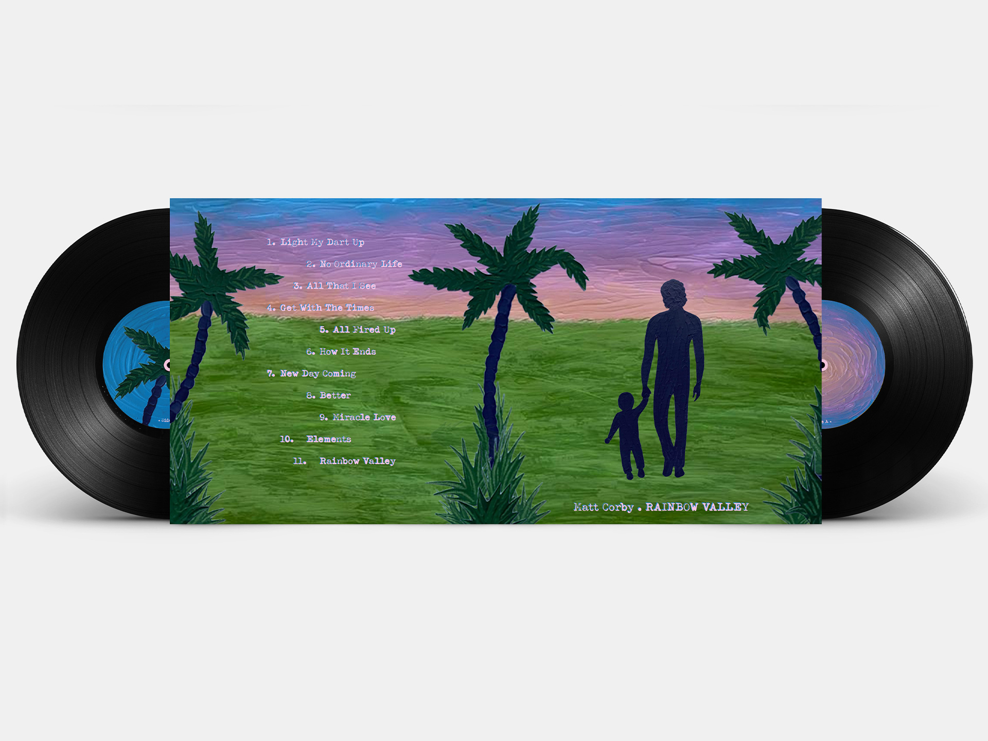
Rainbow Valley - Album Cover Redesign
The project was to redesign an album cover, reflecting the style of music and the message of the album visually. Rainbow Valley is a heartfelt indie rock/soul album that was created as something of an instructional guide to Corby's newborn son about the way Corby views the world. This redesigned cover aims to convey this underlying message whilst reflecting the natural and organic feeling of his music through the visuals and textured paint medium.
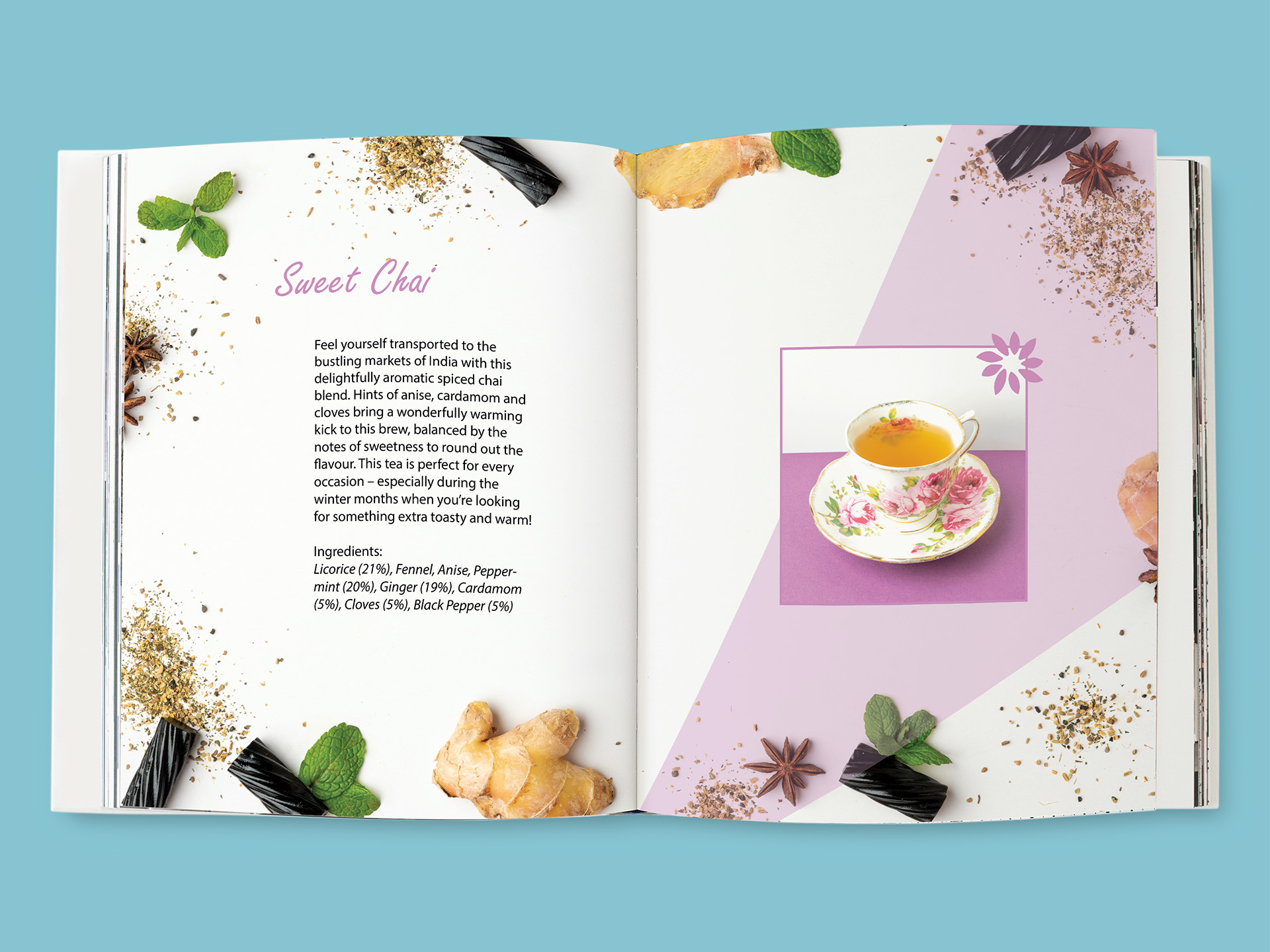
Higher Living Tea - Photography and Brochure
This project was a photography brief, capturing a series of product photographs and then compiling them into a brochure. Key objectives were to show the product in its different forms, to create a stylistically cohesive brochure, and to demonstrate various photography techniques in both studio and on-location settings.
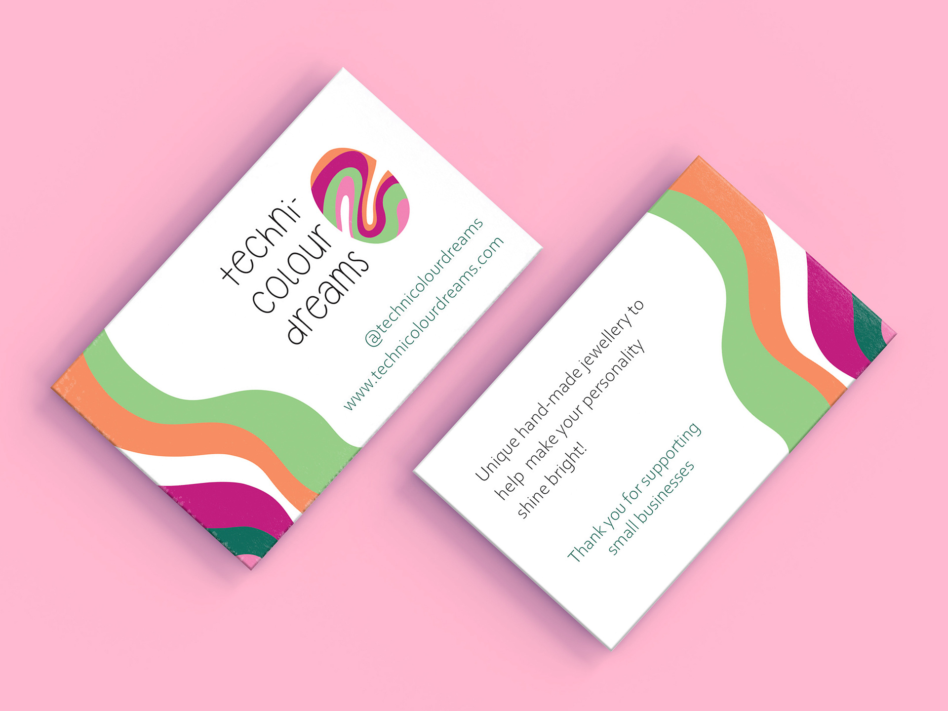
Technicolour Dreams
This brief entailed creating a visual identity for a new small handmade jewellery business, along with packaging for the jewellery, a tutorial video for the customer to make the jewellery themselves, a market stall mockup and additional collateral. The brand is fun, unique and creative, so the project collateral had to reflect this.
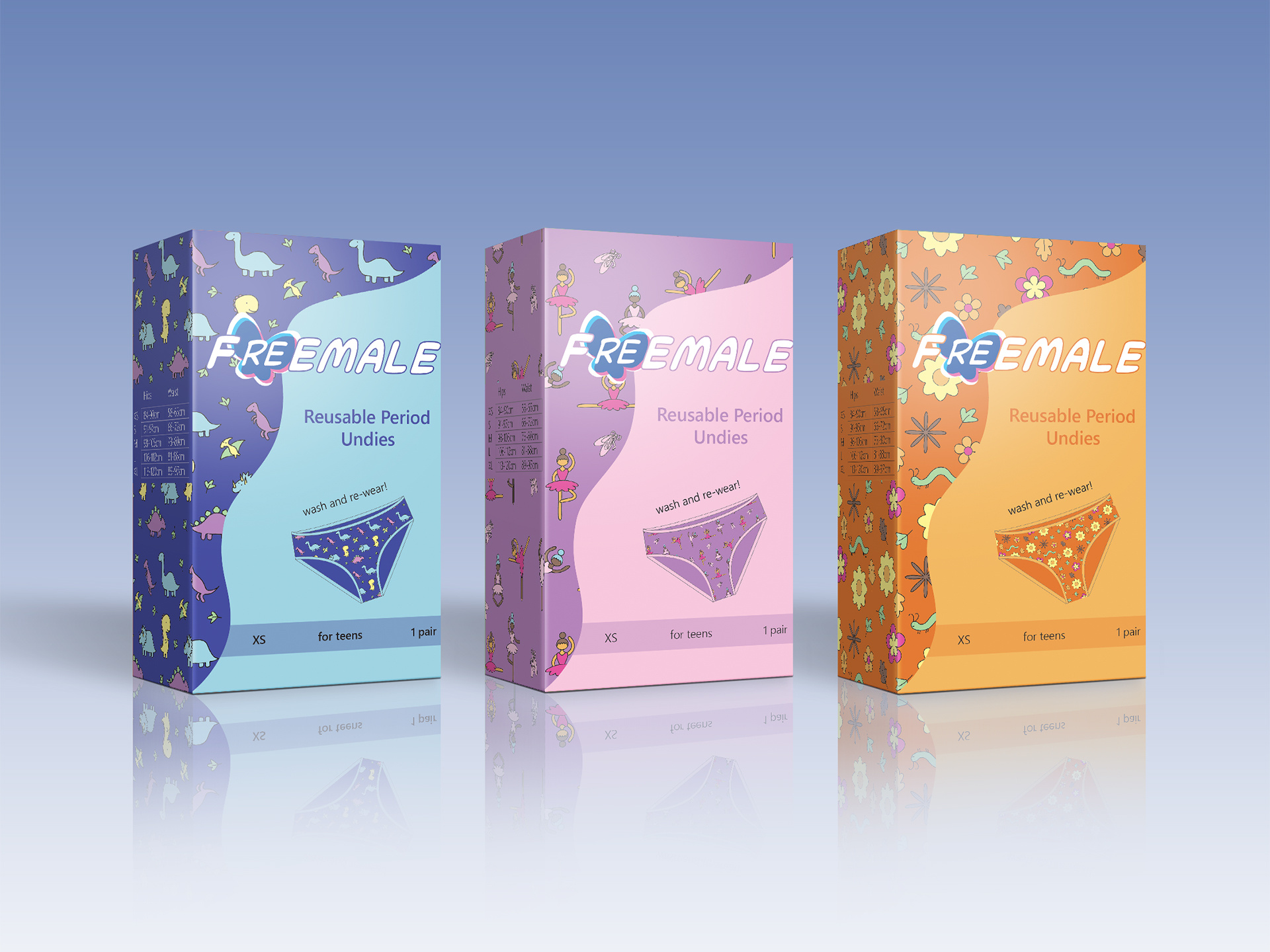
Period Underwear - Packaging Design
There appeared to be a gap in the market for period underwear designed for young teens, particularly ones with youthful prints and gender-neutral options. Three packaging designs were created to make periods less of an intimidating prospect for young teens, and to help encourage a more environmentally conscious new generation.
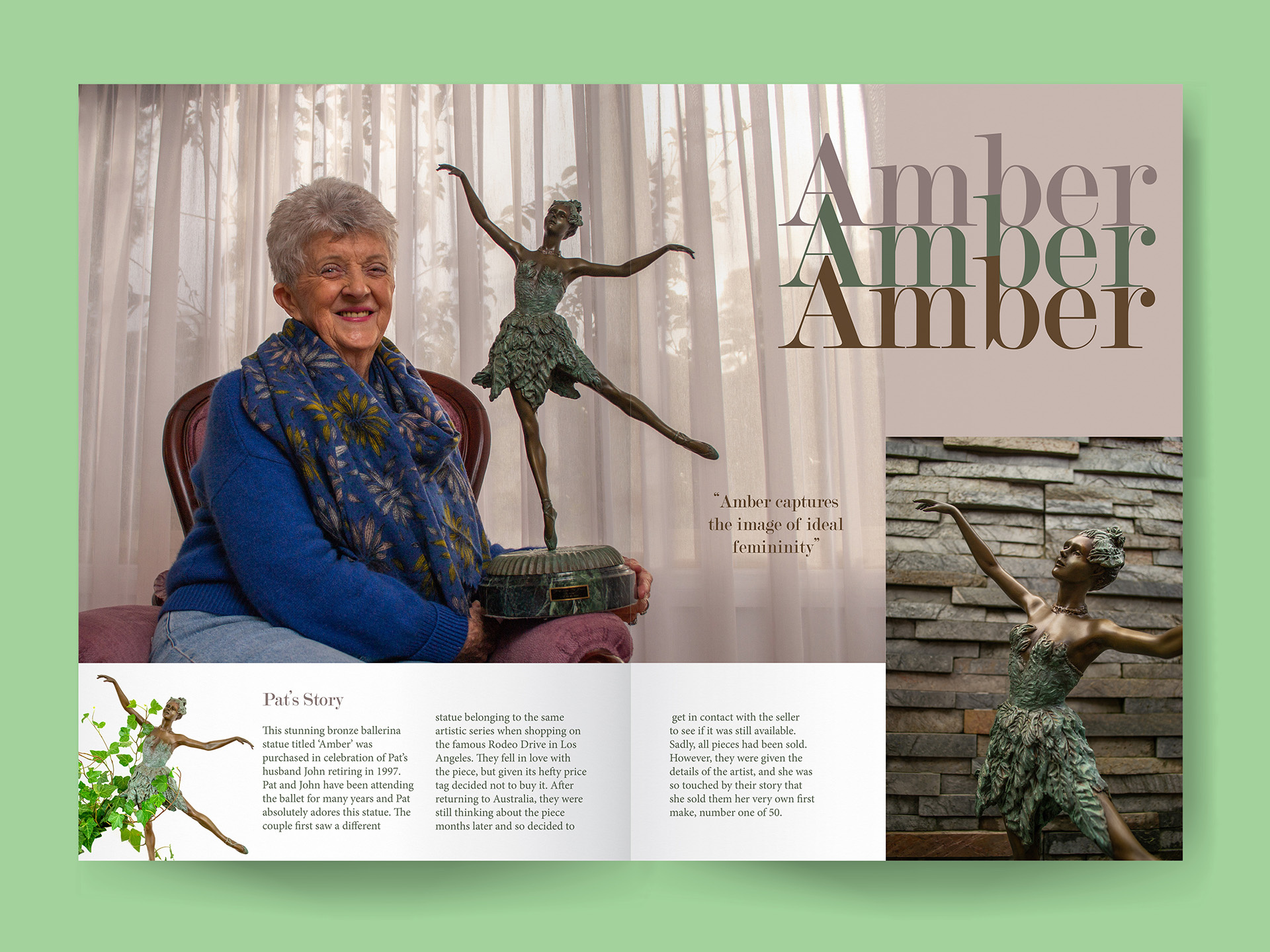
Treasures Magazine
This was a photography brief, the final outcome of which was a magazine showing everyday people and objects that were important to them. The photoshoots were conducted at each subject's home, and they were invited to talk about the object during the shoot to provide the background story of why the object was special to them.