Hi, I am Yin Ting, a communication designer who recently graduated with a degree in Communication Design from Swinburne University of Technology. With a keen eye for detail and a creative approach to problem-solving, I have developed a solid foundation in visual communication and typography during my academic journey. Throughout my studies, I improved my skills using industry-standard software, including Adobe Creative Suite and gained experience in crafting visually appealing designs for a variety of media, such as print, digital, and social platforms. Over the years I have also explored a range of different design fields including Motion Design, PhotoMedia, and UX/UI design. One year of experience as a design director in a student club not only enhanced my technical abilities but also fostered strong communication and project management skills. 

I believe imagery could bring out a large amount of message. Beyond graphic design, I am a dedicated vlogger who enjoys documenting and sharing everyday life with online audience. Vlogging has not only allowed me to connect with a wider community of like-minded individuals but also further enhanced my skills in video editing, content creation, and digital marketing.

I aspire to create meaningful and impactful visuals that resonate with audiences while contributing to the success of the brands I collaborate with. Ready to take on new challenges, I am excited to embark on a professional journey in the design industry.

flaner

Vive La Fleur is a daily pleasure that represents indulgence and fun. A wooden texture reflected the atmosphere of the café culture that roared in the left bank, where young, talented writers, designers, and painters mused for hours. A feeling of spring is evoked by the petal. The fruit's stunning hue complements the product's smell.

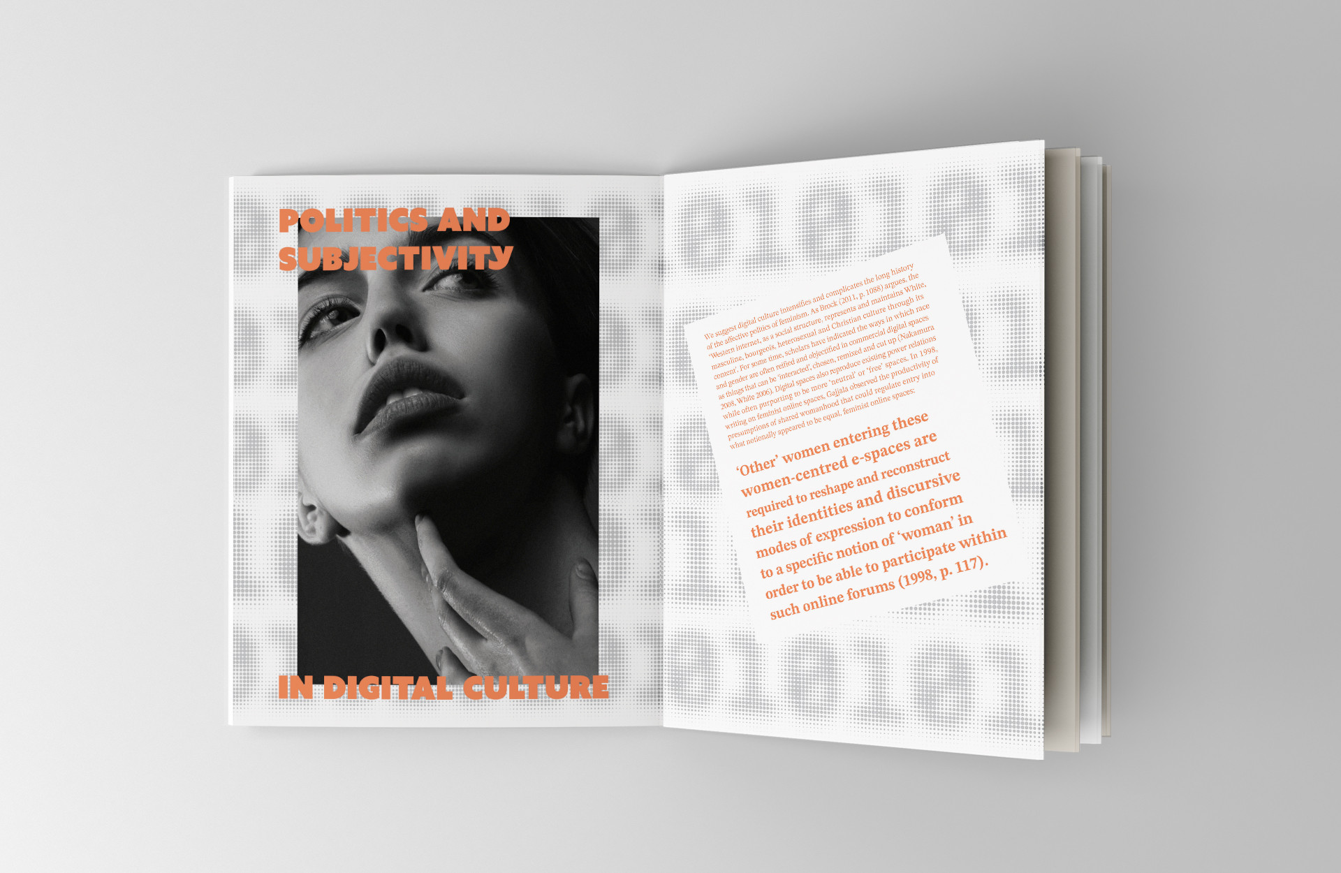
Contemporary Feminism

This project conveys a strong sense of individuality through the development of a style appropriate to the contemporary moment and the selected subject matter. The work provides a means to create a highly articulated personal expression. A flexible grid system is developed help encompassing all of the different types of information included in the document in multiple sections. The grid supports the layout of both text and image components.

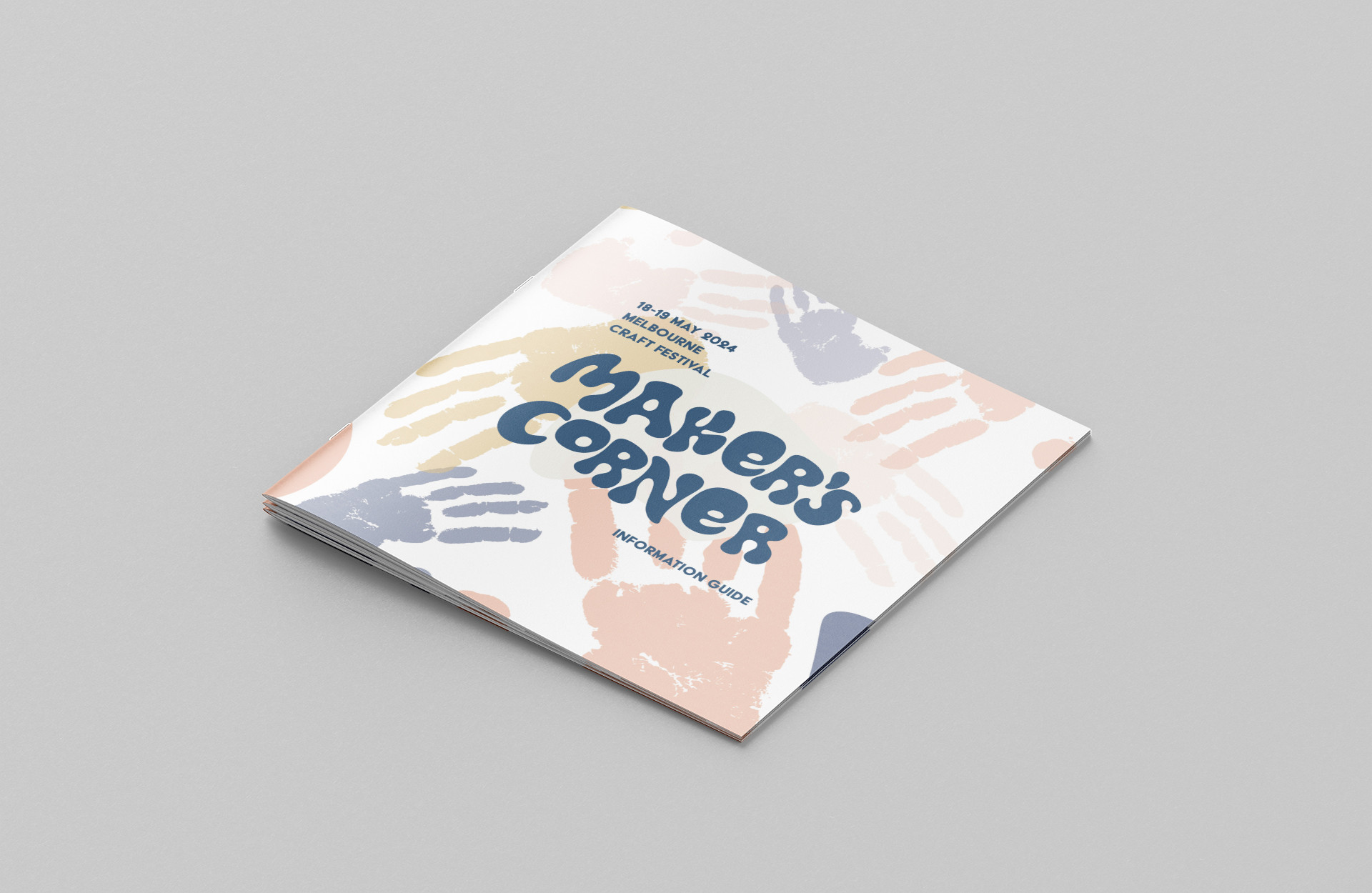
Maker's Corner - Craft Festival

The purpose of this guide is to guide participants during the festival while also promoting innovative makers to draw greater attention to the craft industry. The audience is intended to utilise the guide to become more familiar with the activities and learn more information about what is currently happening. To help the audience feel pleased and relaxed during the event, the guide will be appealing and simple to understand. The guide’s consistent layout, playful font, hand drawn graphics, and photographs will encourage audiences to keep reading to learn more about the activities.

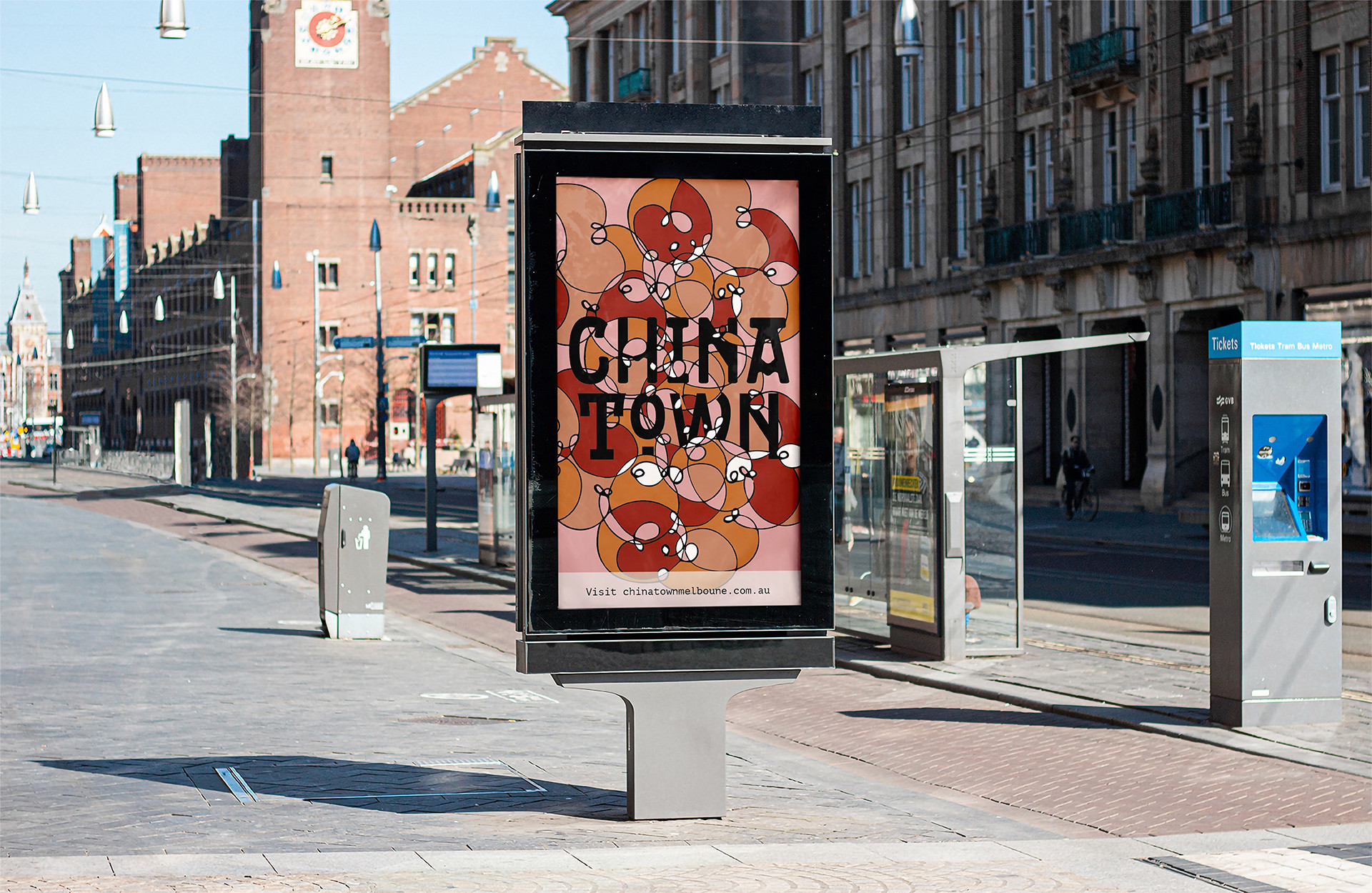
Chinatown

This poster's textured forms, playful font, tensed composition, and expressive colour palettes effectively convey the landmark’s materiality. In addition, the white spaces successfully create negative space in the composition to emphasise the typography. The interaction of typography and forms makes them appear as a group, while also expressing the vibrancy and bustle of this landmark.

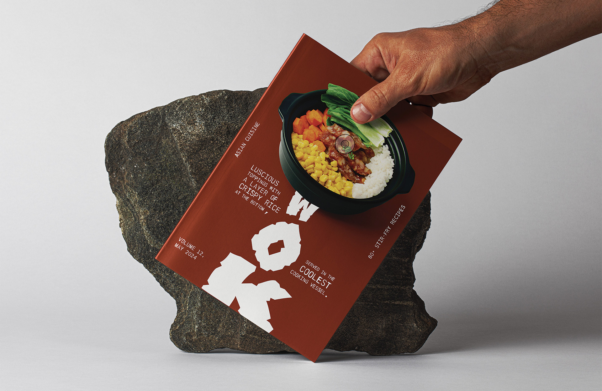
WOK

This piece displays an advanced understanding of fundamental lighting techniques, including advanced lighting balance and control, to produce a flawless lighting style that aligns with intended mood. At the same time, presents highly original and innovative ideas by incorporating sophisticated use of formal elements, props, camera settings, and post-production techniques.