My name is Leah McCabe, and I am a passionate, creative individual who thrives on using design to solve real-world issues. Throughout my studies, I focused on how design can be a tool for positive change, whether it’s addressing social or cultural issues or bringing light to underrepresented perspectives. I love combining thoughtful research with innovative visual solutions to create work that not only looks appealing but also makes an impact. I spend most of my spare time being creative, believing that nothing is beyond repair. I love altering clothes, decorating rooms, and creating artworks, infusing beauty and style into my life.

I recently completed my Bachelor of Design, majoring in Communication Design, where I gained a deep understanding of effective client communication, the power of layout, and the strategic use of design elements and principles. I believe that both education and experience are essential for mastering design, and I draw inspiration from nature, personal experiences, research, and experimentation.

I love crafting unique layouts and dynamic designs across various mediums, including packaging, posters, social media, and larger publications and brand identities. I excel in hands-on tasks and find that diving into research enhances my engagement and fuels my creative process. My strengths lie in my distinctive illustration style and advanced layout skills, which set my work apart.
Moral Disengagement


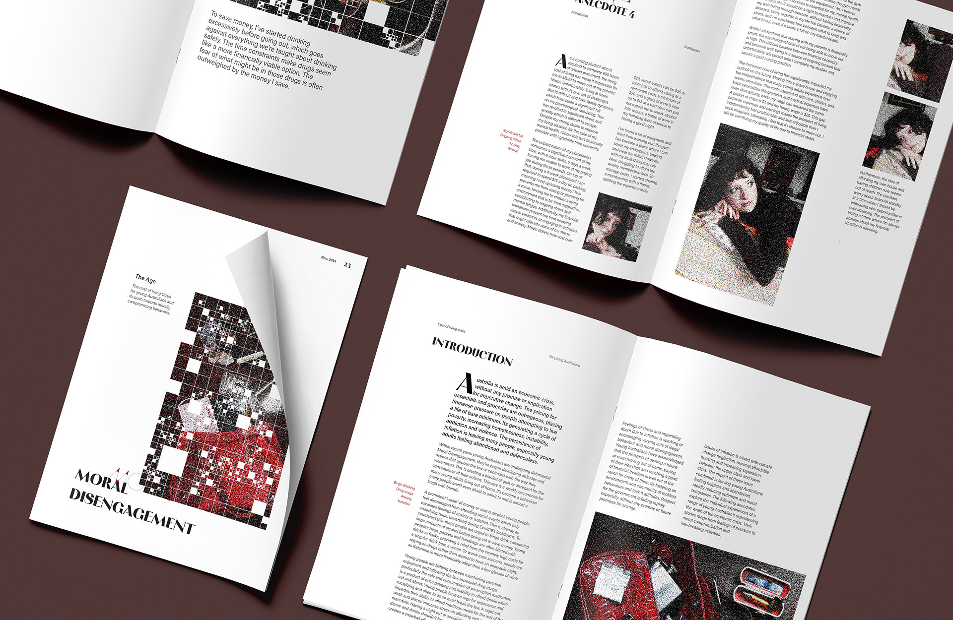
This project focuses on designing a publication, both in digital and print form, along with a social media page and a short article to highlight the issue of inflation through personal stories from young people, exposing and emphasizing the hardships they face.

Anonymous accounts from those affected were gathered and analyzed to identify key themes, with one emotion resonating above all: disconnection. This sense of disconnect—especially from their future and government—emerged as a recurring theme, often cited as a driving force behind their engagement in unlawful activities.

This theme of disconnection inspired the visual style, featuring pixelated photos to symbolize the blurred line between right and wrong. A complex grid layout further intensifies this sense of disorientation, with the eye moving unpredictably across the page to reinforce the feelings of disconnect and uncertainty.

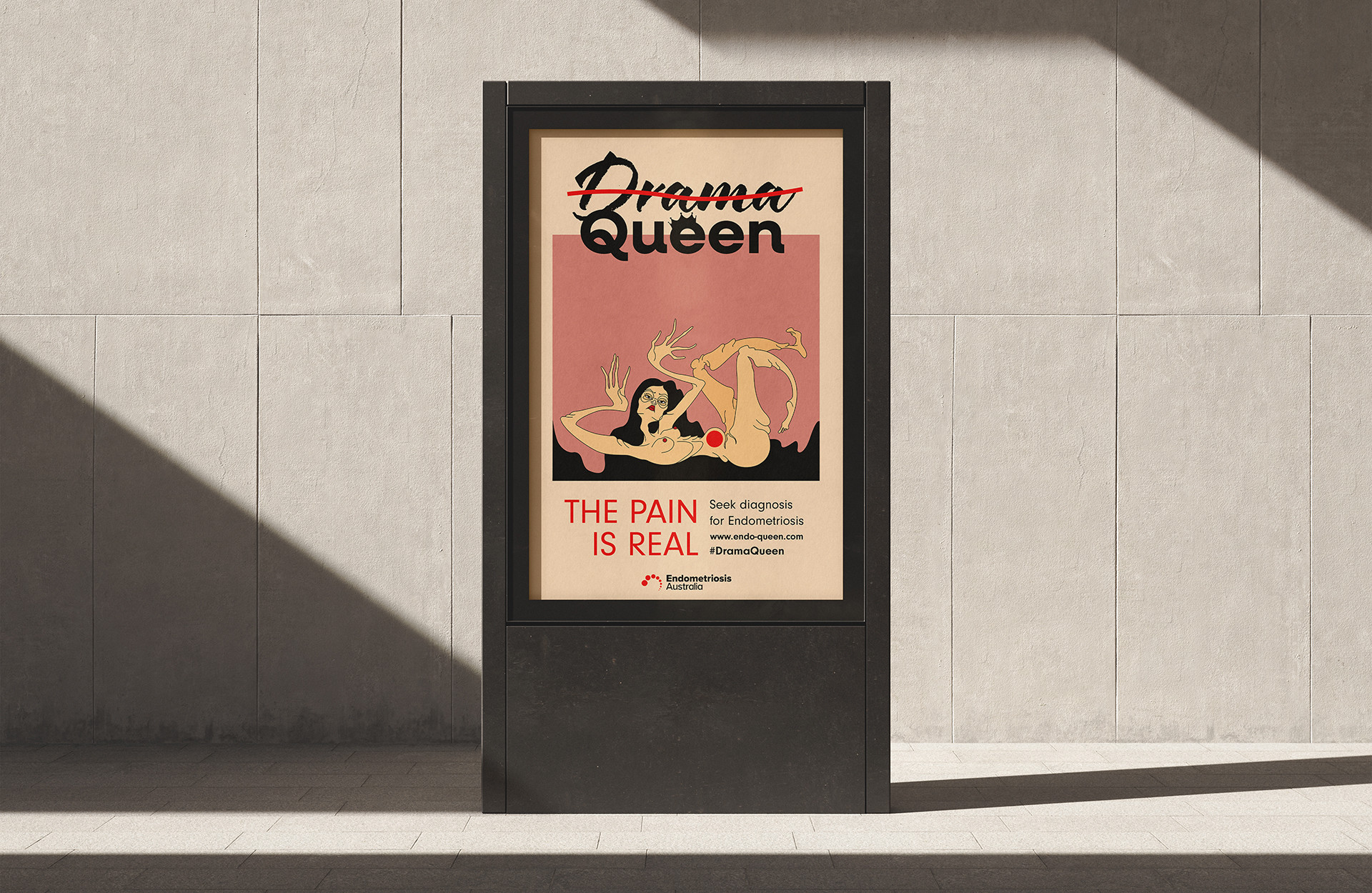
Drama Queen

The campaign Drama Queen promotes awareness and education of Endometriosis, focusing specifically on the common misdiagnosis of the disorder as painful periods and how woman are often considered “Drama Queens”.

Warm tones create a welcoming atmosphere, with shades of pink and pale beige representing the human body and female reproductive system. Bold red emphasizes the tagline and symbolizes pain through the red sphere in the woman’s abdomen, linking the imagery to endometriosis in the pelvic area.

My final imagery features three variations of women with outstretched arms and legs. These grotesque figures convey the pain of endometriosis, and their distinctive poses add drama to the posters, forging a strong connection between text and visuals. The flowing lines of their black hair enhance this dramatic effect.

Nama Tjtra

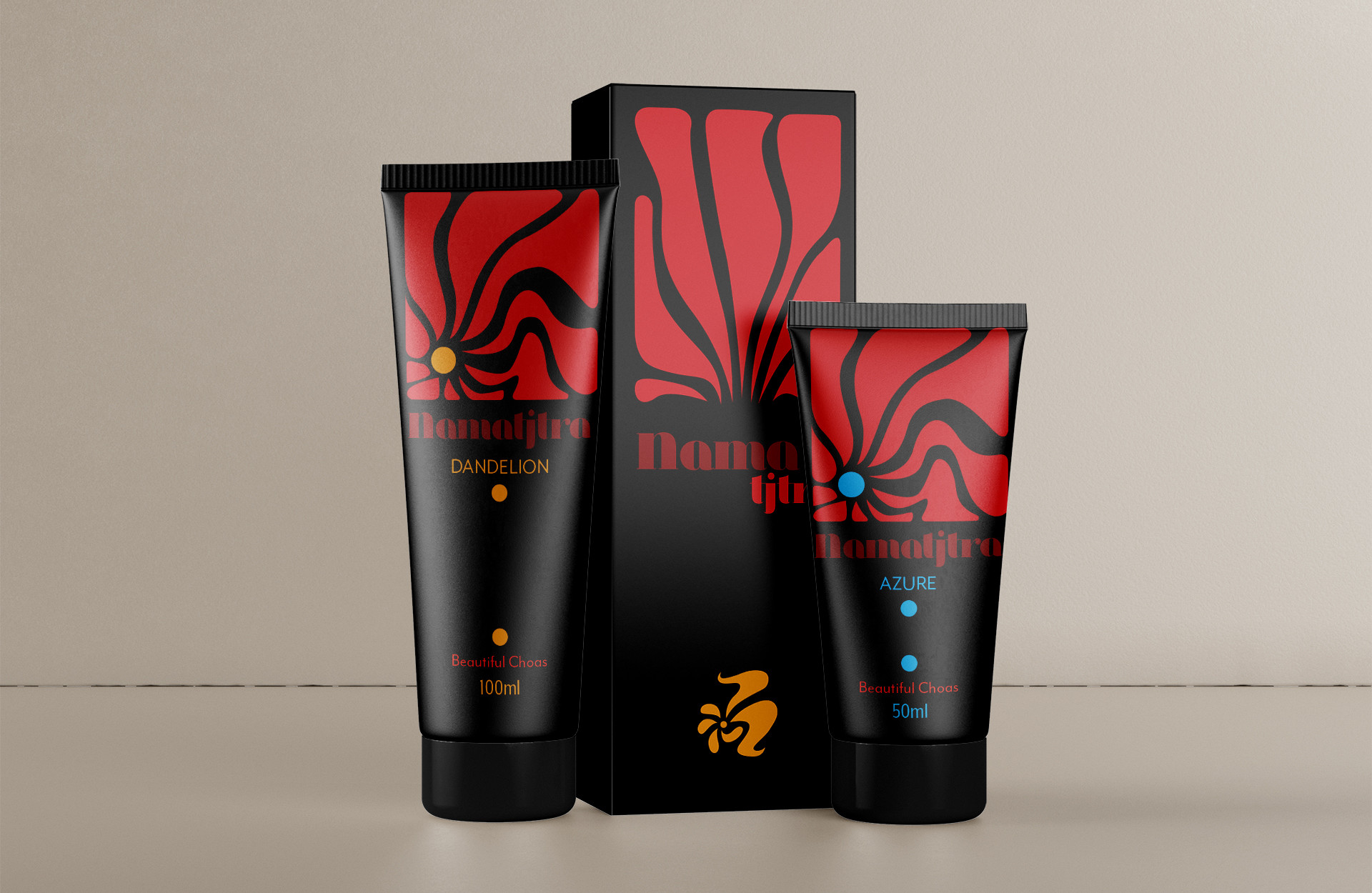
This branding project reimagined the Australian paint brand Matisse as "Namatjira," honoring painter Albert Namatjira to deepen its connection to Australian heritage. The new strategy aims to expand the brand’s reach among children, emphasising that "art is for everyone," while promoting environmentally responsive paints.

The playful, organic logo with earthy tones reinforces inclusivity and sustainability, symbolizing creativity and childhood through its flower-like shape. This refreshed identity makes Namatjira both approachable and inspiring for artists at all levels.

Multiple Catastrophes

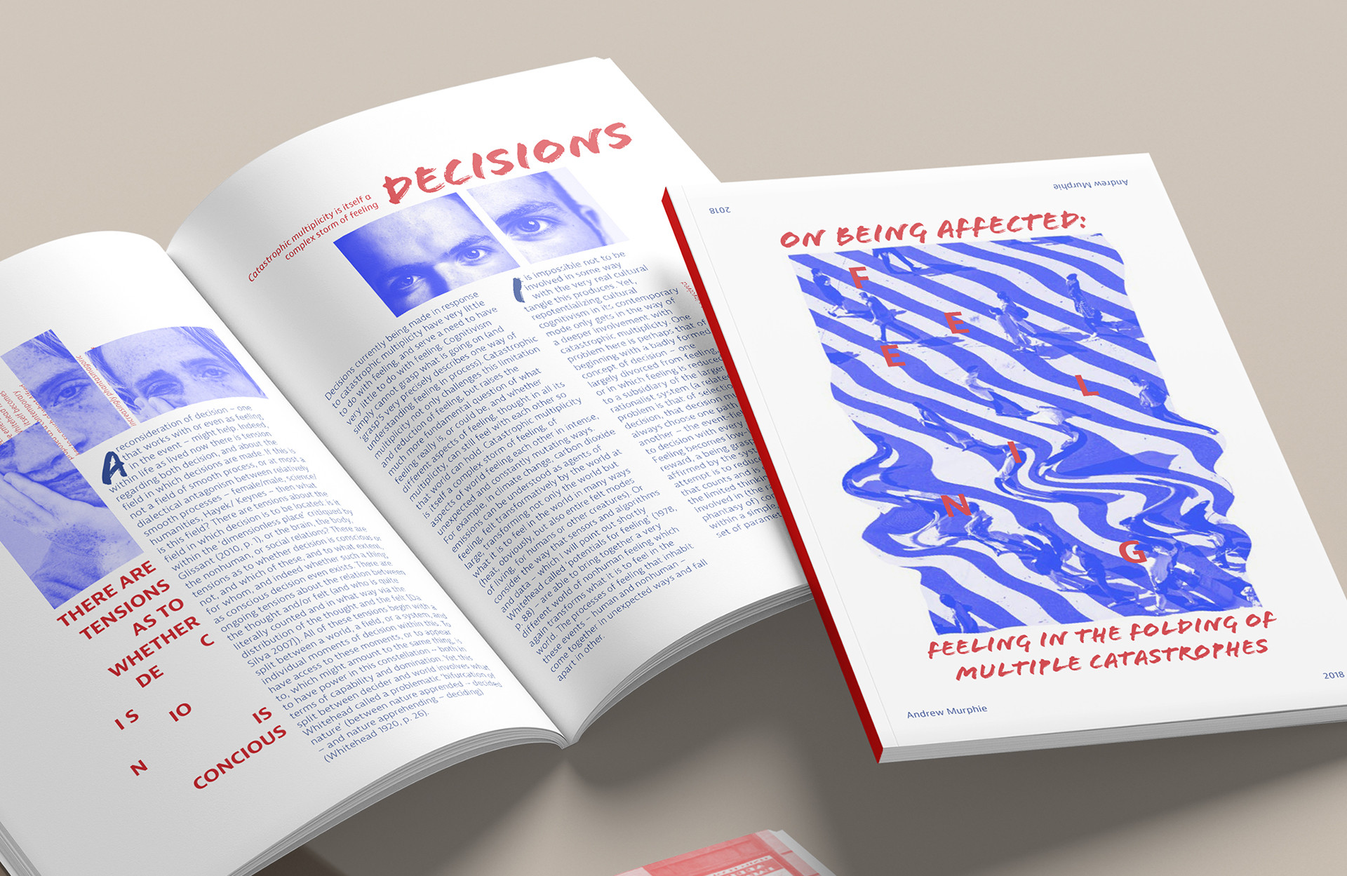
The project involved designing a publication for On Being Affected: Feeling in the Folding of Multiple Catastrophes, which explores how global crises—climate change, social upheaval, and the media revolution—shape collective emotions, a concept called “catastrophic multiplicity.”The goal was to push the boundaries of conventional design, creating a layout that resonates deeply with the emotions of the text.

A 12x12 grid with varied text box sizes and positions, along with duplicated paragraphs, was used to convey chaos and amplify the sense of catastrophic multiplicity. The concept of constellation and multiplicity is central to my design, reflected in the repetition of images and spaced out lettering.

Eternal Ink

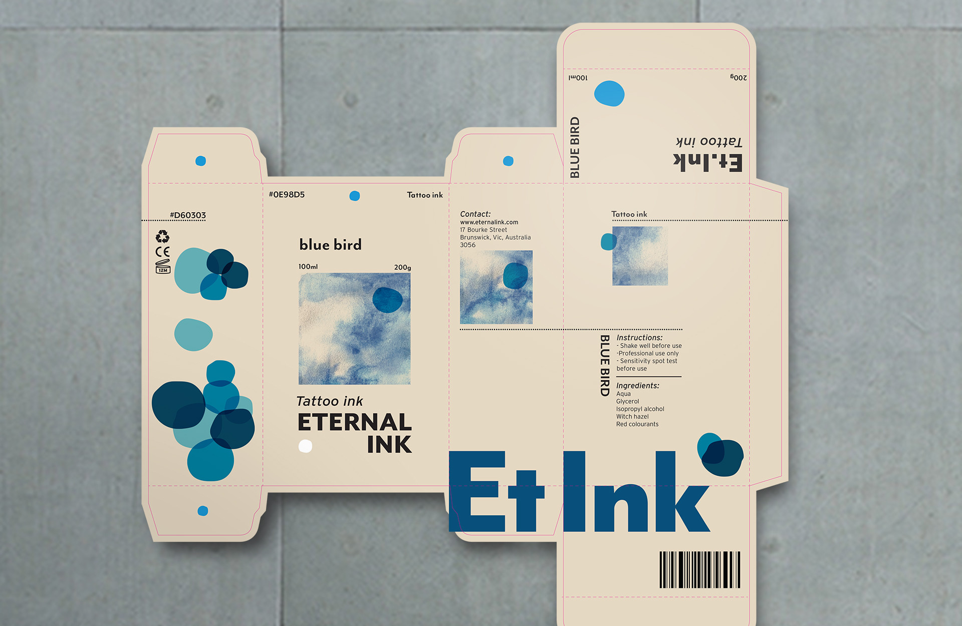
The project involved developing a conceptual brand, Eternal Ink, along with a cohesive brand identity. Recognizing that most tattoo ink packaging feels outdated, the new packaging design reflects the contemporary wave of tattoo art, characterized by flowing, abstract lines and forms. Hand-painted watercolor elements showcase tattoos as elegant and beautiful, while the circular dots symbolize drops of ink. Fine lines composed of tiny dots subtly represent the tattooing process, adding a refined, artistic touch to the overall design.