I have been a designer since childhood. Inspired by my mother and grandmother sewing many of their clothes, I drew my own dress designs while absorbed in the glamour of the televised national fashion awards. Years later, while I studied fashion, my designs were seen on the runway of those same Smokefree Fashion Design Awards, first as a finalist in 1997, and then being Highly Commended in 1998 when I also received special acknowledgment from the judge and renowned designer Akira Isogawa.

I spent more than twenty years in fashion, working in Wellington, London, and Melbourne. My designs have been worn by global celebrities including Kendall Jenner, Nicole Scherzinger and Bella Hadid, and shown at Mercedes Benz Fashion Week Sydney and New York Fashion Week.

During the Covid-19 pandemic—when communication design became so vital—I decided to pivot my design career and use my talent to design for social good, enrolling in Swinburne Online’s Bachelor of Design, majoring in Communication Design.

Through my studies, I have focused on designing for good, with projects to increase engagement with Melbourne’s public artworks, raising awareness of the need for hearing protection at music events, and Australia’s gender pay gap. I delight in publication design, brand and identity, packaging and communication strategy design. I find infinite inspiration from language and the endlessly intriguing joy of typesetting.

As communication design envelops the world around us, and as my endless enthusiasm to explore this new avenue of design confirms, I have never looked back.
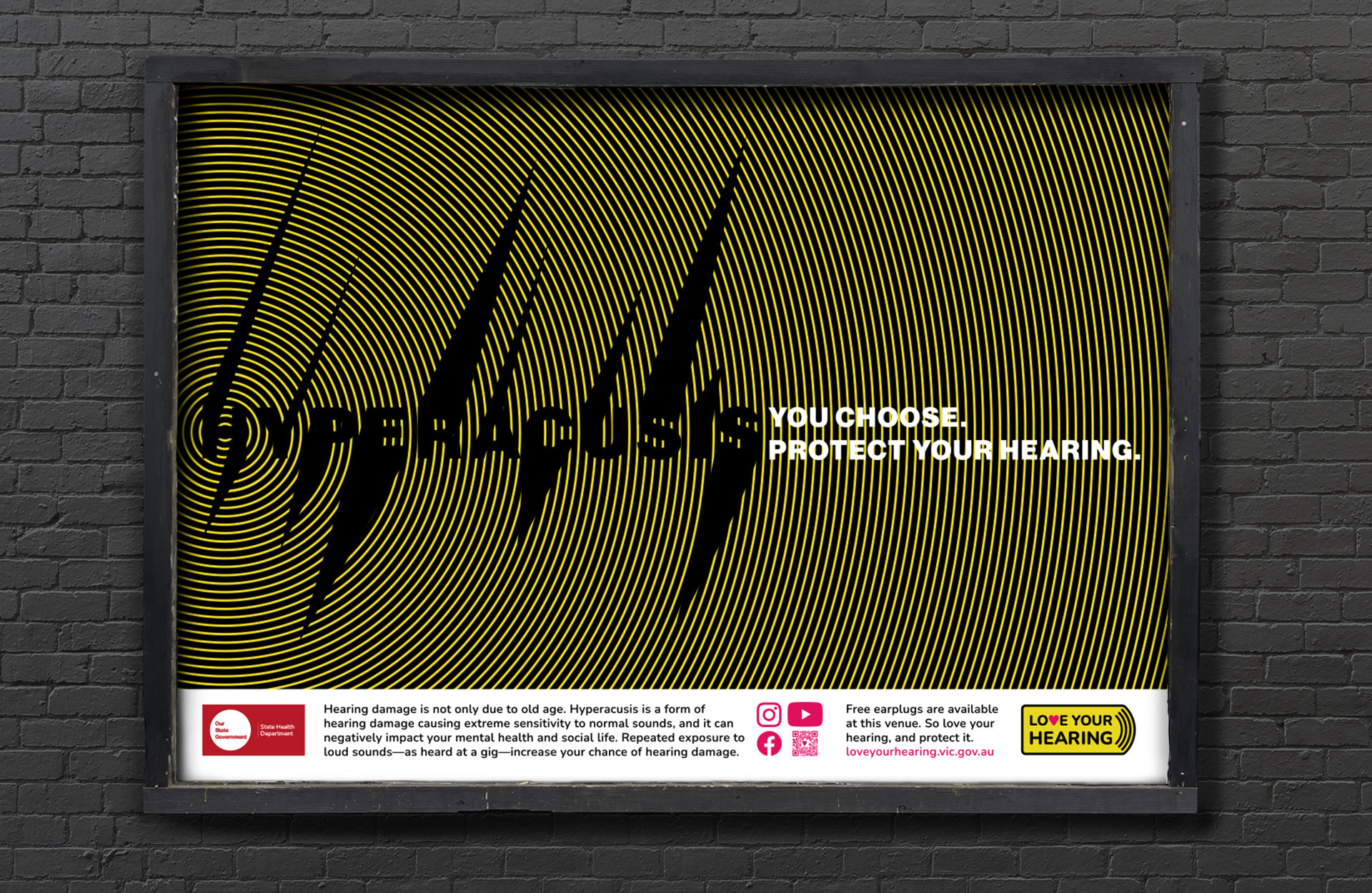
Campaign for Change: Love Your Hearing—Destigmatising Wearing Hearing Protection to Music Events

Through extensive research into the topic of hearing damage through exposure to loud music, it was discovered that very few 18–34 year olds protect their hearing when attending loud music events. Using vivid aposematic warning colours, shape and texture to express loud sound, the campaign garners attention, educates and prompts consideration into the consequences of choices amongst the target market, while offering the solution—FREE earplugs, available at gig venues.

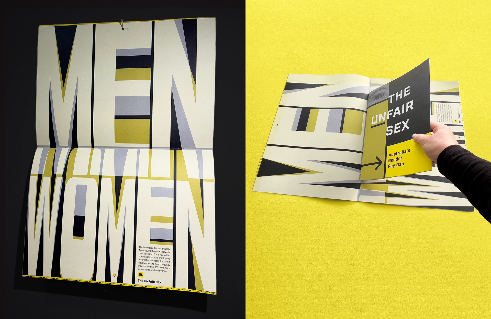
Publication Design: The Unfair Sex—Australia’s Gender Pay Gap

Ostensibly a typesetting proposition, this project not only delivered opportunities to explore, learn and perfect the setting of justified text, but through deep research opened up the desire to draw attention to this issue through expressive use of typography. By using typographic forms and subverting type conventions, data relating to the gender pay gap was conveyed at giant scale to attract attention, inspire thought and start conversations towards positive progress to close the gap.

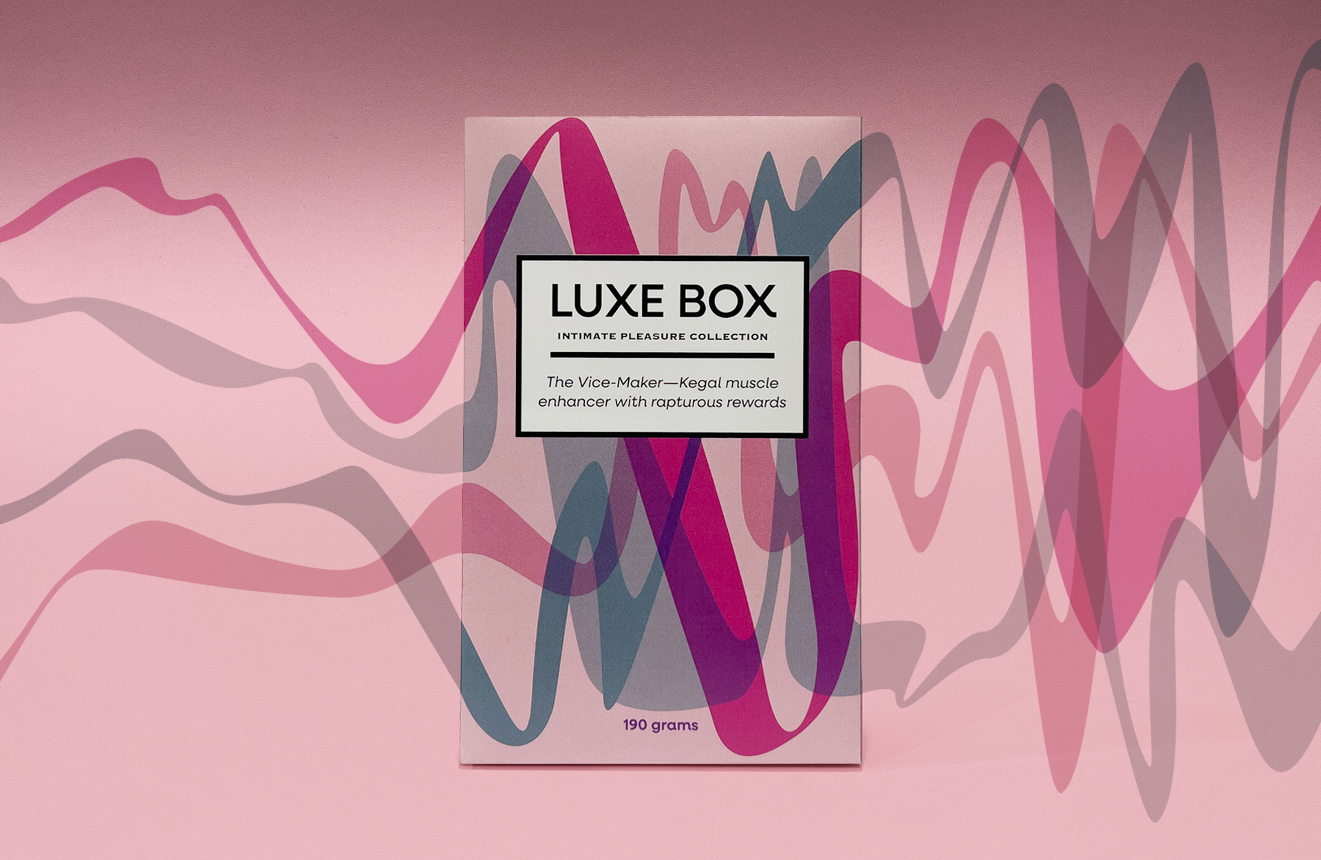
Packaging Design: Luxe Box—Intimate Pleasure Collection

The considered approach to the design of the surface graphics capitalises on the overprint effect, creating a ‘vibrating’ visual result, communicating the transformative effect of the products inside each box. Subtle visual communication cues indicate connections to luxury goods, with typographic elements sensitively styled to reference high-end fashion branding. Through dynamic representations of rapturous reactions, Luxe Box packaging transforms products that were at times considered ‘indecent’ into deluxe and desirable.

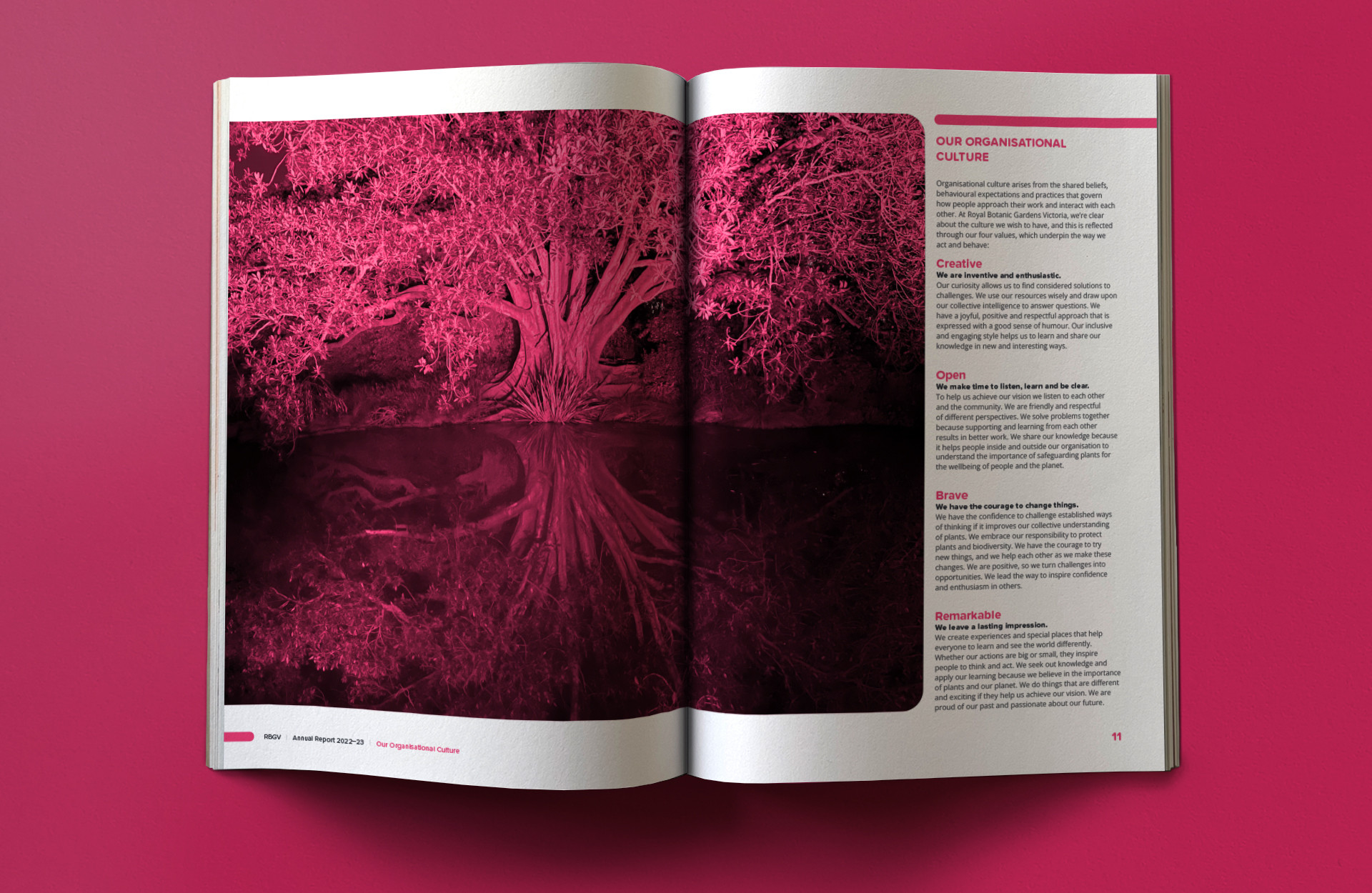
Publication Design: Royal Botanic Gardens Victoria—Annual Report Design

Inspired by original nighttime photography taken at the RBGV’s hugely popular Lightscape event, the concept for this annual report design upturns expectations of a natural green landscape and instead positions the RBGV at the cutting edge of creativity and vision as they aim to garner engagement from a new generation of nature-lovers. This unique design approach along with the methodical application of typographic conventions and meticulous typesetting delivers an enlightened edition.

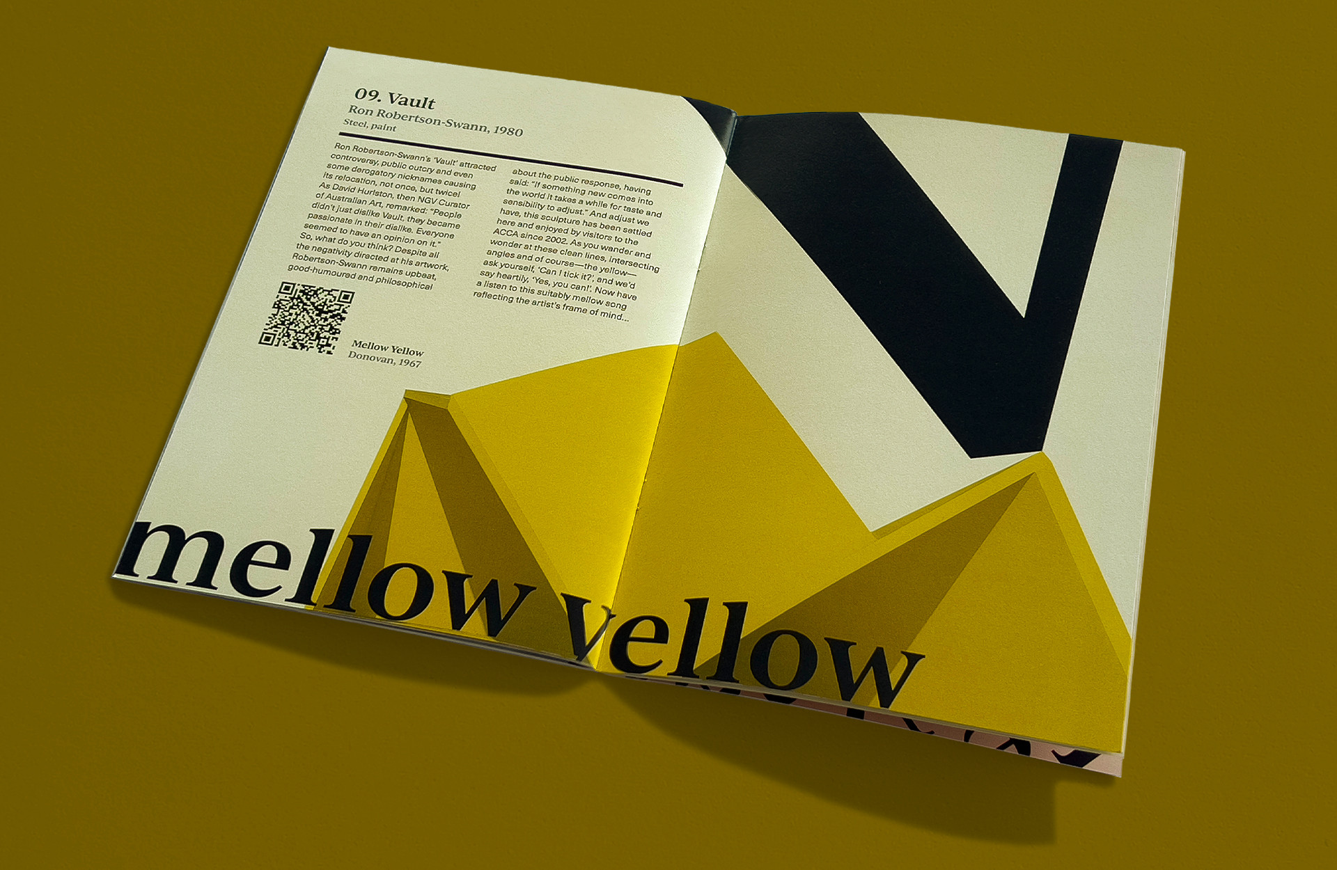
Publication Design: Move It! Bop-tastic Melbourne Artwalk

Through engaging deeply with the artworks Melbourne has in abundance, and taking original photography—cropped in unexpected ways—the concept for the Move It! Bop-tastic Melbourne Artwalk was born. With cleverly crafted copywriting interwoven with toe-tapping musical connections, the public artworks plentifully placed around Melbourne are explored in new ways by the reader. The relationships of typographic forms and the motifs uncovered in each artwork are exploited to dramatic effect on each spread of this A5 publication.