I’m Quynh Anh Do, a communication design student with a passion for visual storytelling and creating impactful brand identities. My work blends technical skill with a unique artistic perspective, allowing me to craft visuals that communicate messages with clarity and beauty. I’m dedicated to innovation and cultural understanding, striving to create meaningful connections between brands and their audiences. Each project I take on is an opportunity to bring ideas to life in ways that are both engaging and memorable.
Quynh Anh Do
Cà-Rem Gelato Design Project
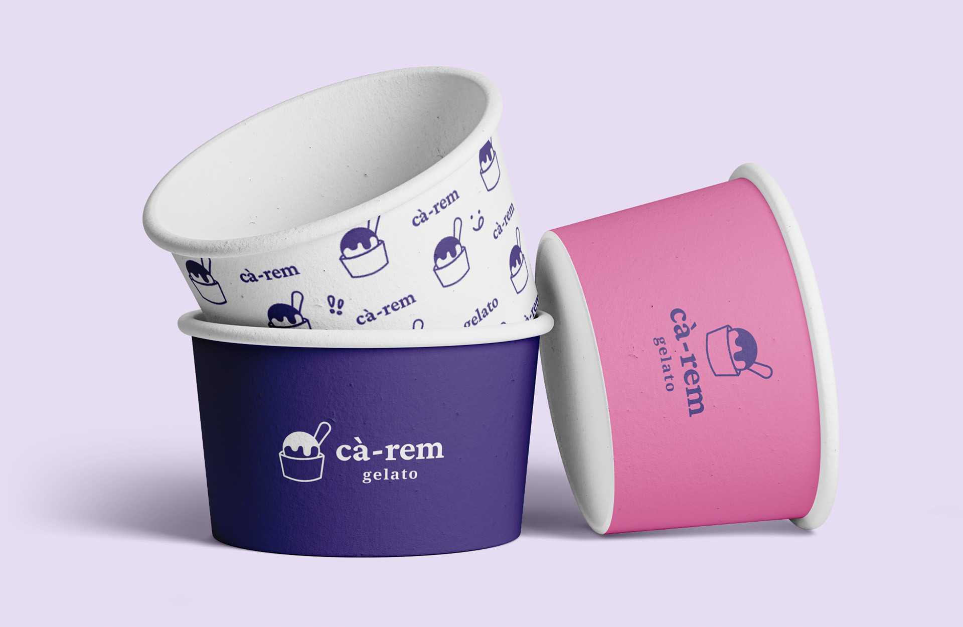
The Cà-Rem Gelato rebranding project redefines the brand’s identity to highlight its unique fusion of flavours, craftsmanship, and cultural heritage. This initiative spans an engaging website, vibrant packaging, and various brand deliverables, creating a cohesive experience that connects with customers on a deeper level.
The redesigned website serves as a digital hub, showcasing Cà-Rem Gelato’s story, flavours, and heritage. New packaging features bold visuals that blend modern appeal with cultural elements, capturing attention and reinforcing the brand’s roots. Additional deliverables—such as in-store signage, promotional materials, and social media assets—provide a unified and memorable brand experience.
This rebranding aims to elevate Cà-Rem Gelato’s market presence, attract new audiences, and build lasting loyalty by celebrating the brand’s authenticity and passion. It invites customers to savour not just the gelato, but the story and craftsmanship behind each scoop.
Spark Of Nature
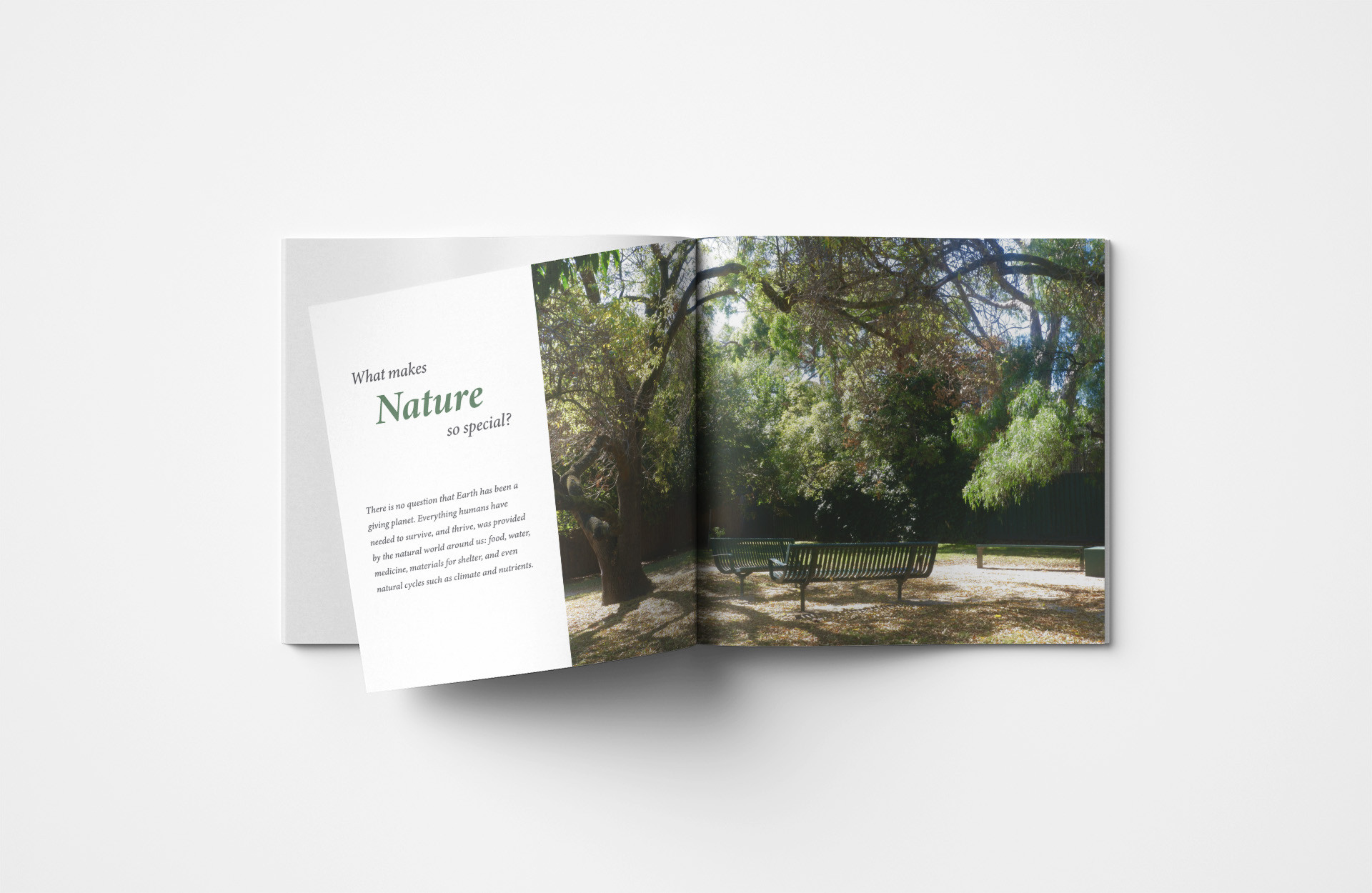
Spark of Nature" is a journey into the heart of natural landscapes, capturing the serene beauty, raw power, and intricate details that define our environment. This photo book celebrates nature through an exploration of light, texture, and movement, immortalising moments that might otherwise go unnoticed—from dawn’s gentle glow to the deep, mysterious hues of twilight. Each page invites viewers to immerse themselves in the natural world, offering glimpses into scenes that evoke wonder and peace.
The goal of this project is not just to showcase beautiful imagery but to spark a deeper connection to the natural world around us. Through these images, I hope to remind viewers of the delicate balance in nature and inspire a renewed sense of mindfulness and respect for our shared environment. "Spark of Nature" is both a celebration and a call to cherish and protect the beauty of our planet.
Love Them Wild
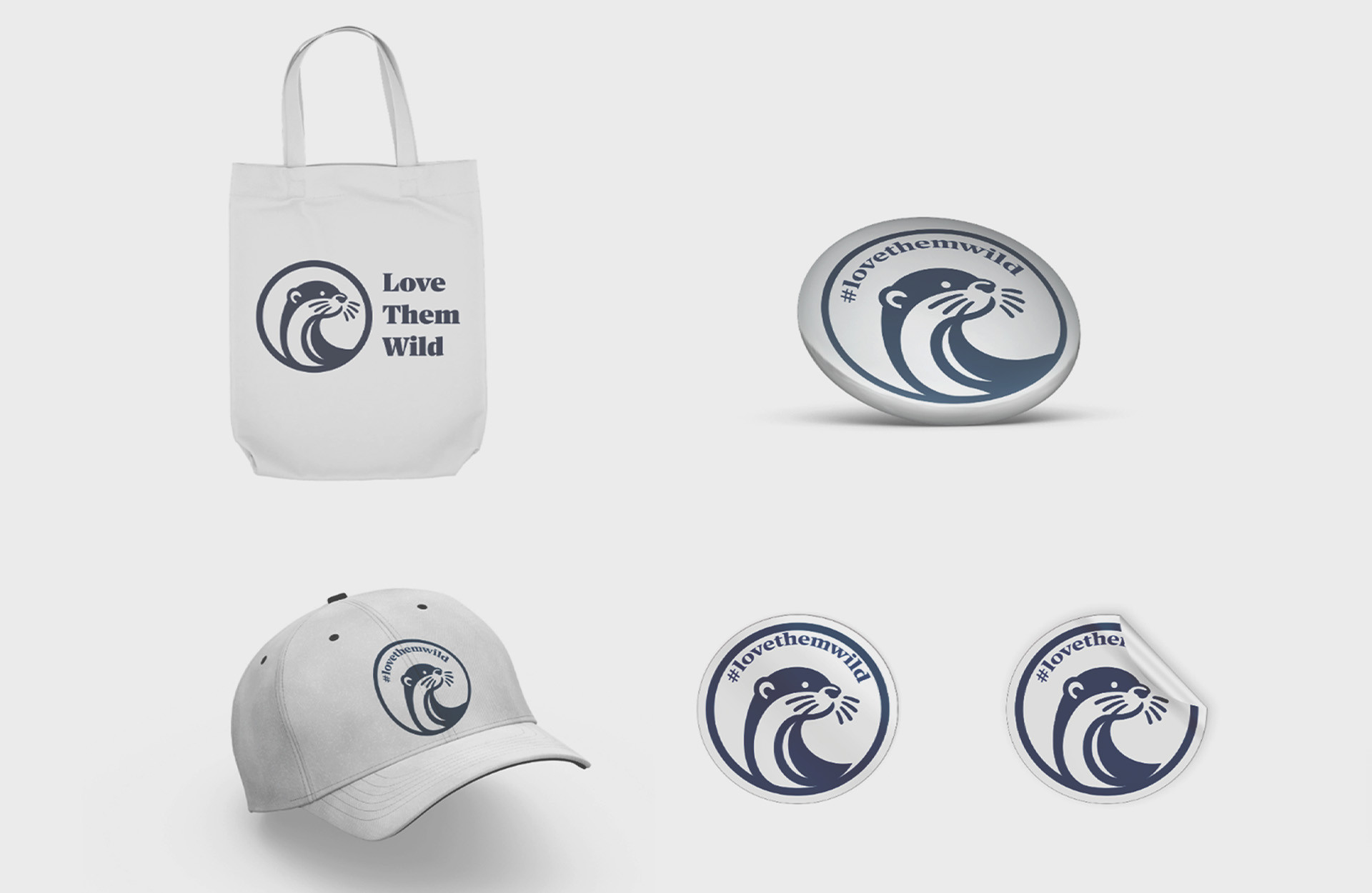
Presenting the Love Them Wild campaign, a heartfelt initiative to raise awareness about the importance of keeping otters in their natural habitats. Otters are wild animals with intricate needs that cannot be met in a domestic environment. This campaign encourages people to admire these creatures from afar and support conservation efforts instead of attempting to domesticate them.
Our merchandise—featuring badges, stickers, totes, and caps emblazoned with the slogan #LoveThemWild—serves as a reminder that these animals deserve to be free. By wearing and sharing these items, you’re helping to spread the message that otters belong in the wild, where they can thrive as nature intended. Join us in protecting their habitats and promoting a future where otters stay wild and free.
We Are All People
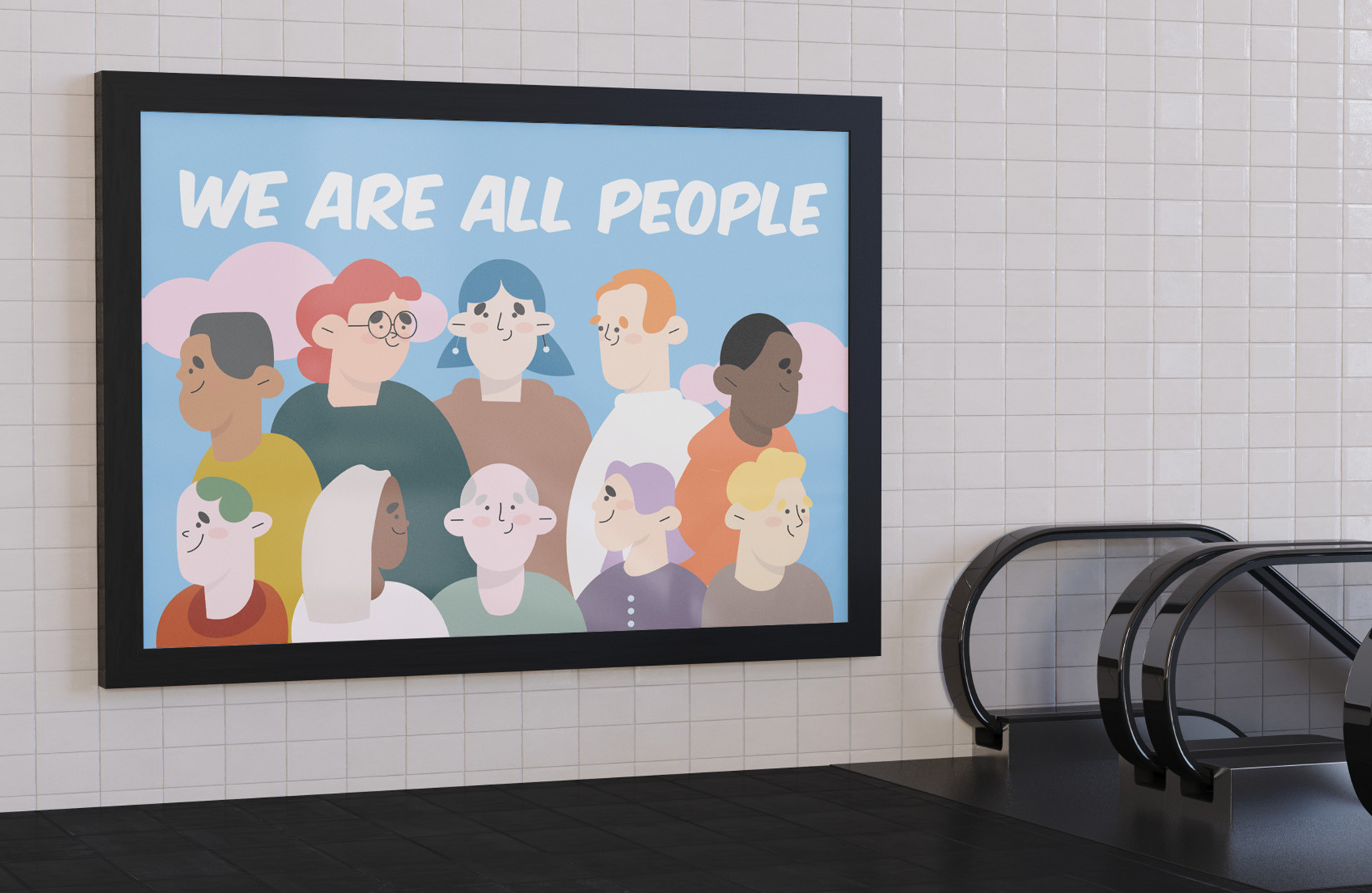
This poster is a call for unity and an end to racism, encapsulated by the message, 'We Are All People.' The illustration features a diverse group of individuals, each with unique characteristics, symbolising different backgrounds and identities. By depicting a variety of skin tones, hairstyles, and facial features, the artwork celebrates inclusivity and the richness of human diversity.
The use of soft, pastel colours creates an approachable and harmonious visual, while the bold, handwritten-style font adds emphasis to the powerful message. Positioned in a public space, this poster serves as a reminder that, despite our differences, we share a common humanity. Its aim is to foster empathy, encourage reflection, and inspire viewers to stand together against racism and discrimination in all forms.
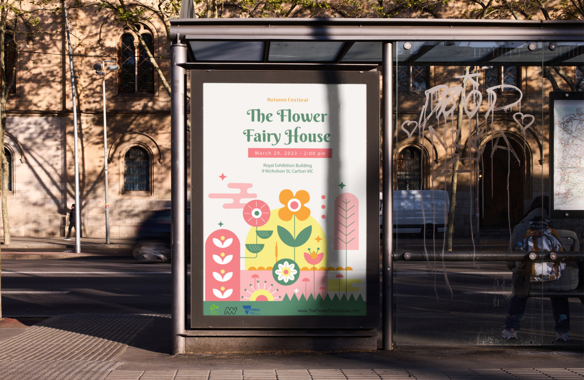
The Flower Fairy House
This print publication design for 'The Flower Fairy House' festival seeks to capture the enchanting, whimsical spirit of the event. By combining playful illustrations with a soft, inviting colour palette, the design evokes a fairytale-like quality that resonates with the festival's theme of nature and creativity. This approach appeals to both children and adults, inviting families and individuals alike to explore and engage with the lantern.
The design aspires to create a memorable visual experience that not only draws attention but also conveys the joyful, immersive essence of the festival, making it a truly special celebration of nature's beauty and the power of imagination.